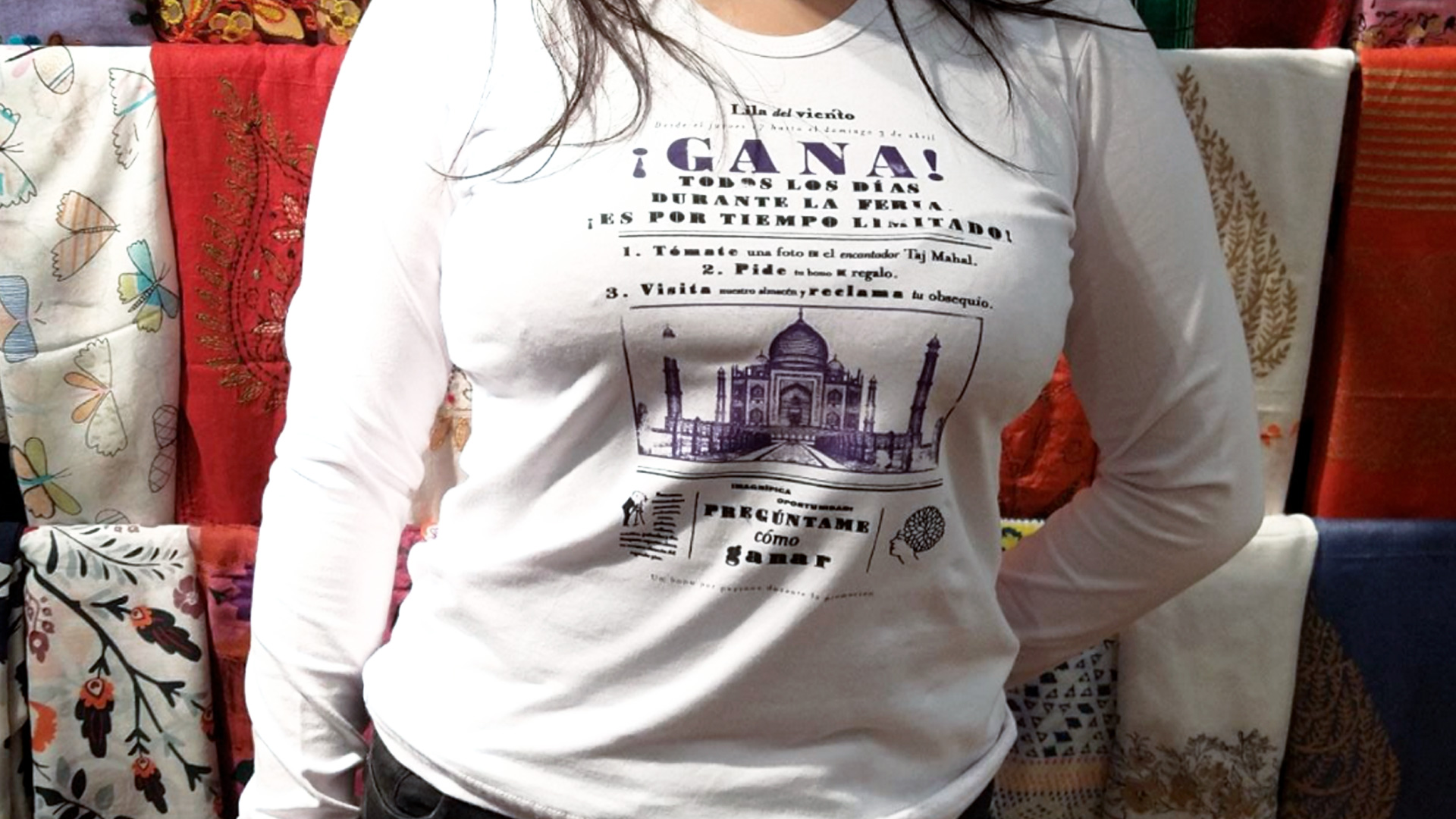
Brand design and interior design for Lila del viento
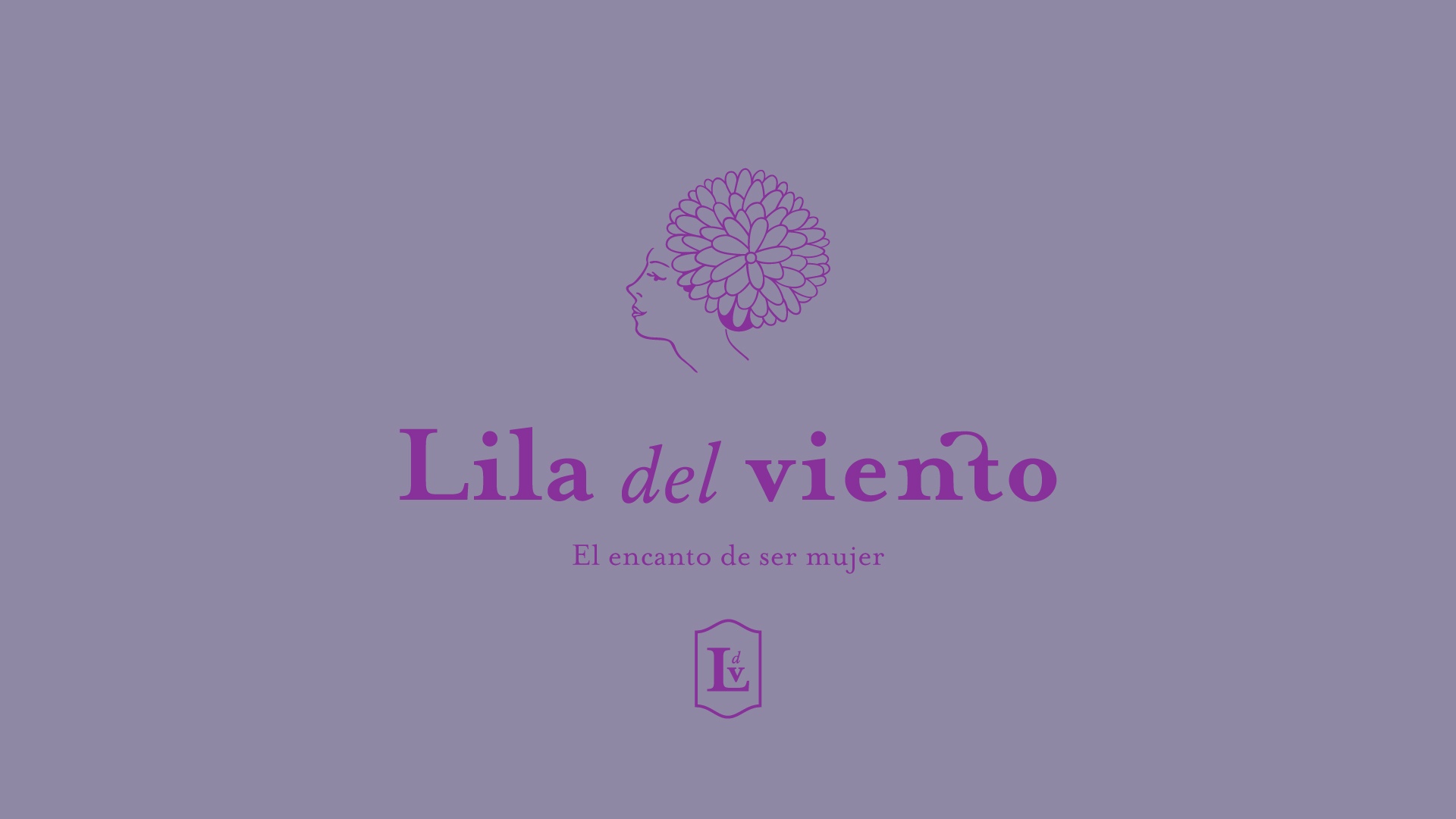
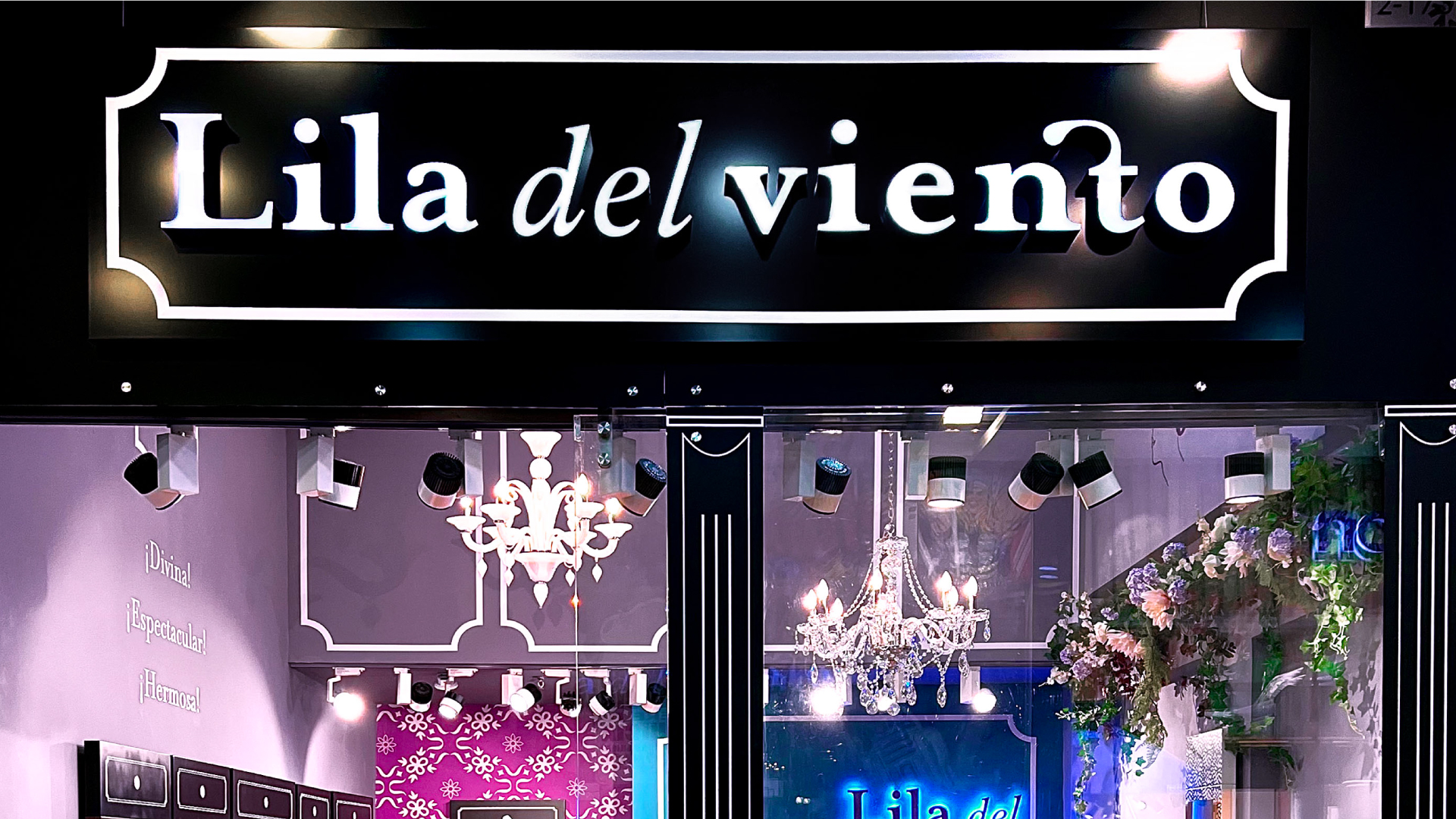
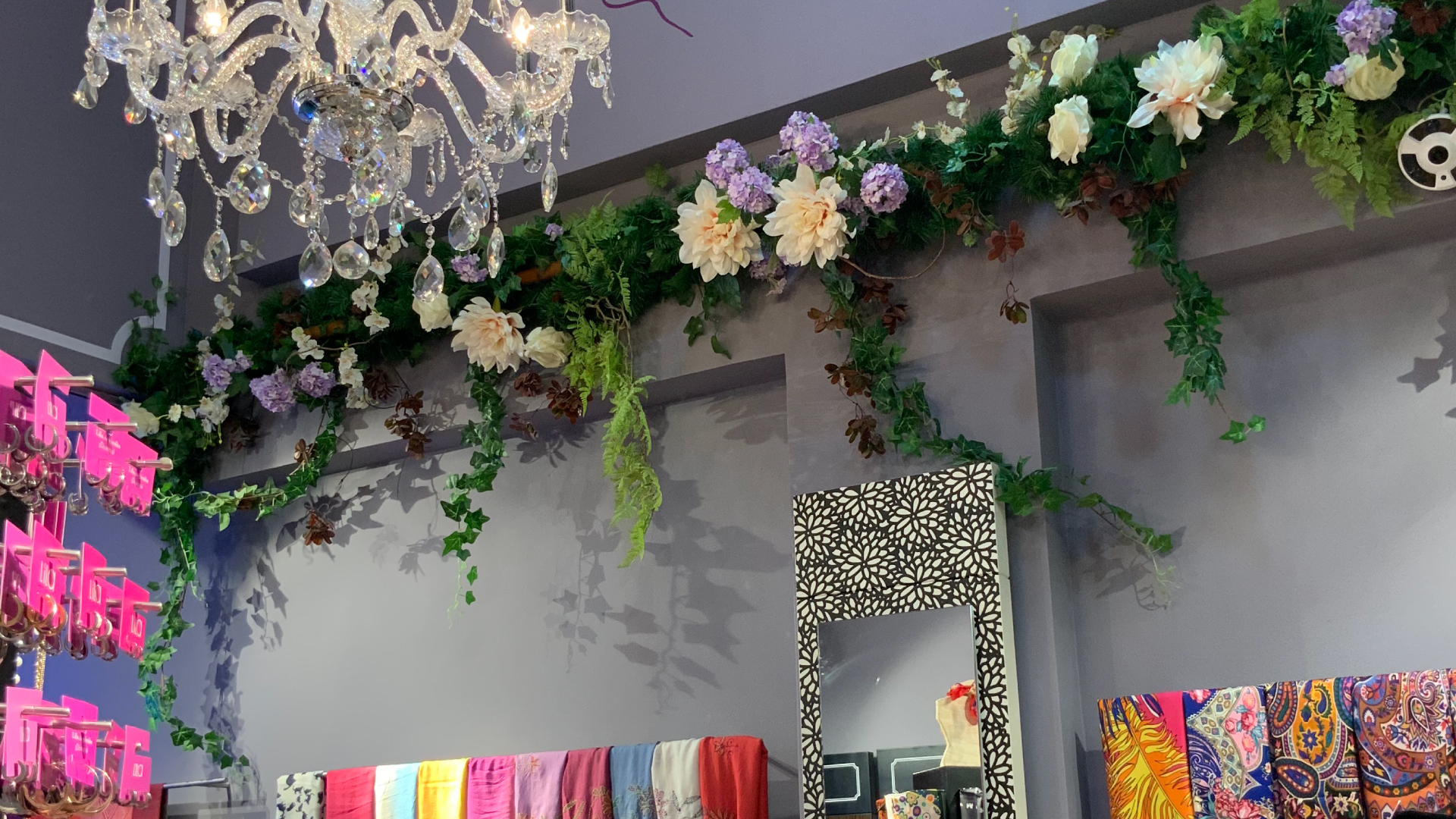
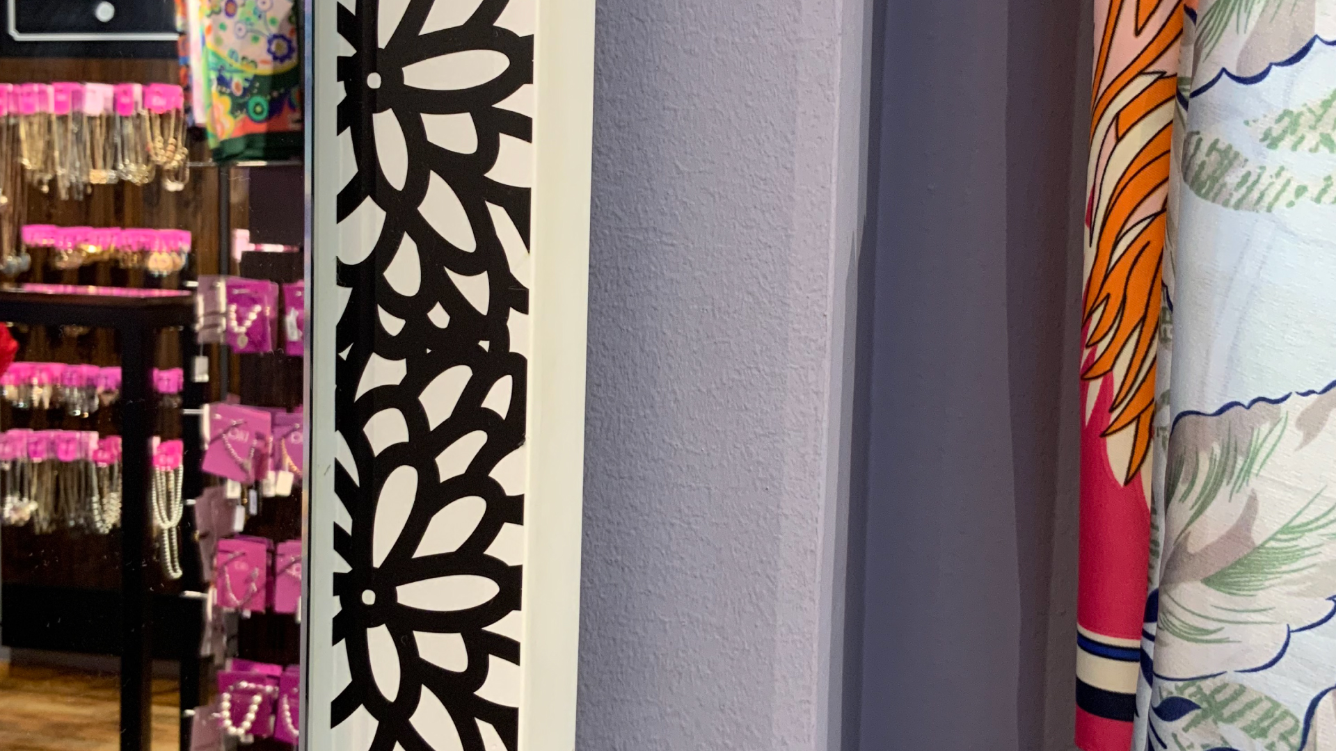
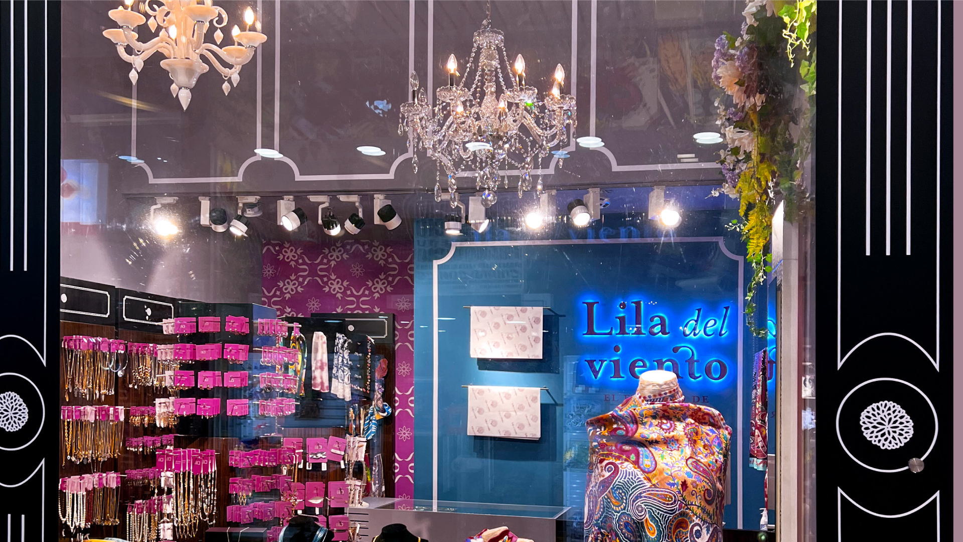
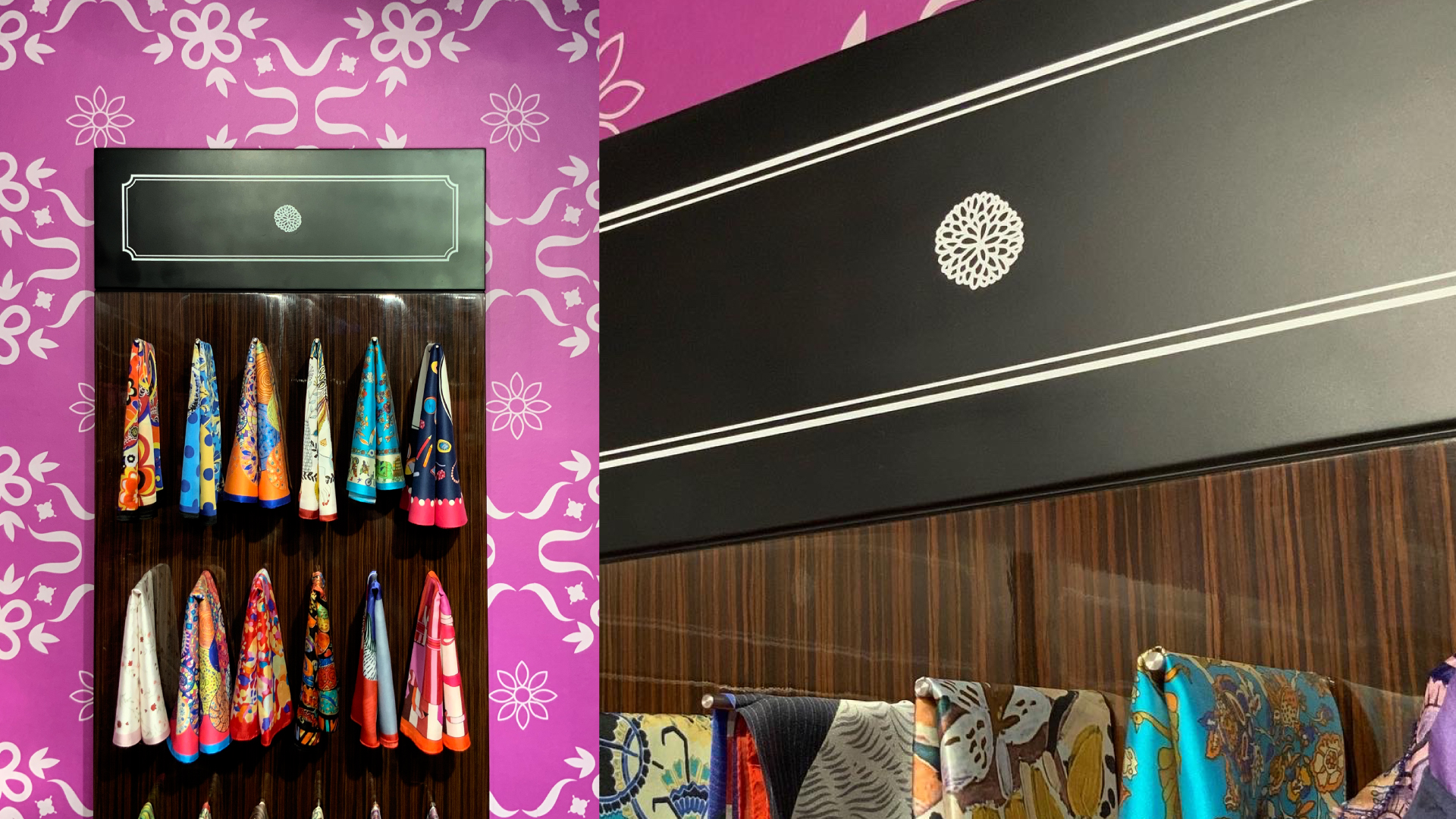
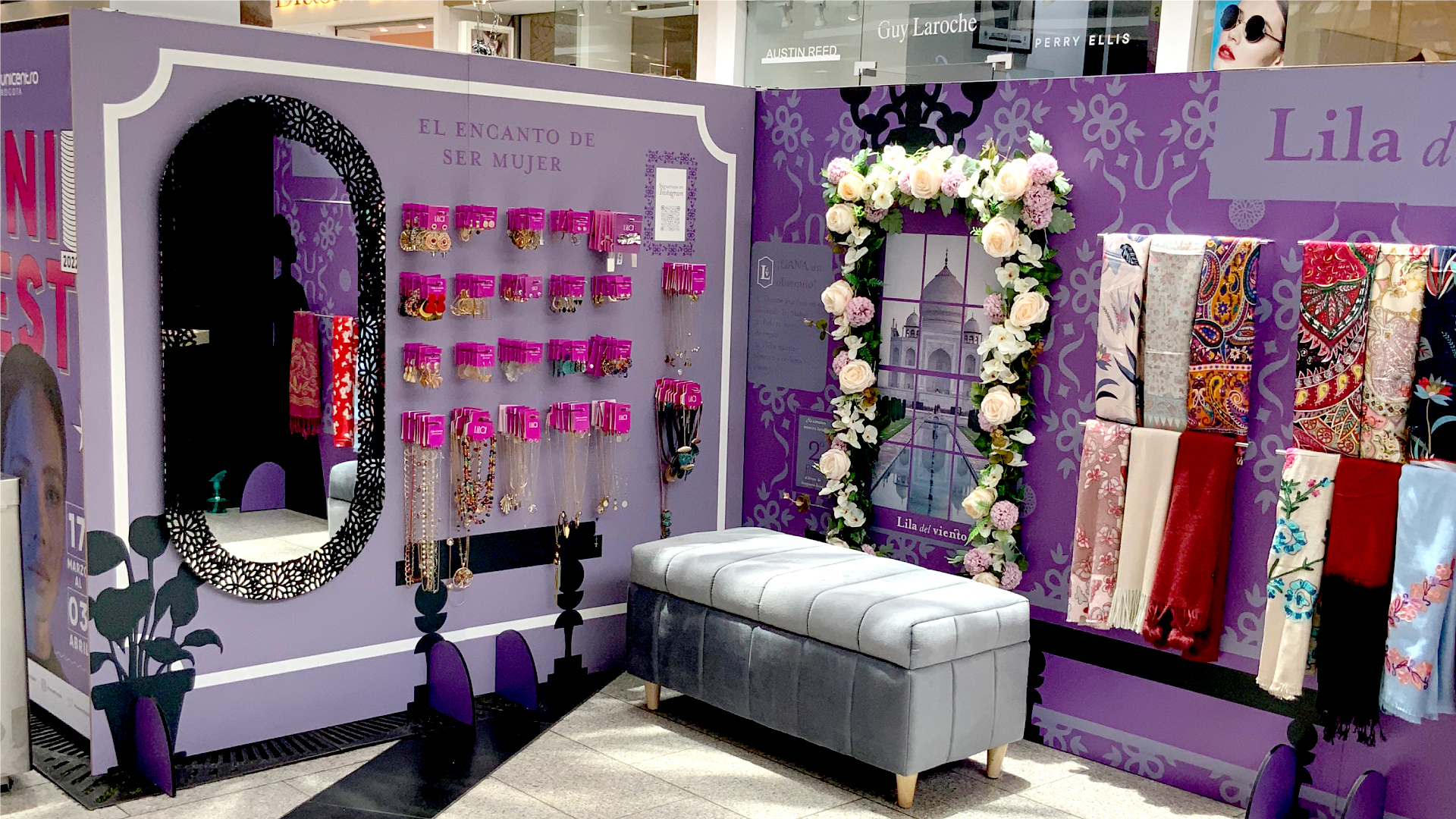
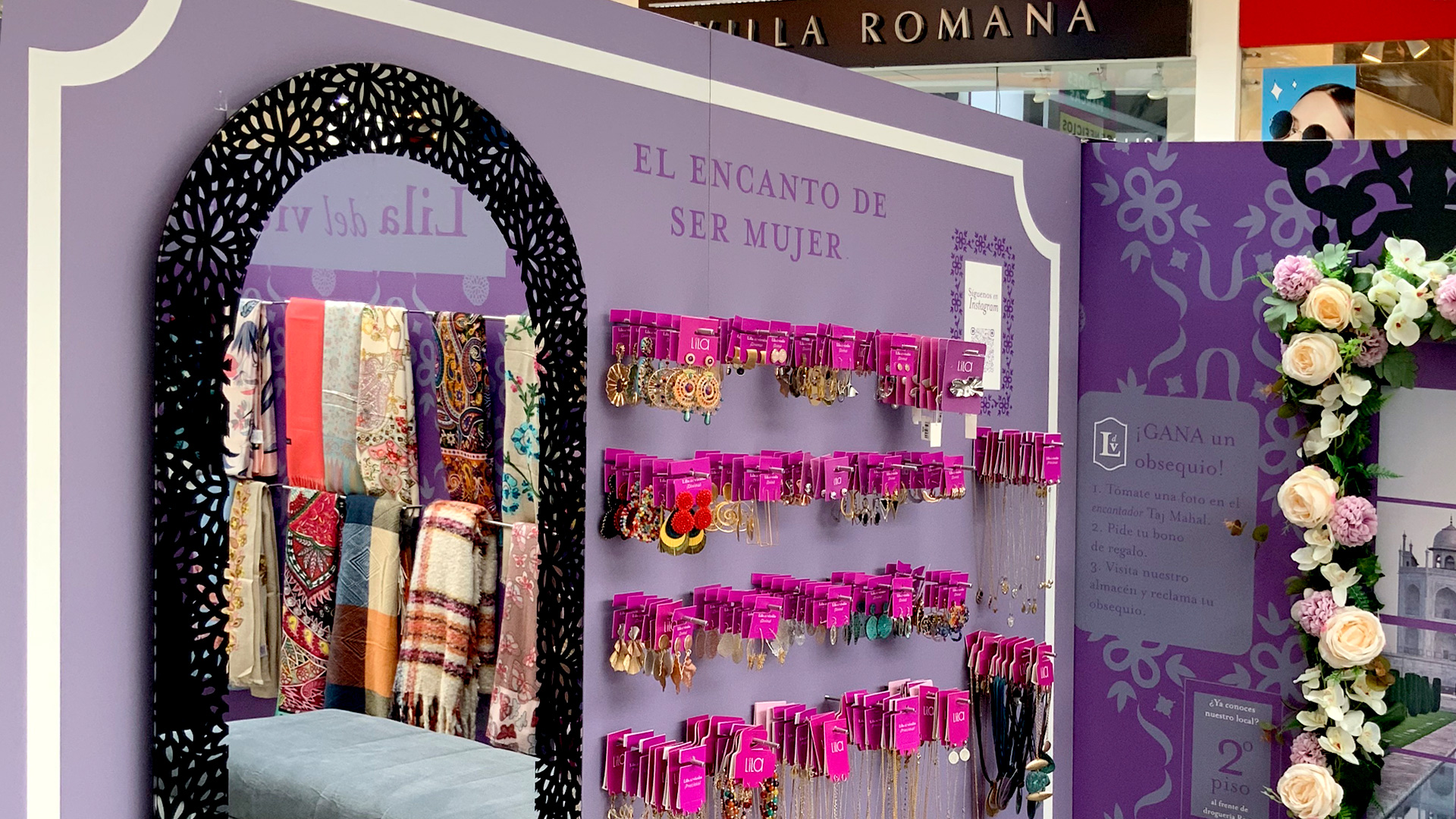
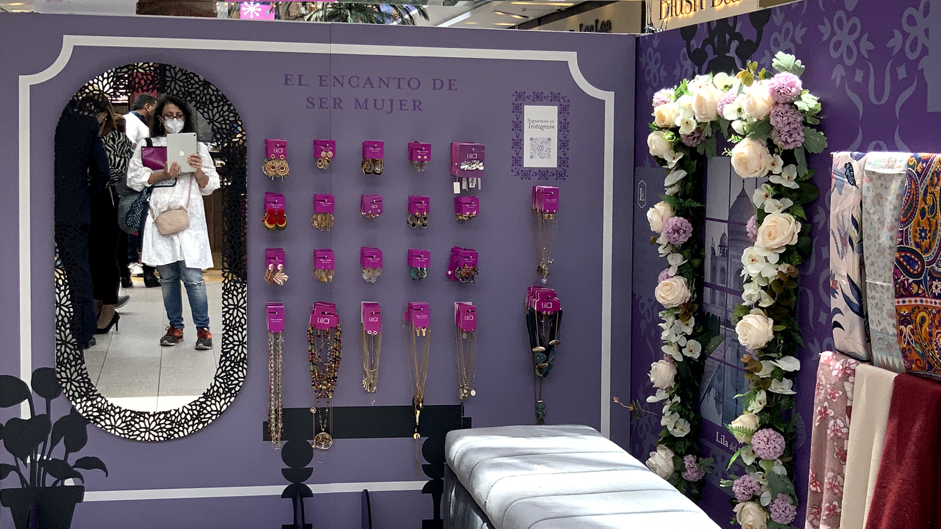
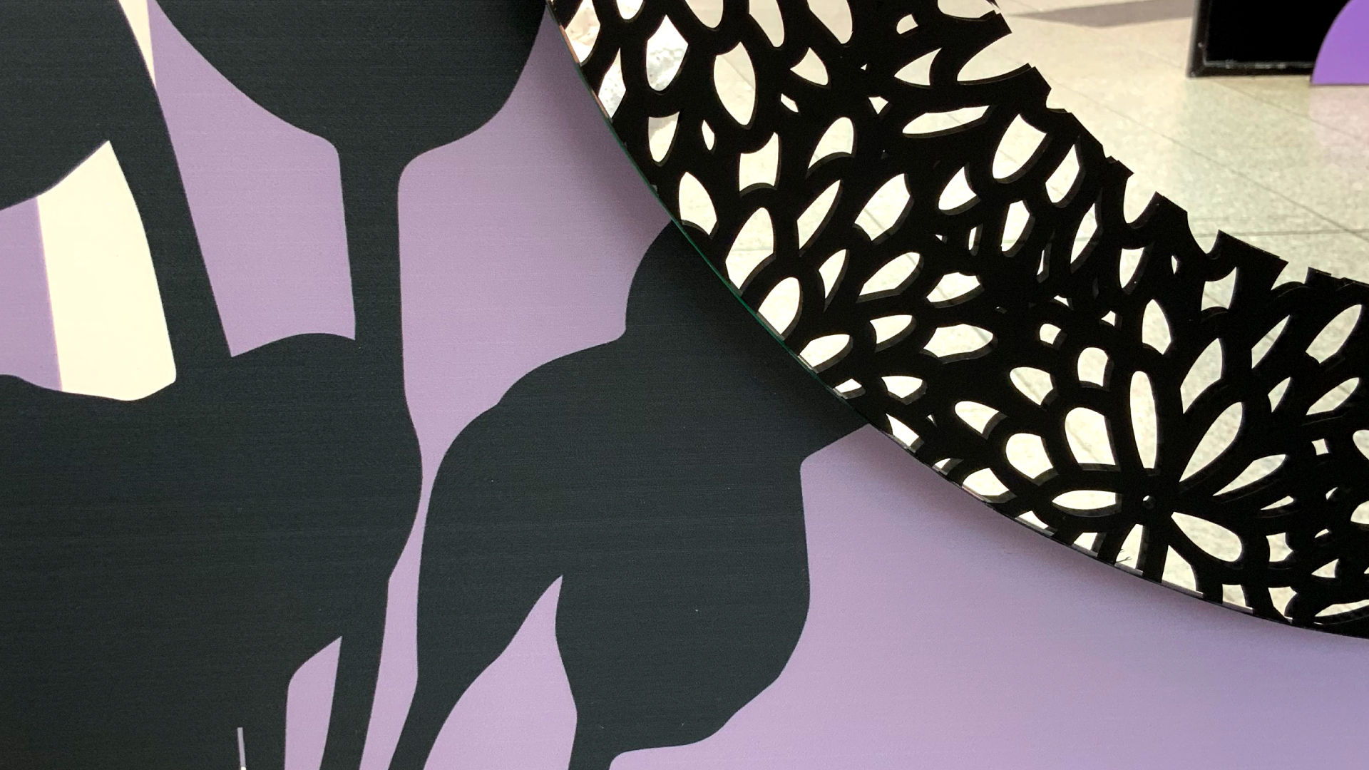
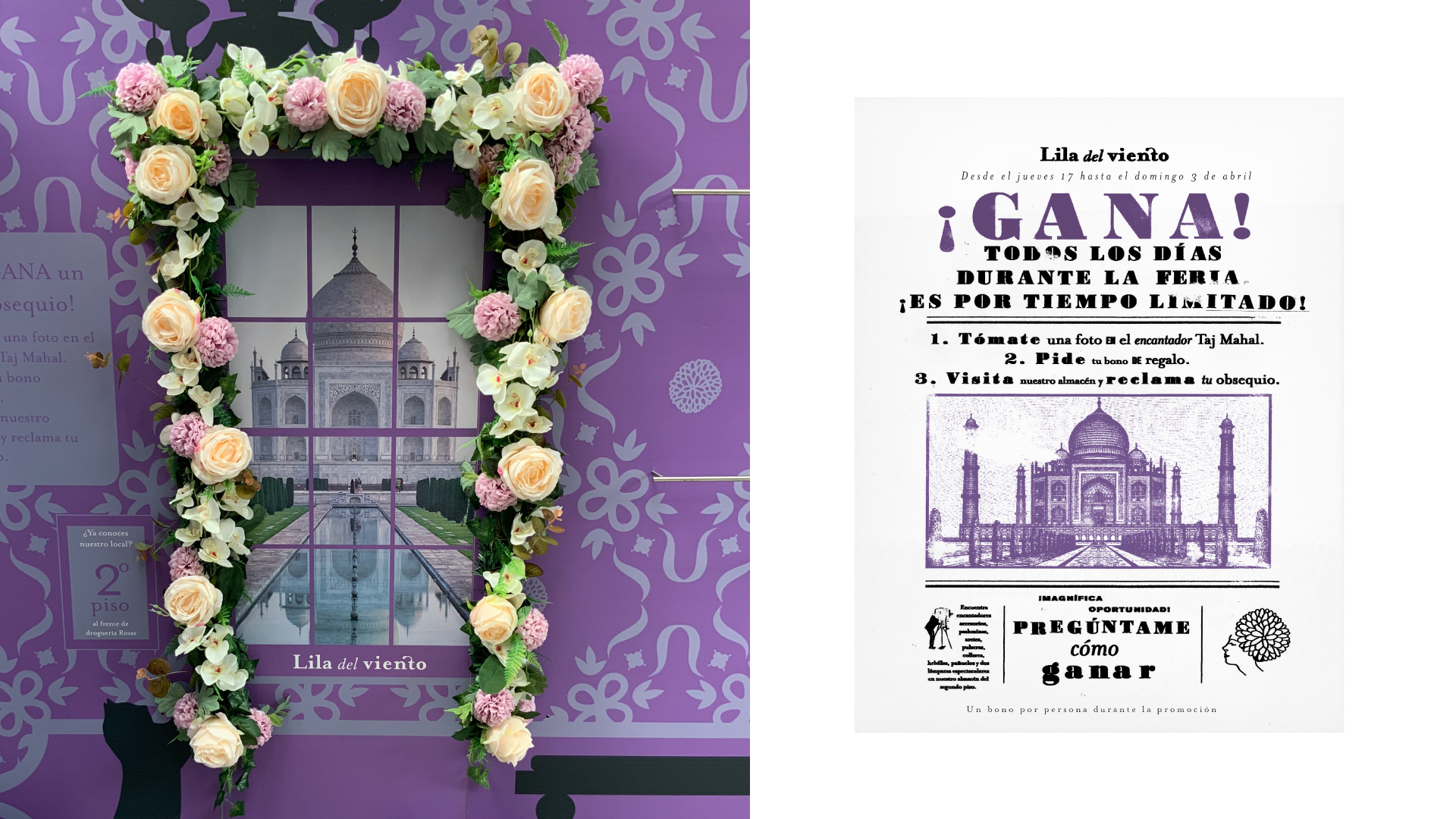
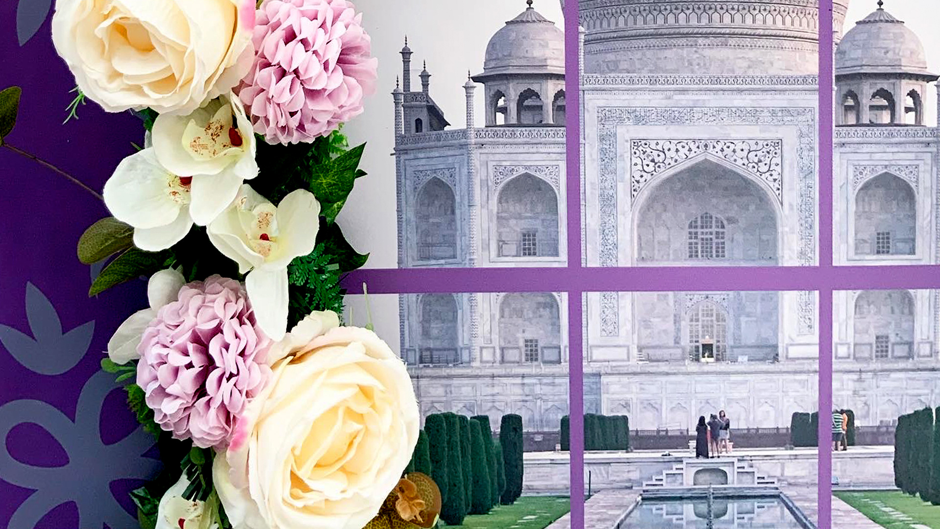
The branding of this brand began by thinking of a new name since “Lila” (the old name) could not be registered. After developing the communication strategy, we came to the conclusion that “Lila del viento” was a name that helped us tell about one of the brand’s favorite activities: traveling. The products that Lila de viento offers are varied accessories that are found in different parts of the world, among the most prominent, Mumbai, New York and Malaysia. We wanted to have a woman present within the visual system and we wanted, of course, to have an accessory, so I created the proposal of a woman with flowers on her head with that style of fashion illustration from the 50’s. Then I was lucky enough to be able to develop the interior design of the premises. This work was wonderful, because I was able to broaden the imagery of the brand and create the main “set”. Many times clients request this work from architecture offices and it was truly an honor to be able to carry out this project. For the local part, I proposed a style that mixes the English Victorian era with something of the Hindu style. The clients already had a vague idea of this, since in their old premises they had a chandelier that, so to speak, was the starting point for all the decoration. There was also the wooden furniture where the accessories are hung, and these combined very well with the style that I proposed. I developed a wallpaper using the Iconic font (designed in-house) that retains the stylistic language of Indian castle patterns. I designed the color palette and put the Lila´s flower on the furniture. The entrance to the premises is designed like the entrance to a all shop in London, with the columns and the partitions. I also placed a touch of flowers inside the premises, increasing its femininity. The design has been a total success among customers, all are amazed at the staging of the brand. I also designed the stand for fairs, where I wanted to recreate the Victorian feel of the place. Always with a modern touch given by the flat finishes and shapes of plants, lamps and obviously a cat!
Scope:
–– Discovery and Strategy
–– Naming
–– Work Mark (Logo)
–– Symbol
–– Monogram
–– Packaging
–– Tags
–– Interior design
General production and photography : png-lab
Production: avance
Want to buy the Iconic font? click here
See the brand site here
See another retail project here

Related Projects