Logo design for the artist Carolina Agudelo
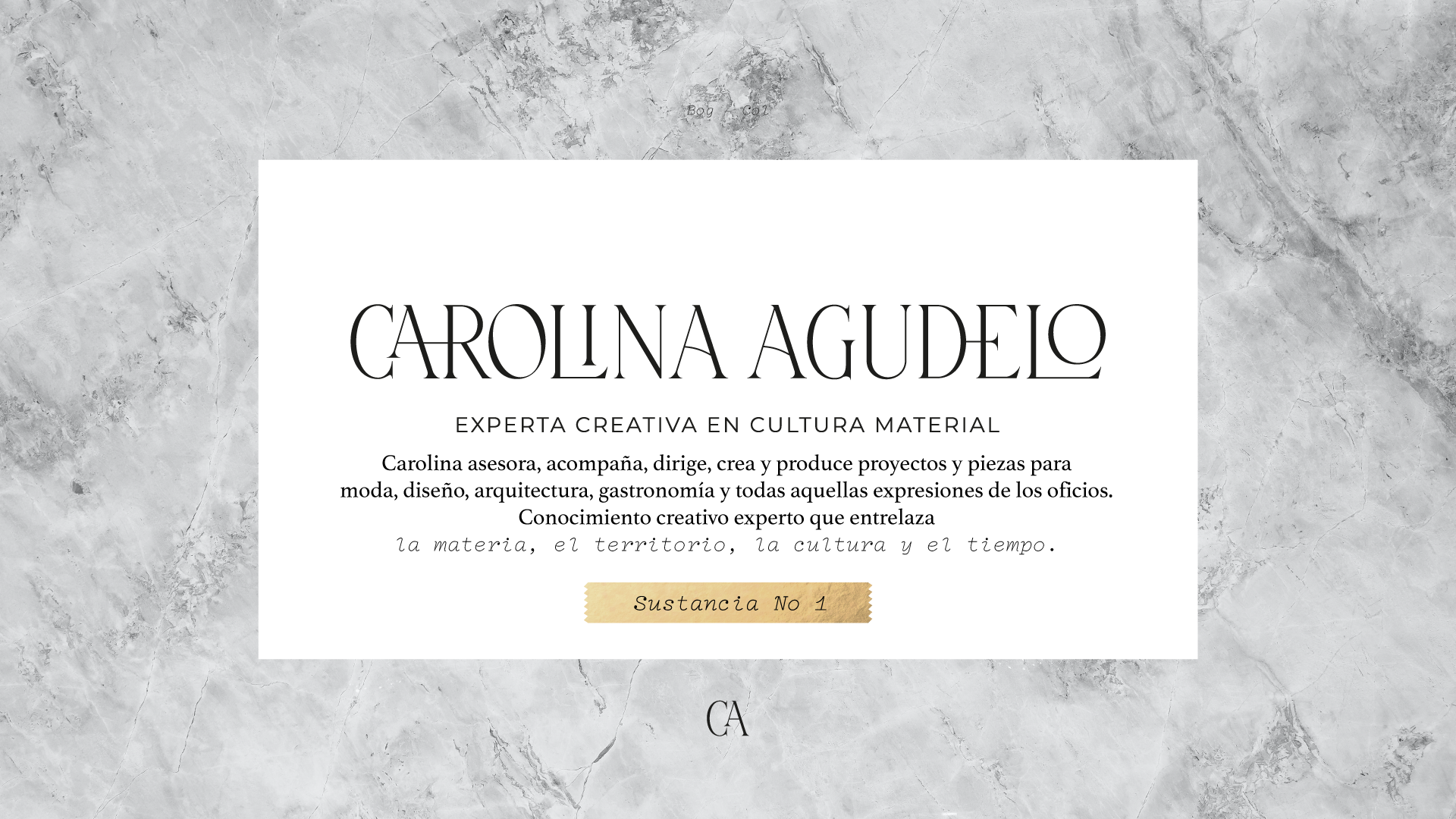
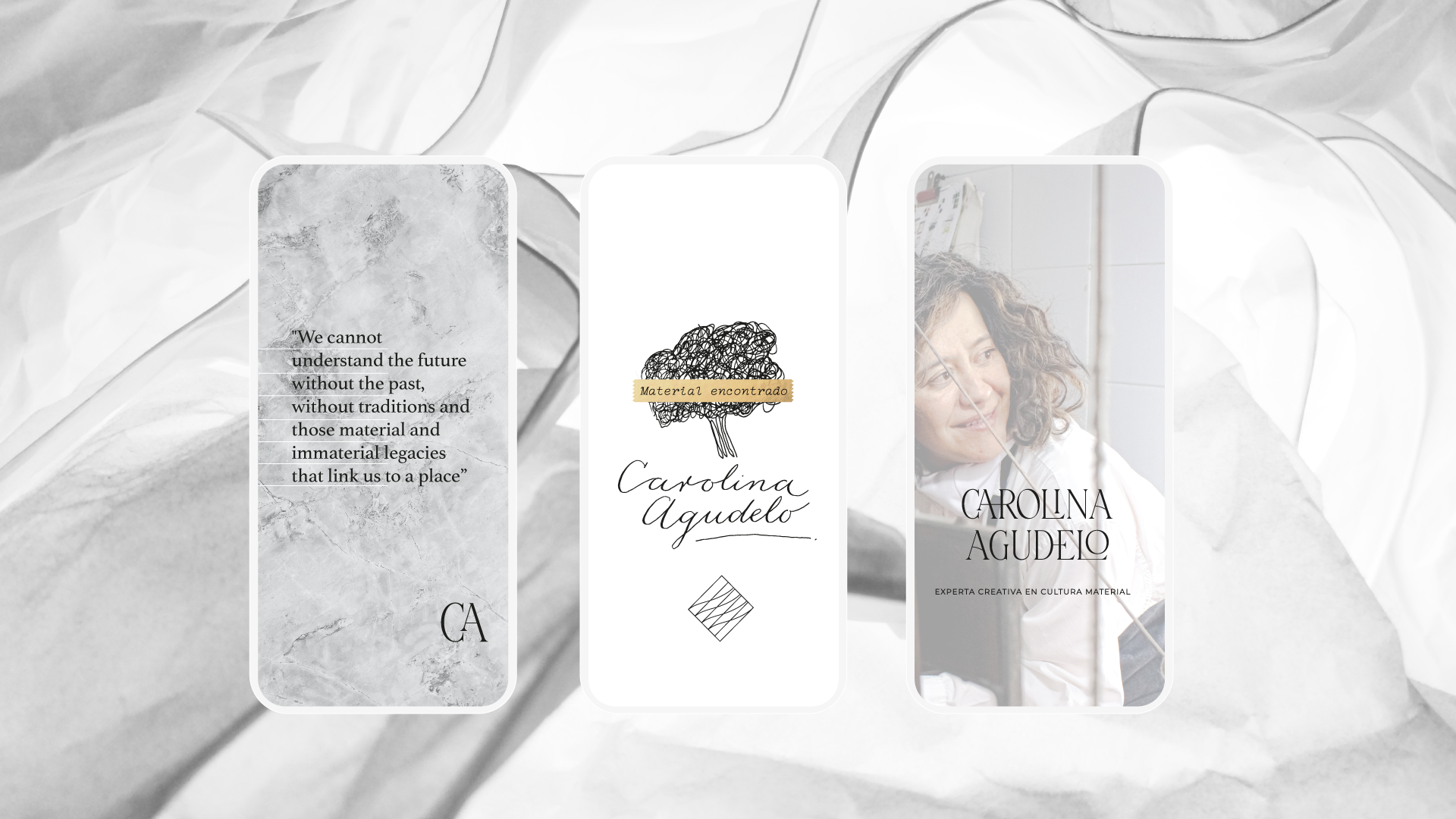
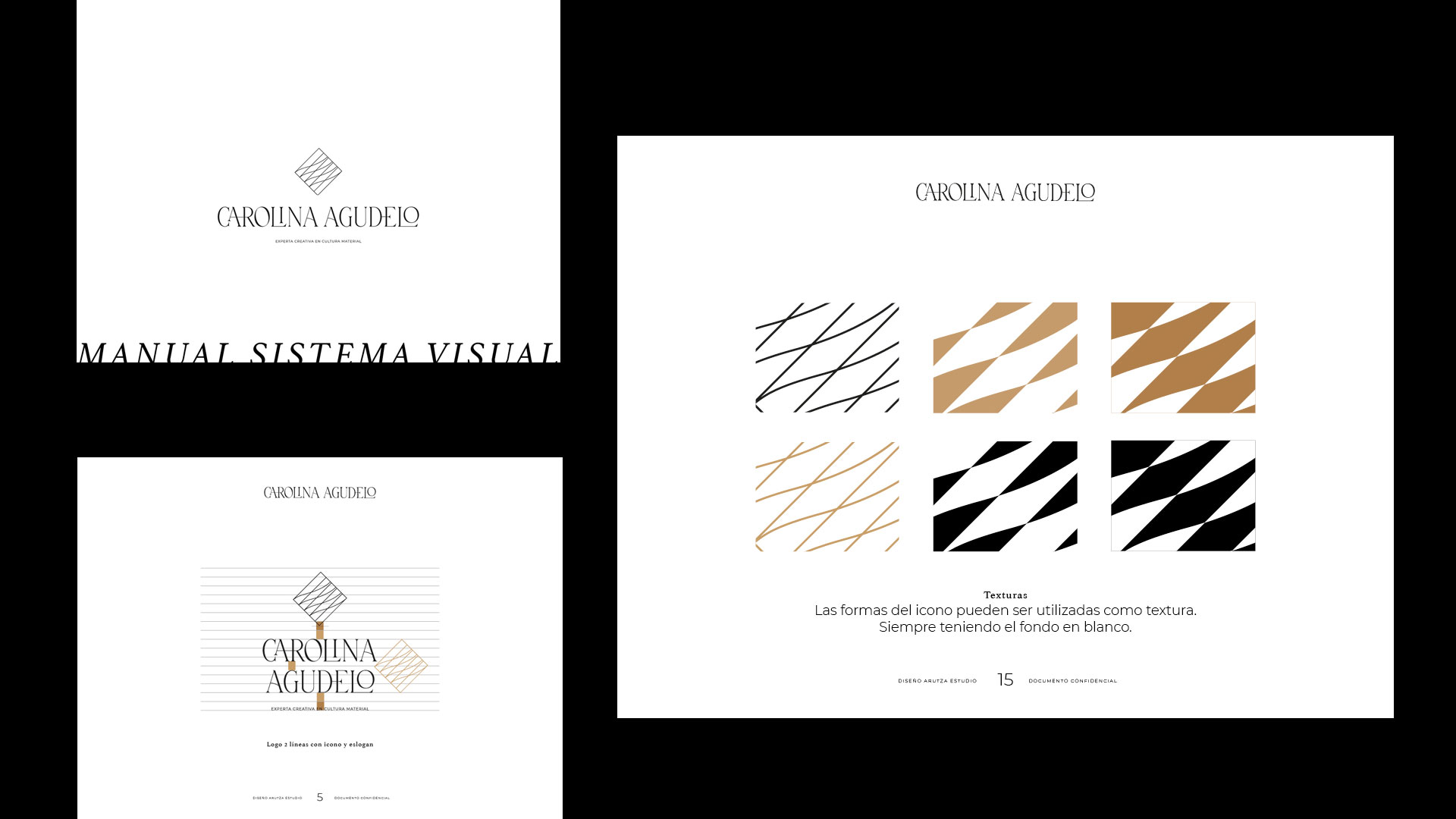
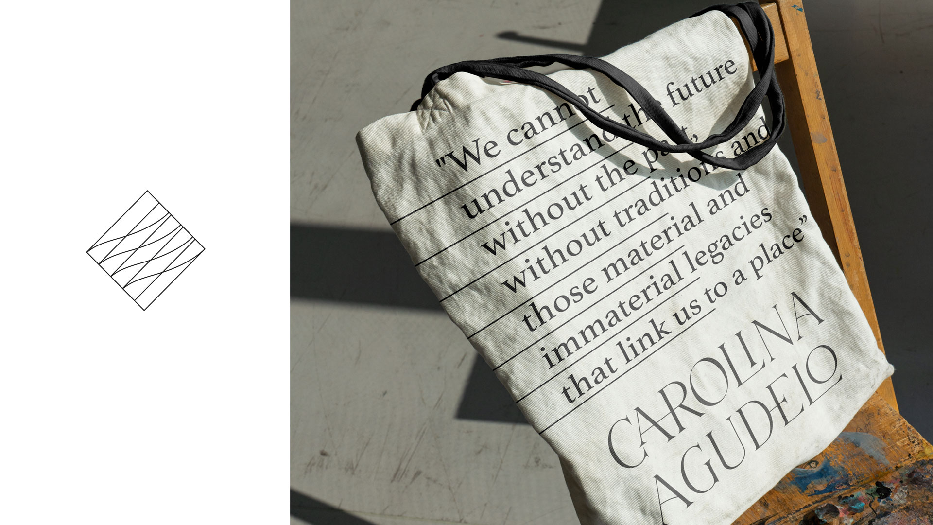
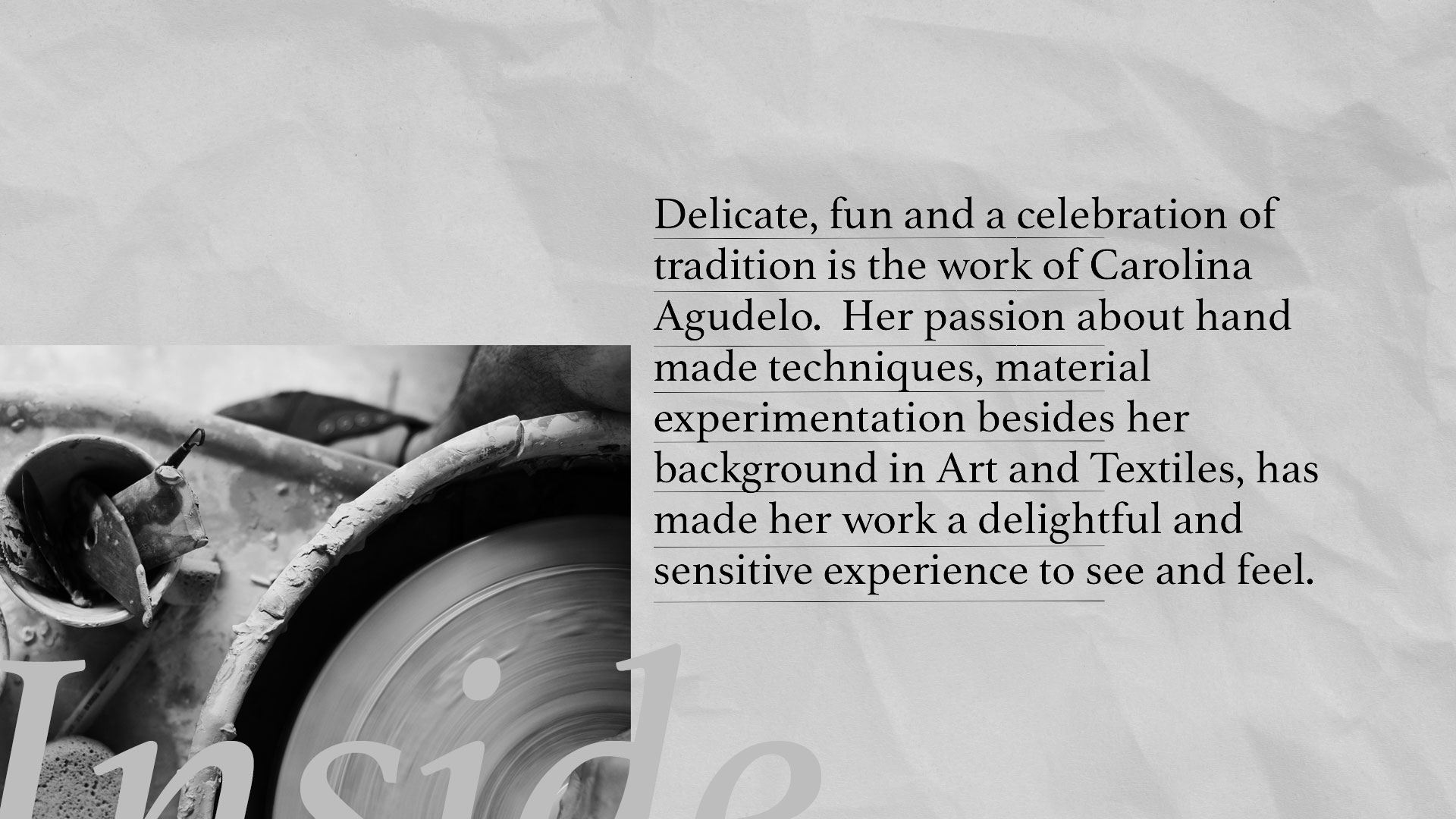
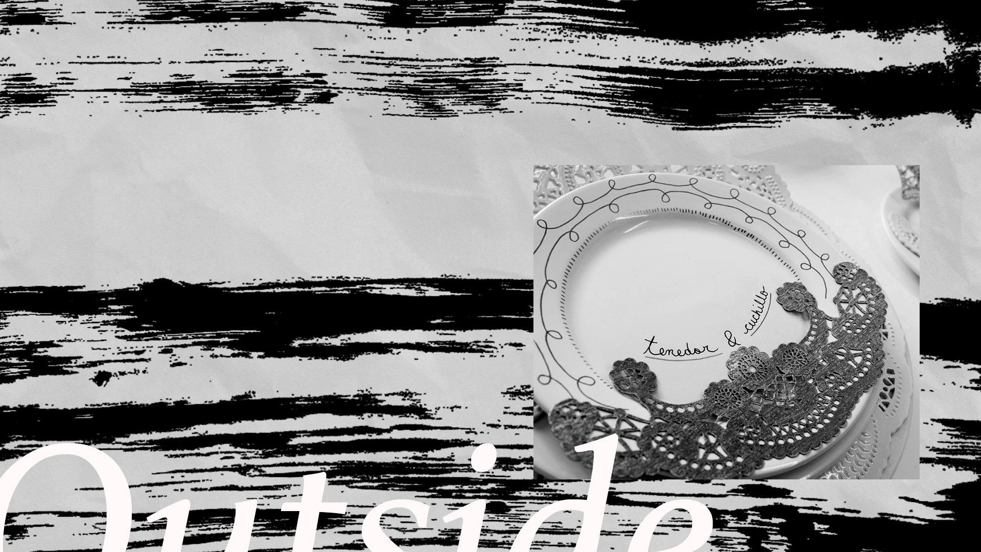
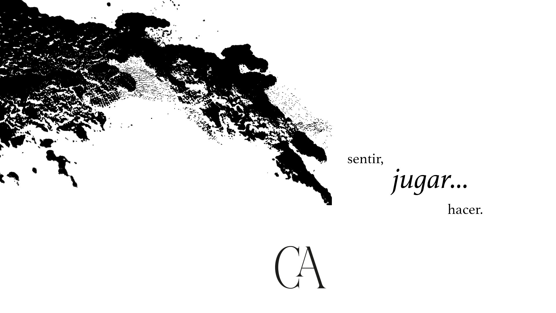
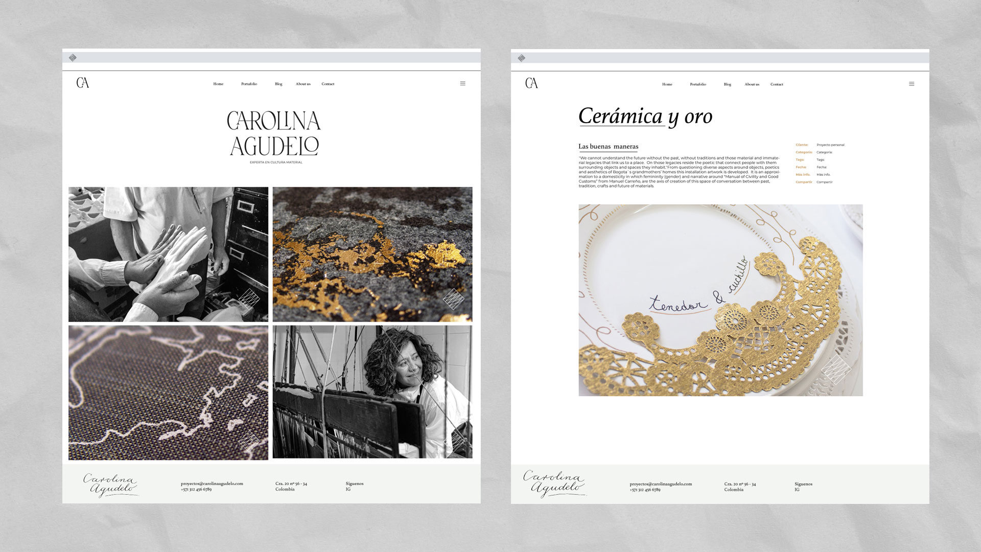
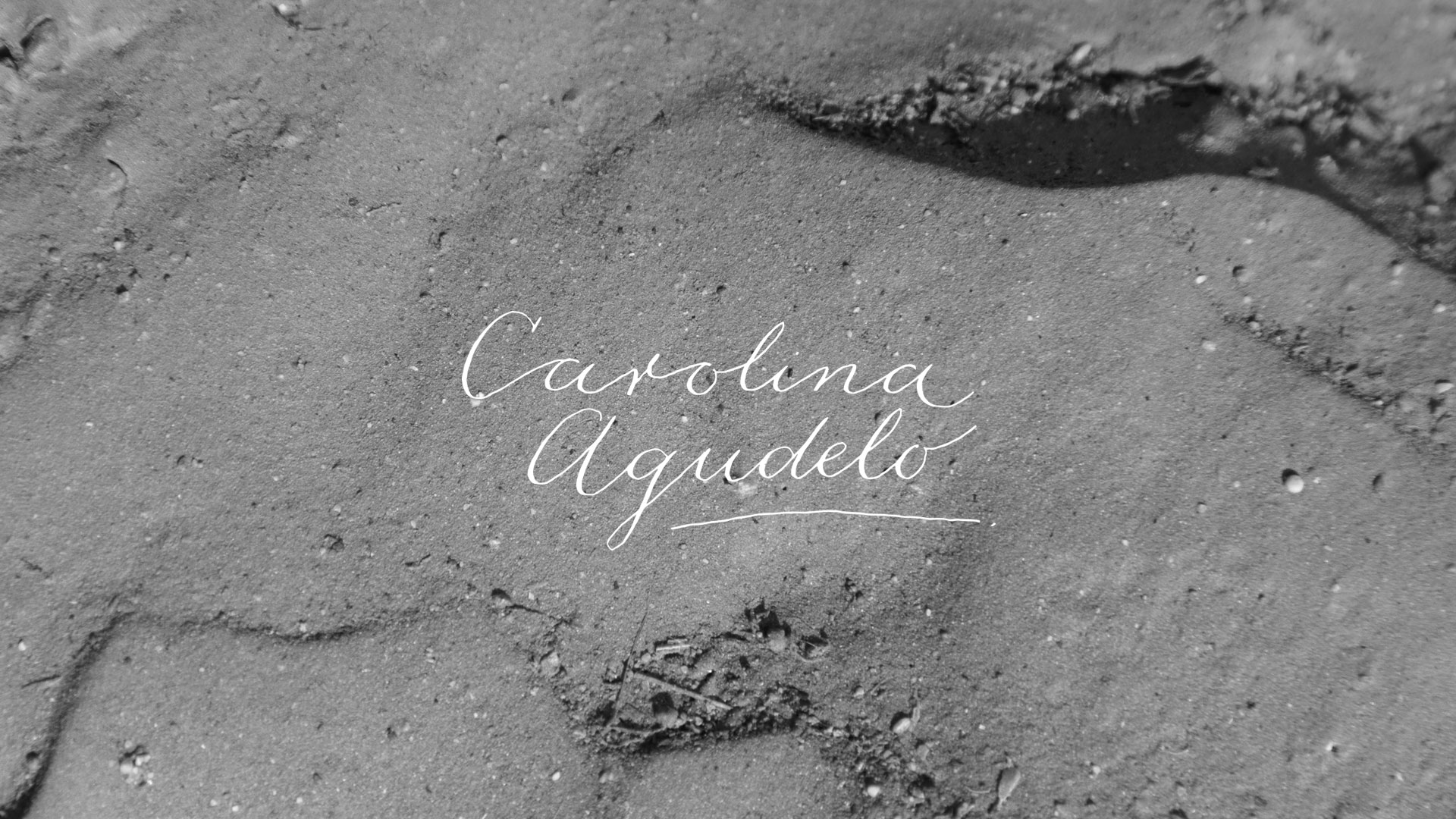
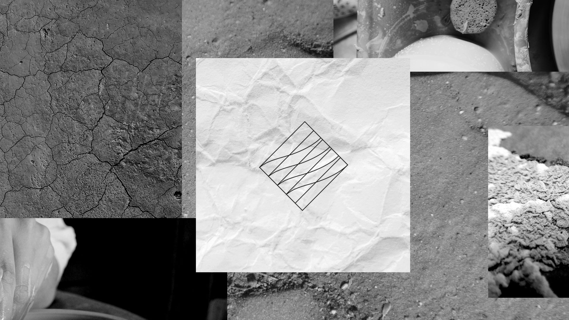
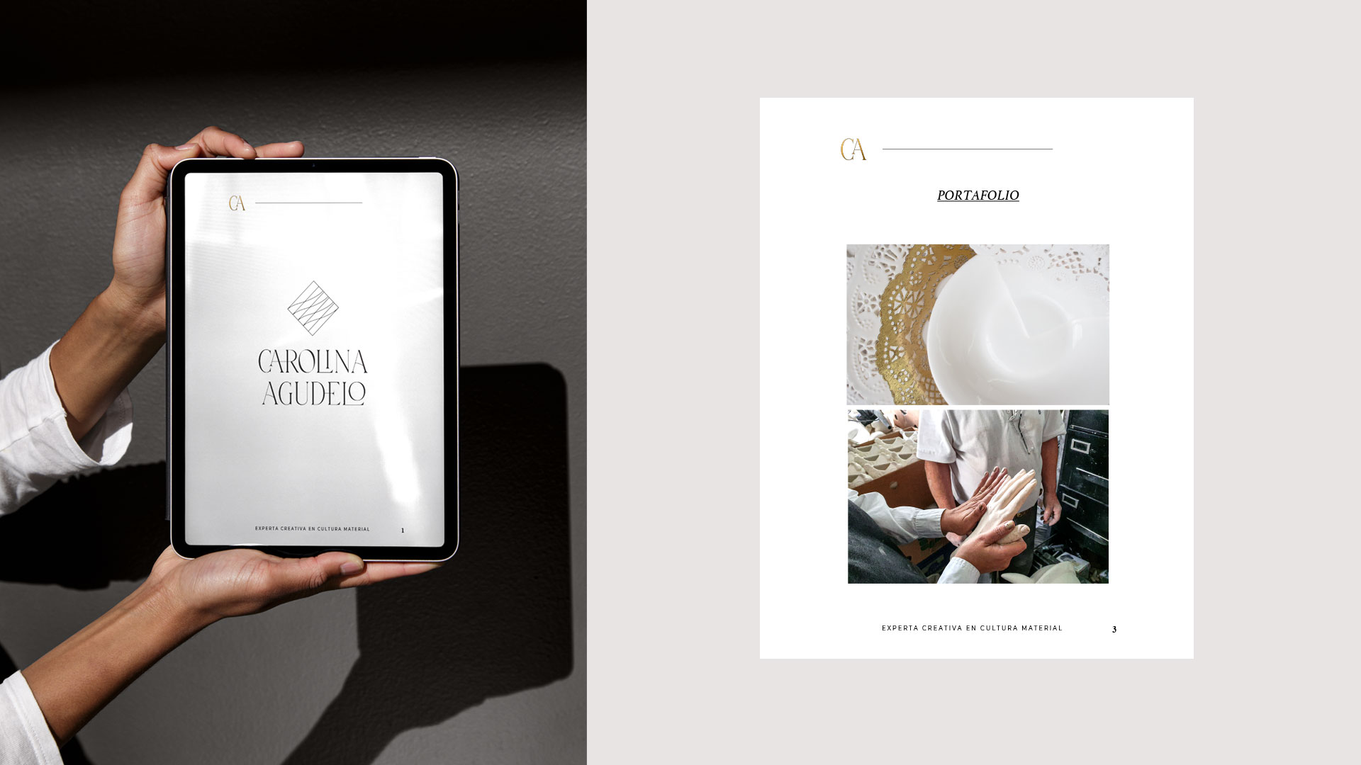
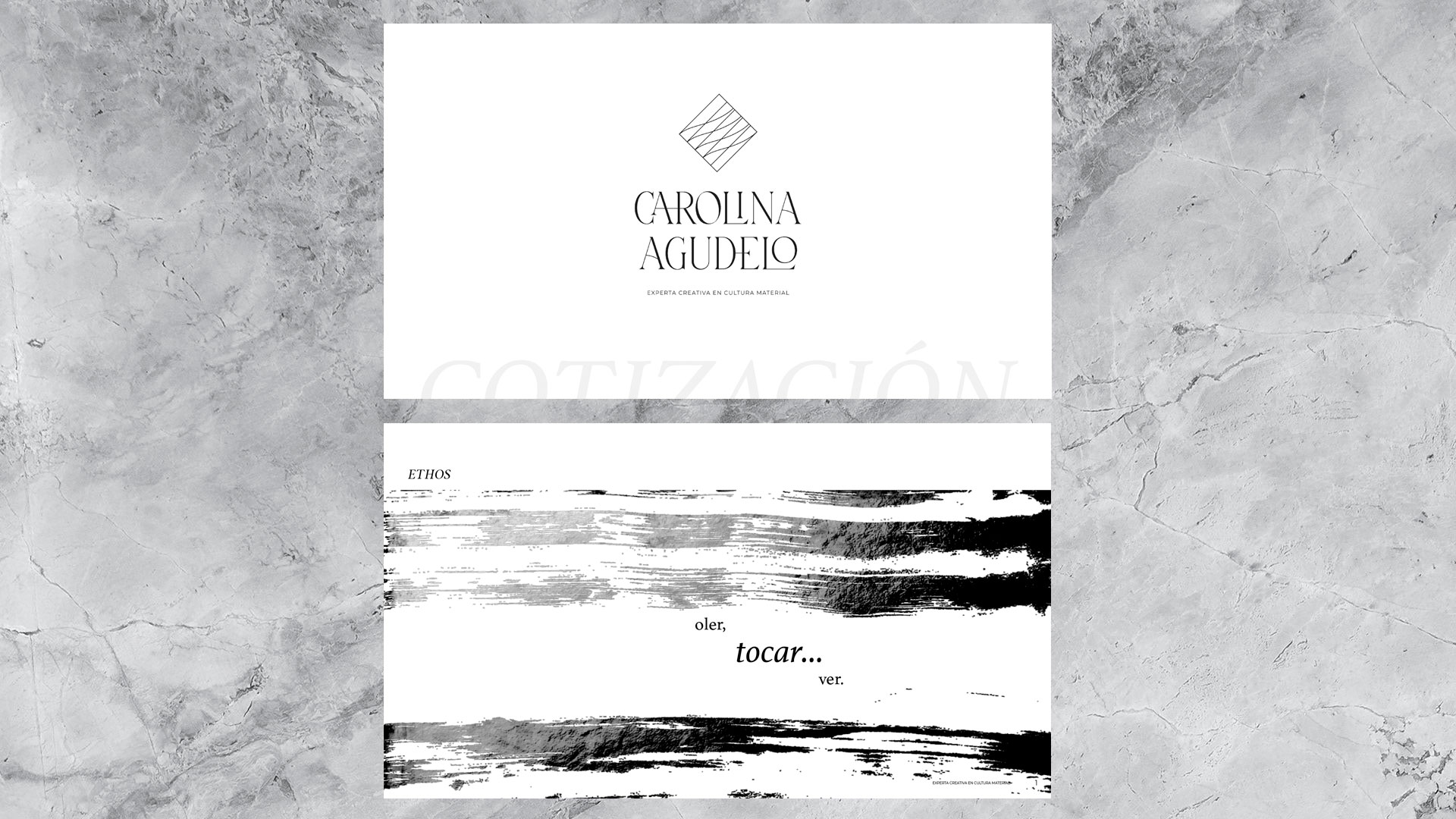
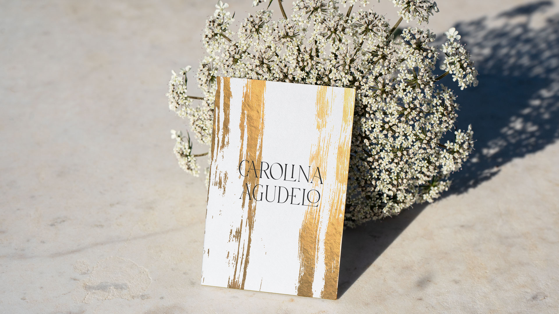
The identity for this surface designer, reflects her deeply love for the materials and crafts. The visuals are full of textures both photographic and illustrative, trying to express all the richness of the physical world. The black and white predominancy of the aesthetics gives a poetic and evocative emotion to the brand. This process lasted about 3 months in its development and was a very personal one. We had each meeting in different pastries, where we ate delicious breads and desserts while we discussed the strategy of her brand. Carolina is a very recognized fashion leader in Colombia. After her studies in London, San Martín´s she came back the country to work in the Los Andes University developing such an amazing classes like bio-fashion, surface design and many others. Besides her huge knowledge in materials, she also has developed an immense investigation about the crafters and its crafts in our country and other places. After decades of academic work, she had the urge motivation to start something by her own. The logo was a modified typography that was selected because of its delicate and very contrasted forms, that remain us the letters used in fashion magazines. The ligatures and altered forms of the letters wanted to communicate the constant change and variation of the materials. The icon works on the concept of mobility and transformation but in this case, it also gives to you a feeling of threads and embroidery, a sense of craft. The calligraphy was made by Marianna Rezk.
Scope:
Discovery and Strategy
— Logo Design
— Custom Wordmark
— Typography & Color
— Brand Guides
— Presentation Deck
— Social Templates
— Web look and feel
Published on:
World Brand Design
Cards Design
Another project for art here!
Info
Date:
June 9, 2022

