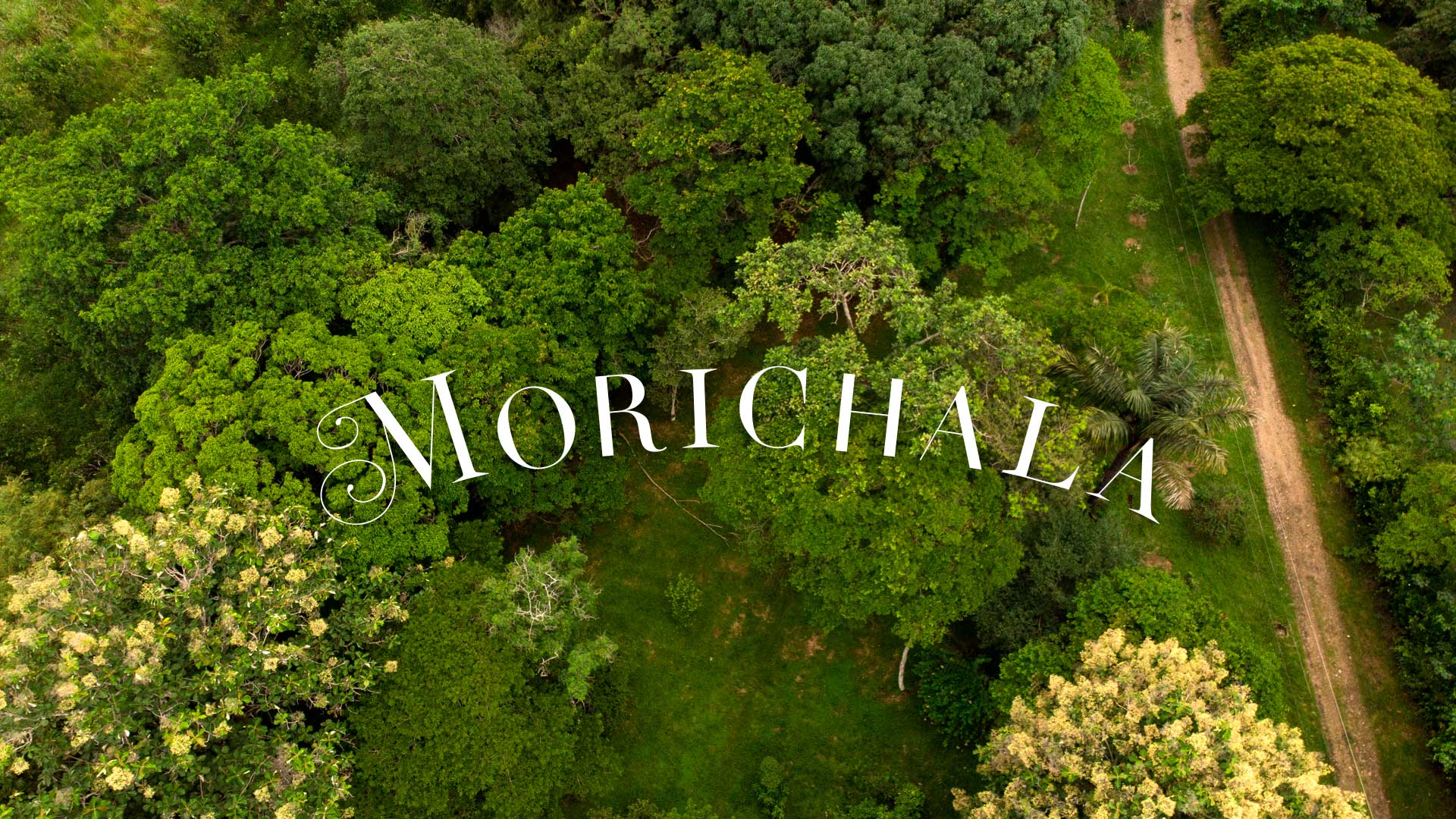
Morichala Branding
Our branding project for this sustainable farm with ecosystem conservation focused on conveying an authentic and committed image to the values of sustainable agriculture and environmental conservation. Our branding strategy aims to establish a strong and coherent identity that reflects our unique and differentiated approach in the market.
Our name and logo are carefully designed to convey the fundamental principles of our project: sustainability, respect for the environment and nature, and the production of healthy food.
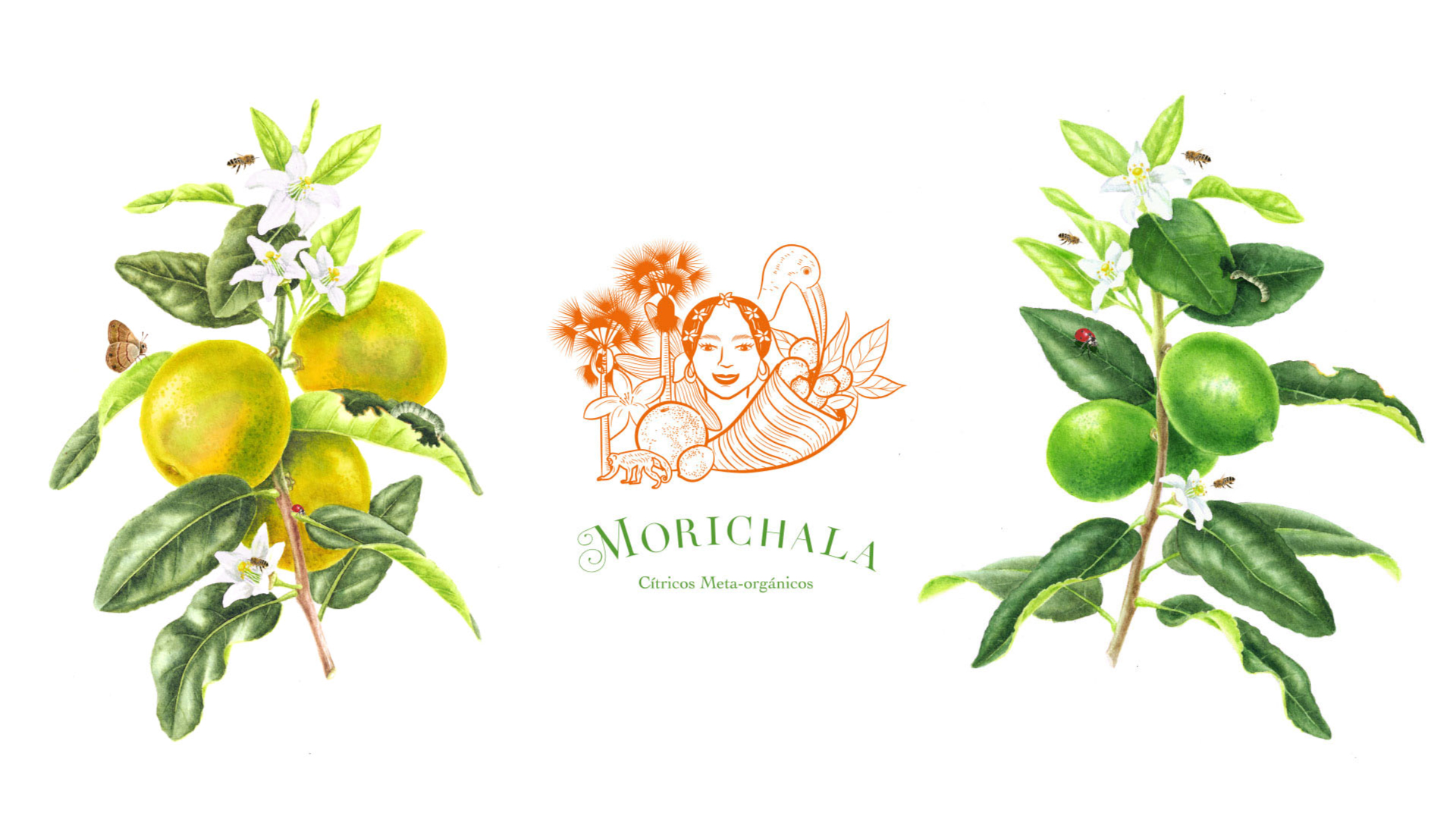
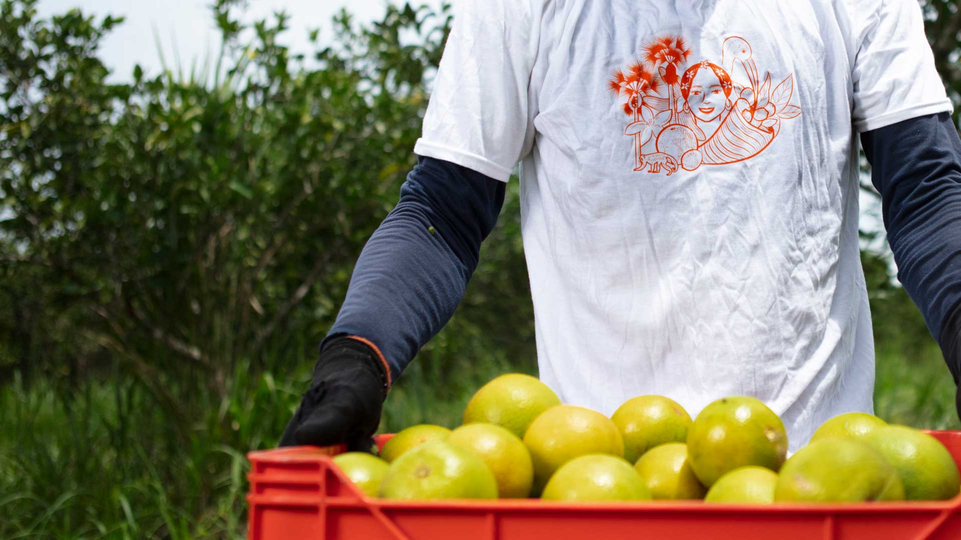
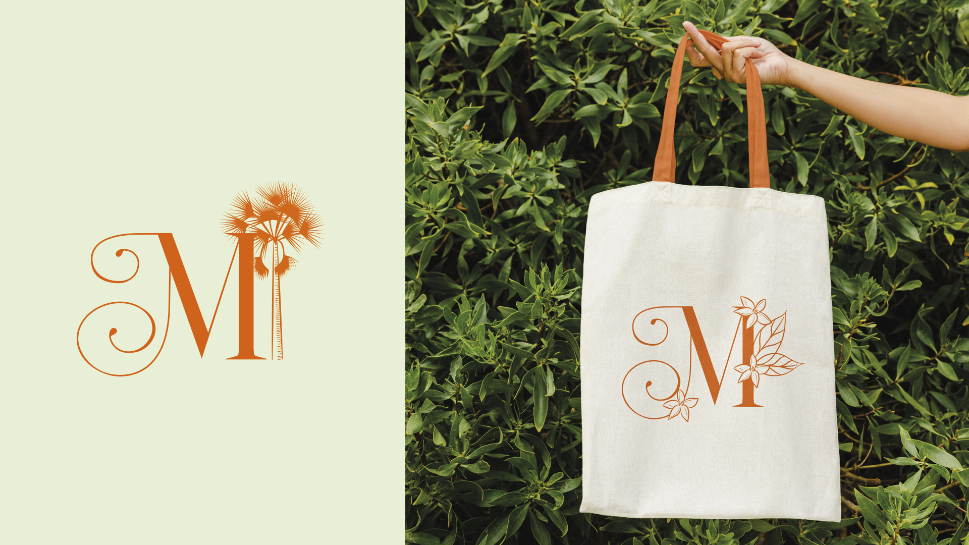
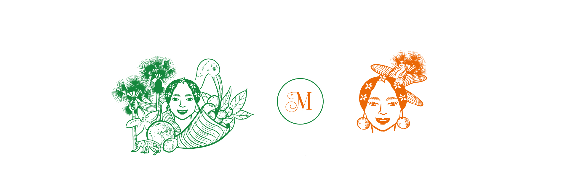
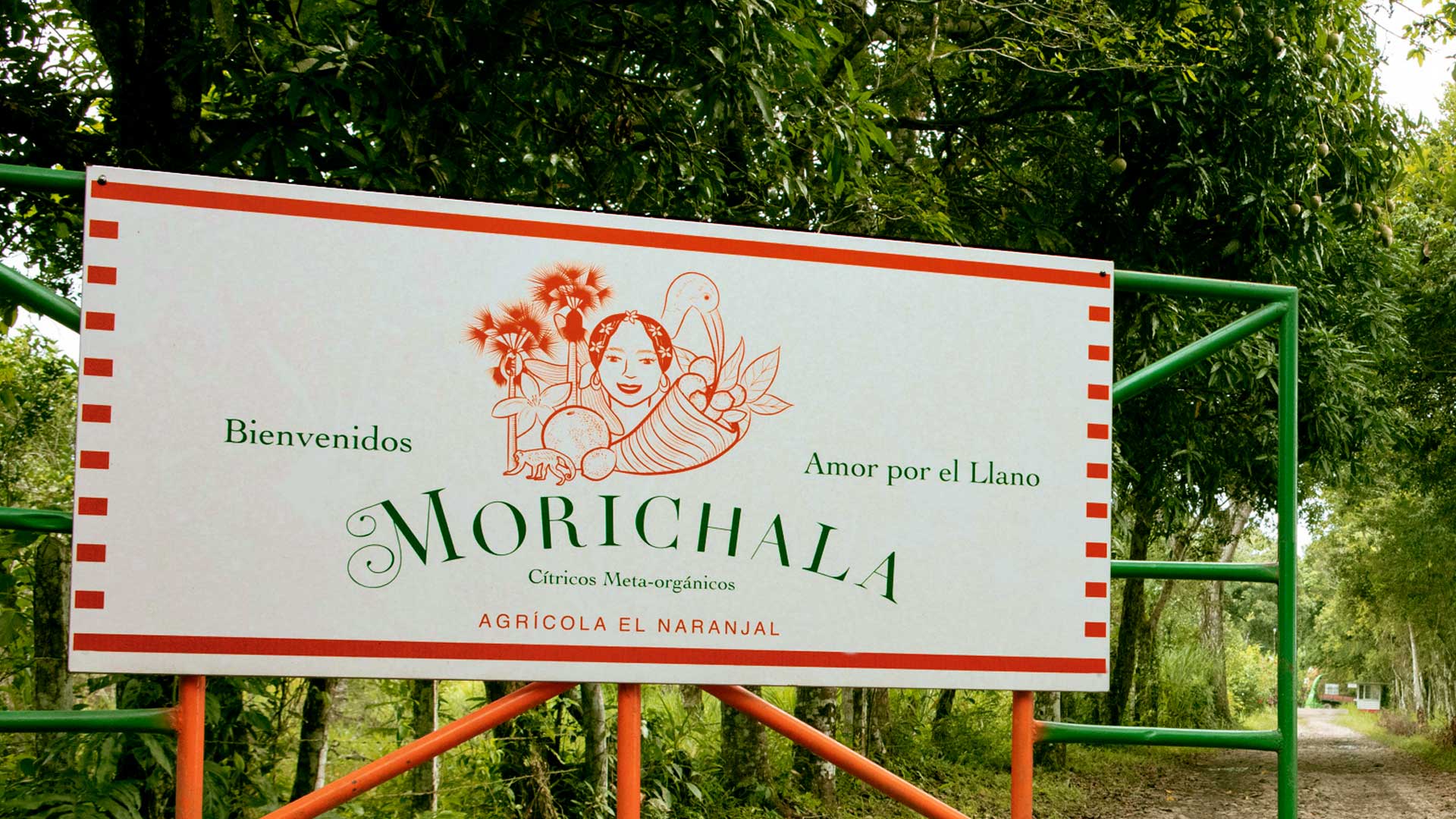
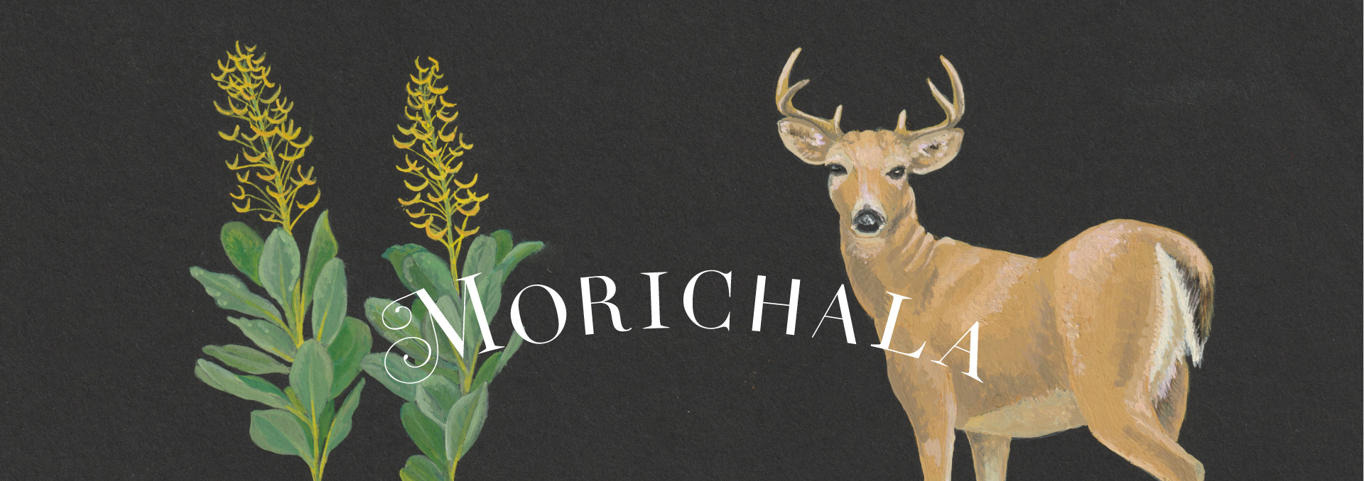
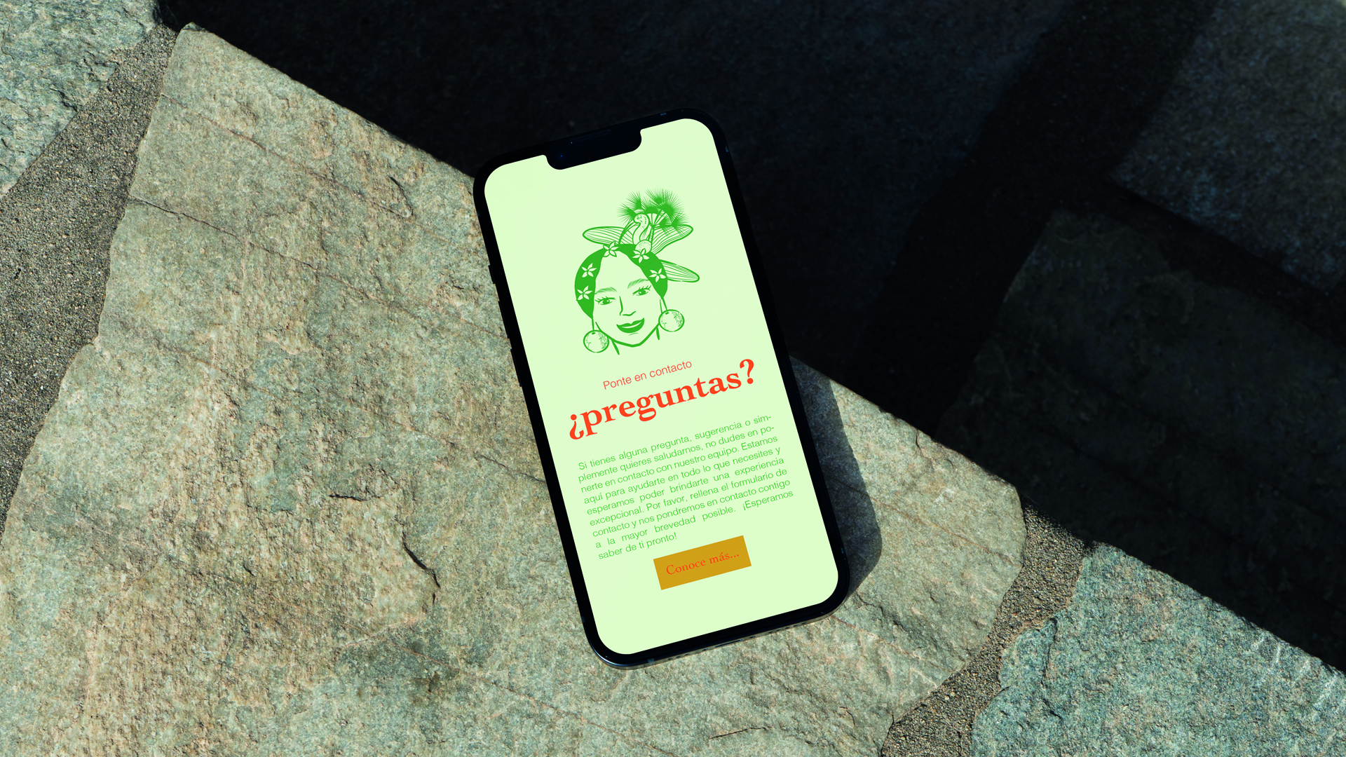
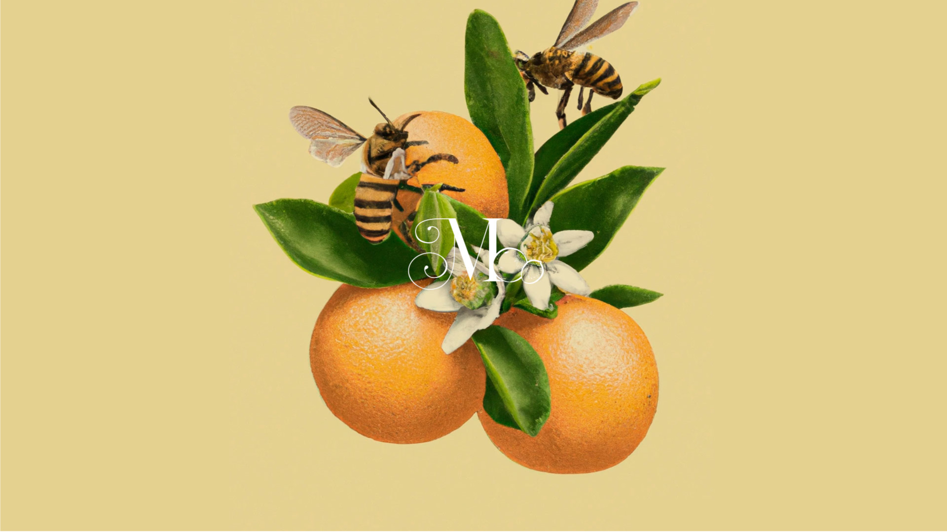
The name Morichala comes from “Morichales,” a type of palm tree that thrives within the llanero ecosystem, adding a feminine touch. I drew inspiration from the goddess of agriculture, Ceres, and images of her to create the accompanying logo. For the illustration of this llanera goddess, I drew inspiration from photographs of women from that region and added some animals and plants from the farm, such as orchids, monkeys, herons, lemons, and oranges, which are the farm’s flagship products. It is also accompanied by the cornucopia, which is part of the symbolism of the goddess Ceres. A simpler version of this drawing represents a portion of this ecosystem as the headdress, inspired by Carmen Miranda.
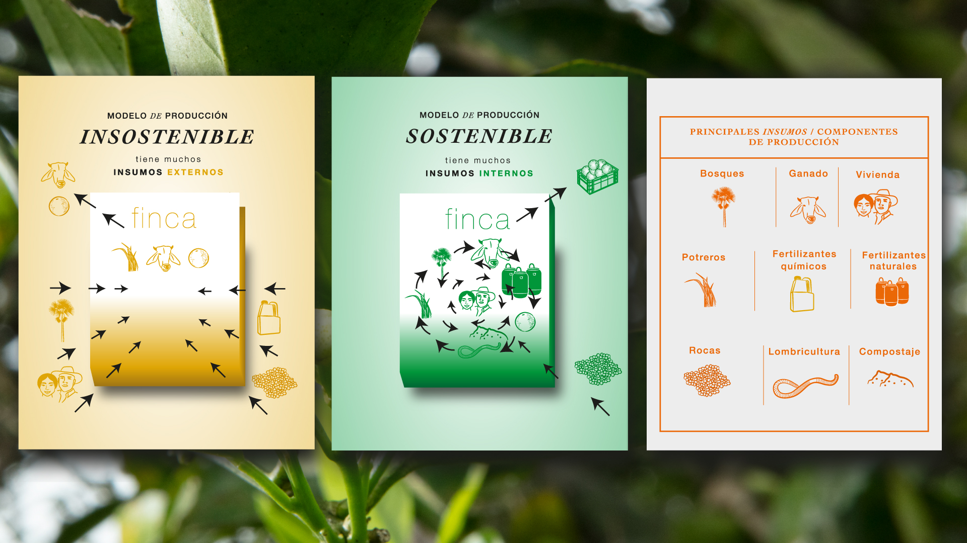
Our color palette draws inspiration from the farm’s products, using shades of green to represent lemons, orange to represent oranges, and a secondary palette of tertiary colors that convey a sense of calm, freshness, and connection with the environment. These colors seek to evoke the feeling of being in a natural environment in harmony with the earth.
Regarding the logo, I created a custom typography that reflects the brand’s biodiverse personality. While the shapes have a similar basic structure, each letter has distinct details. The “M” combines a classic serif shape with a script, the “C” resembles a heron’s beak, and the “A” letters have different endings, each reflecting a personality that highlights the importance of differences in an ecosystem.
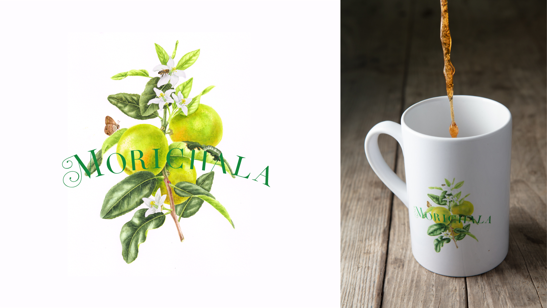
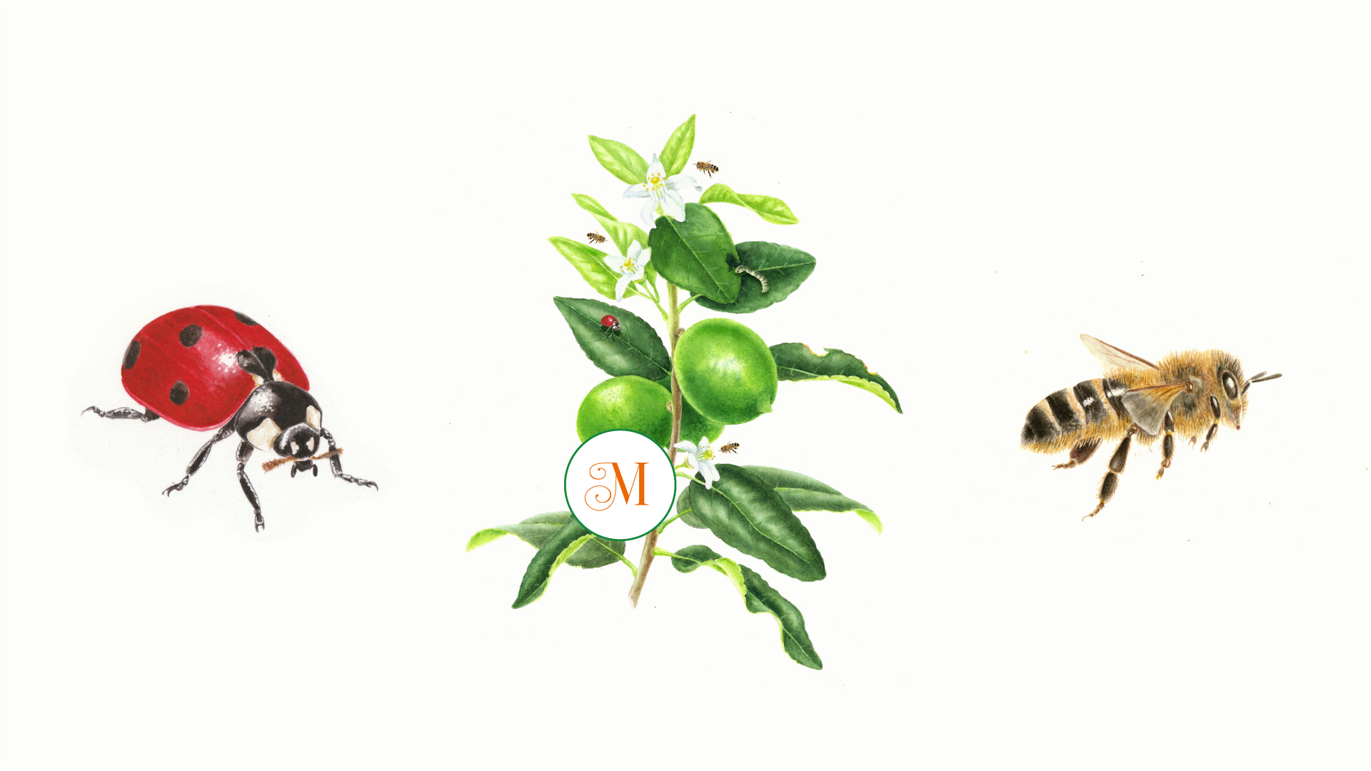
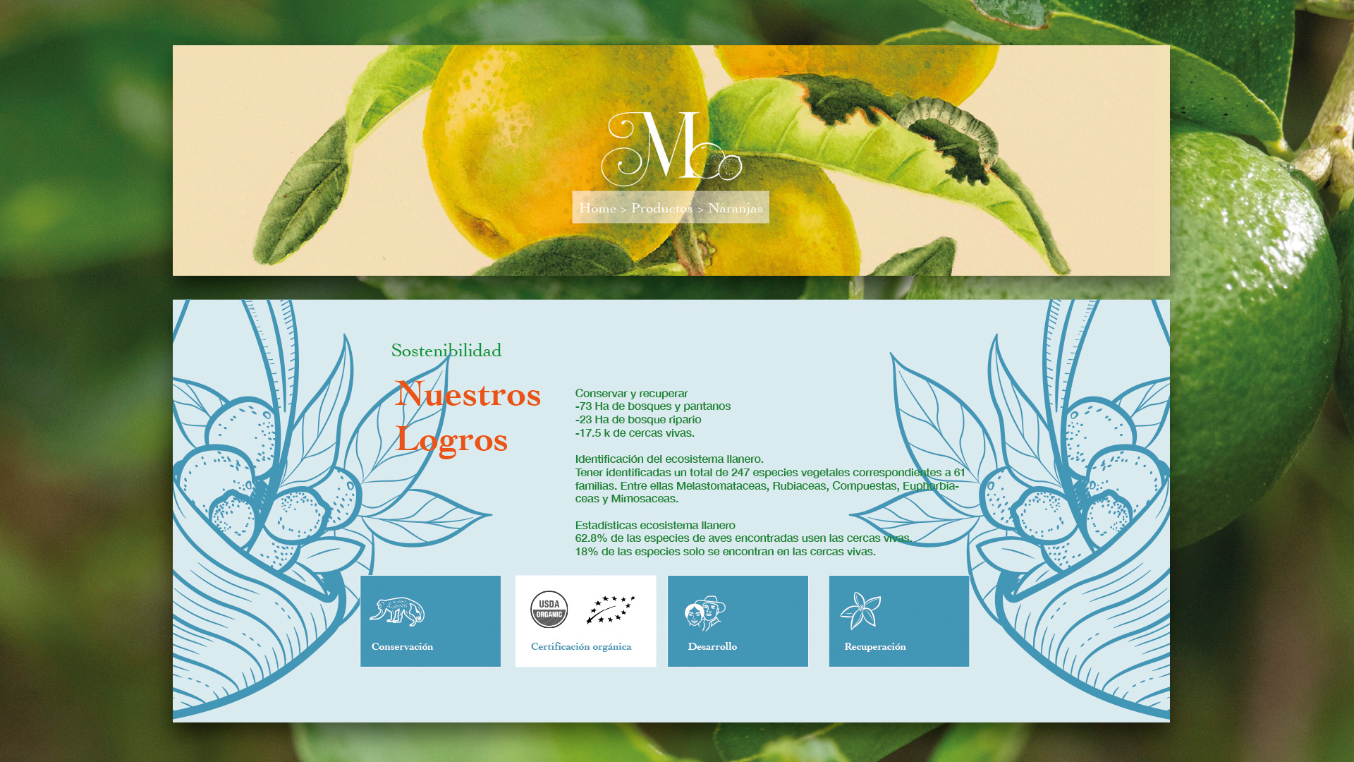
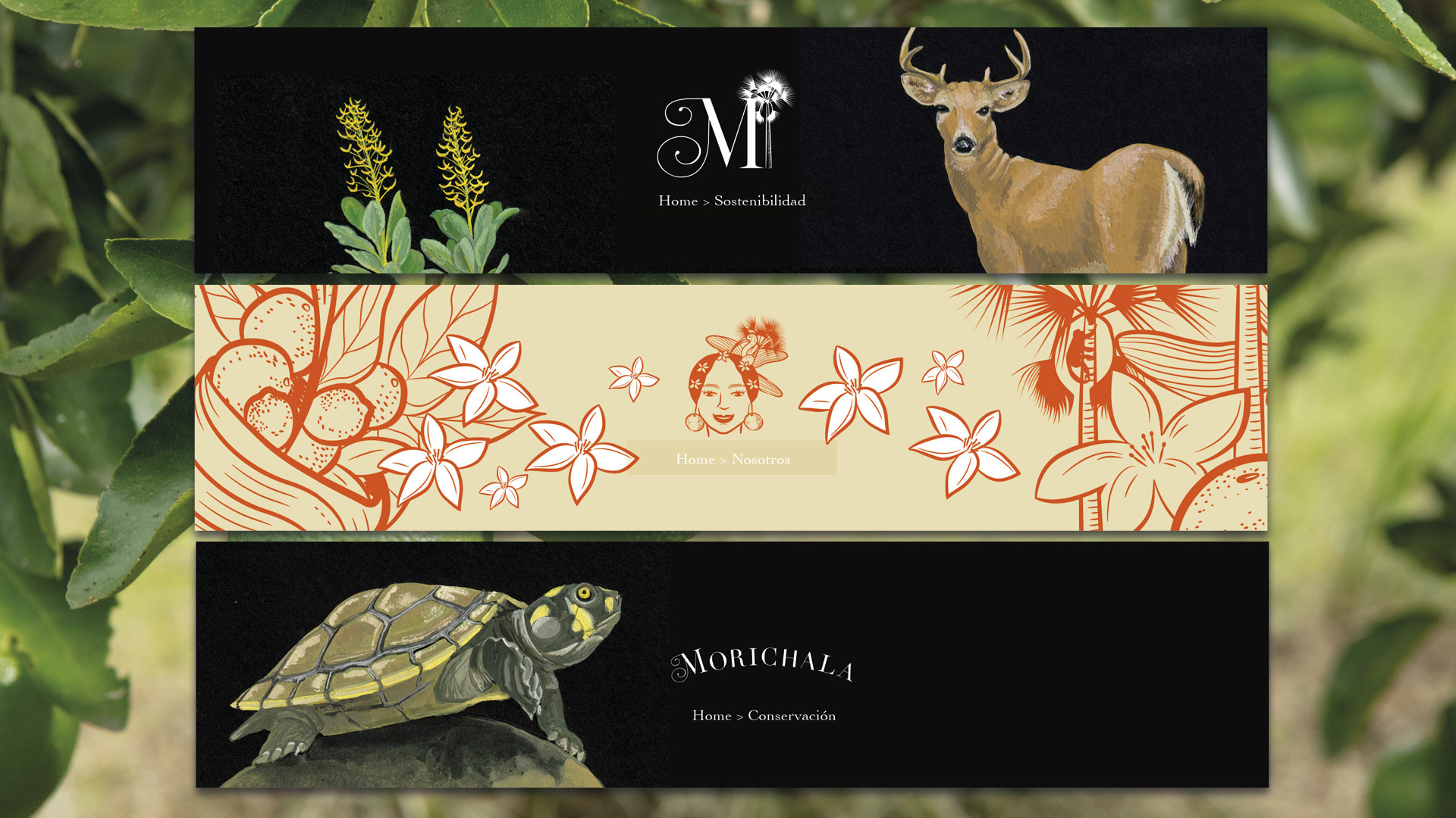
An important part of this project is illustration. From the initial meeting, the clients expressed their preference for botanical drawings to be incorporated into the visual system. We wanted these illustrations to deviate from their colonial origins and depict the plants in their natural state, with dried leaves, sometimes nibbled by animals, and with insects that are vital to their life cycle.
We commissioned these illustrations to the talented Lisa Anzellini, who used analog techniques for their creation. She also created beautiful illustrations on black paper featuring animals, plants, and the Morichala community.
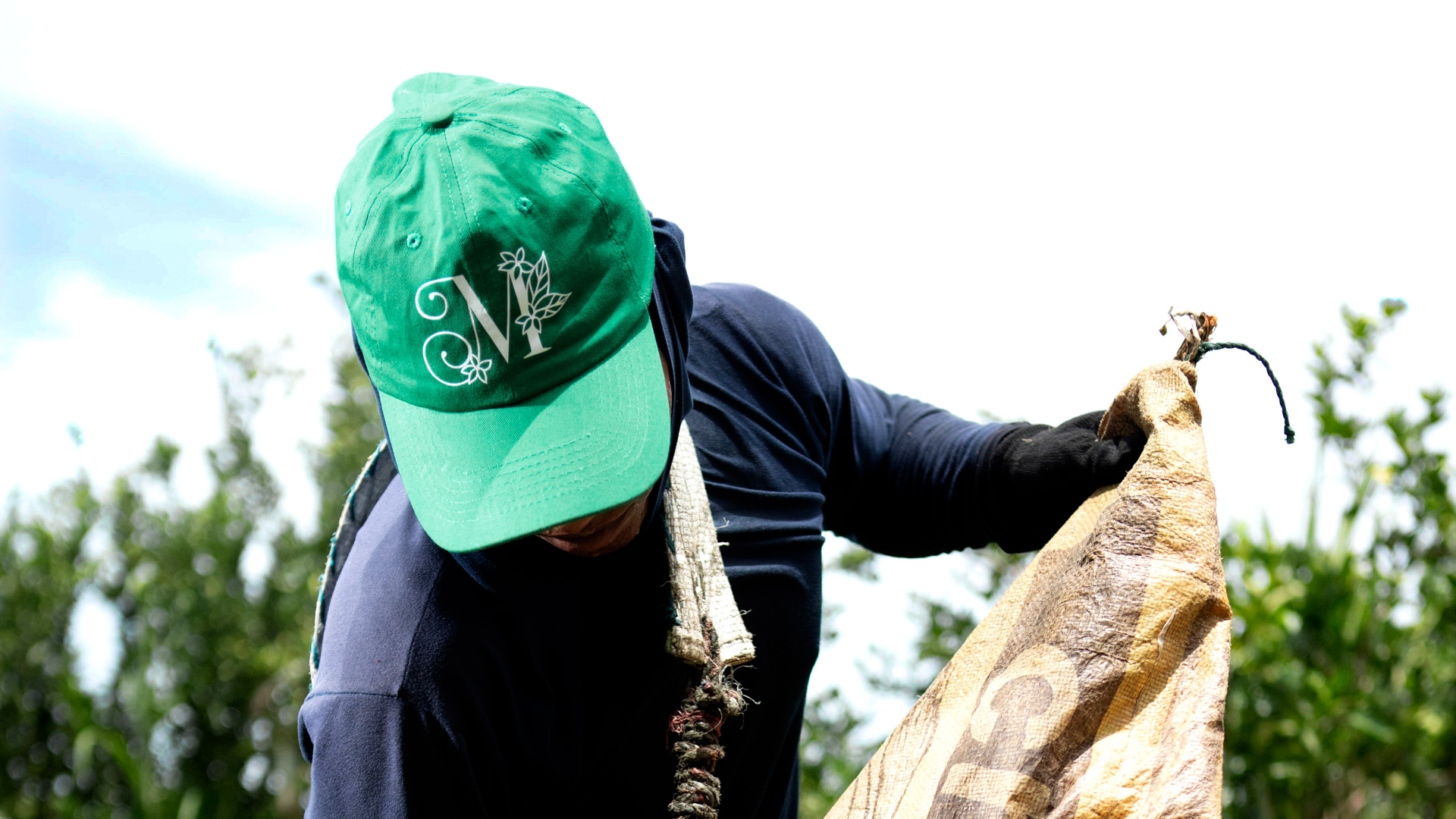
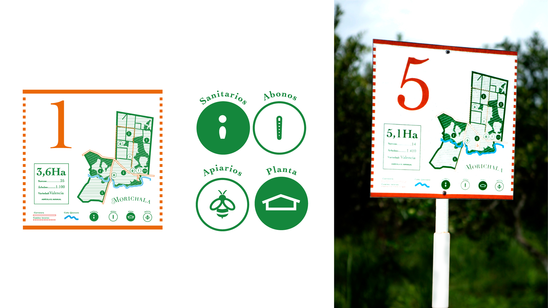
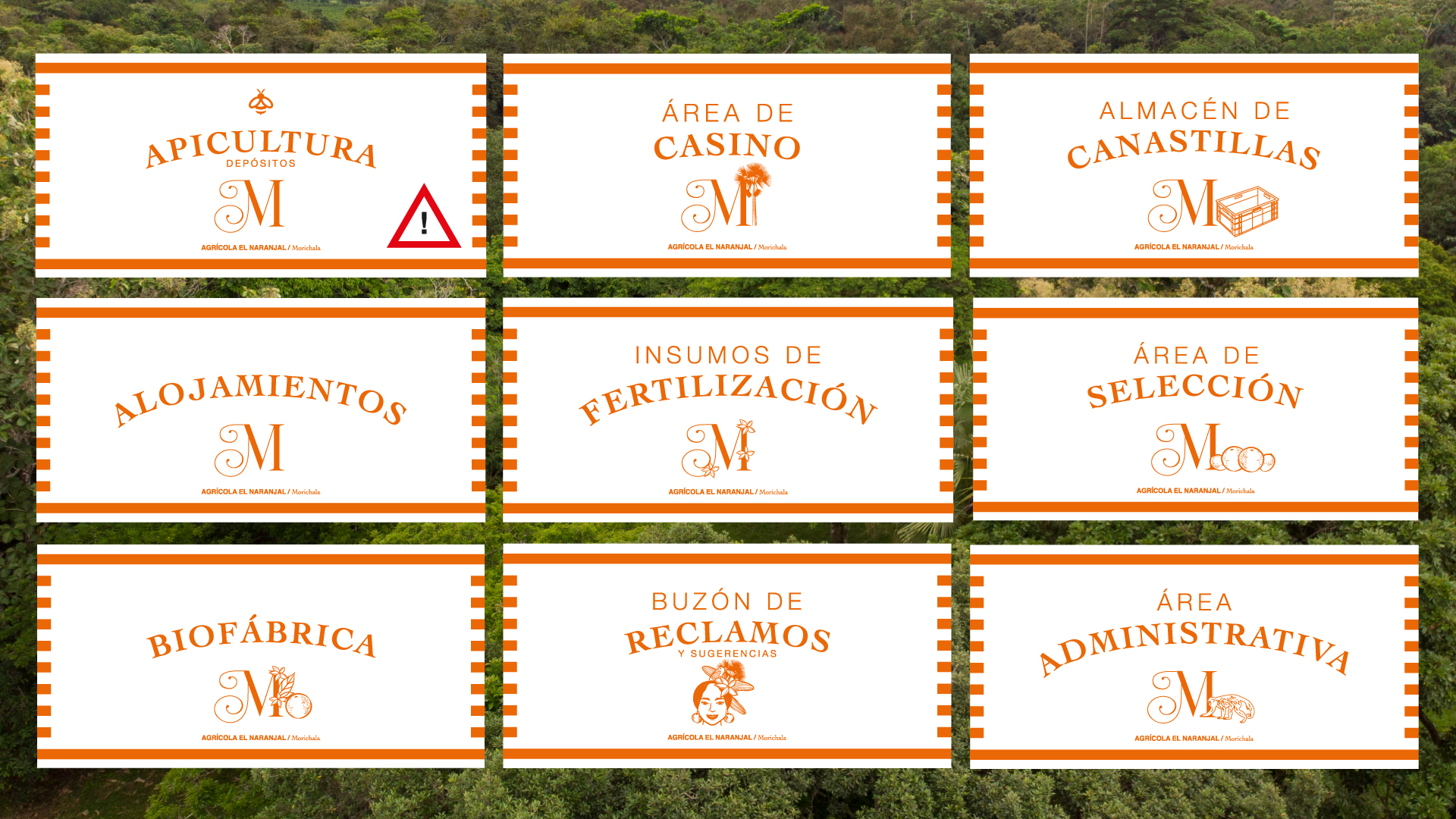
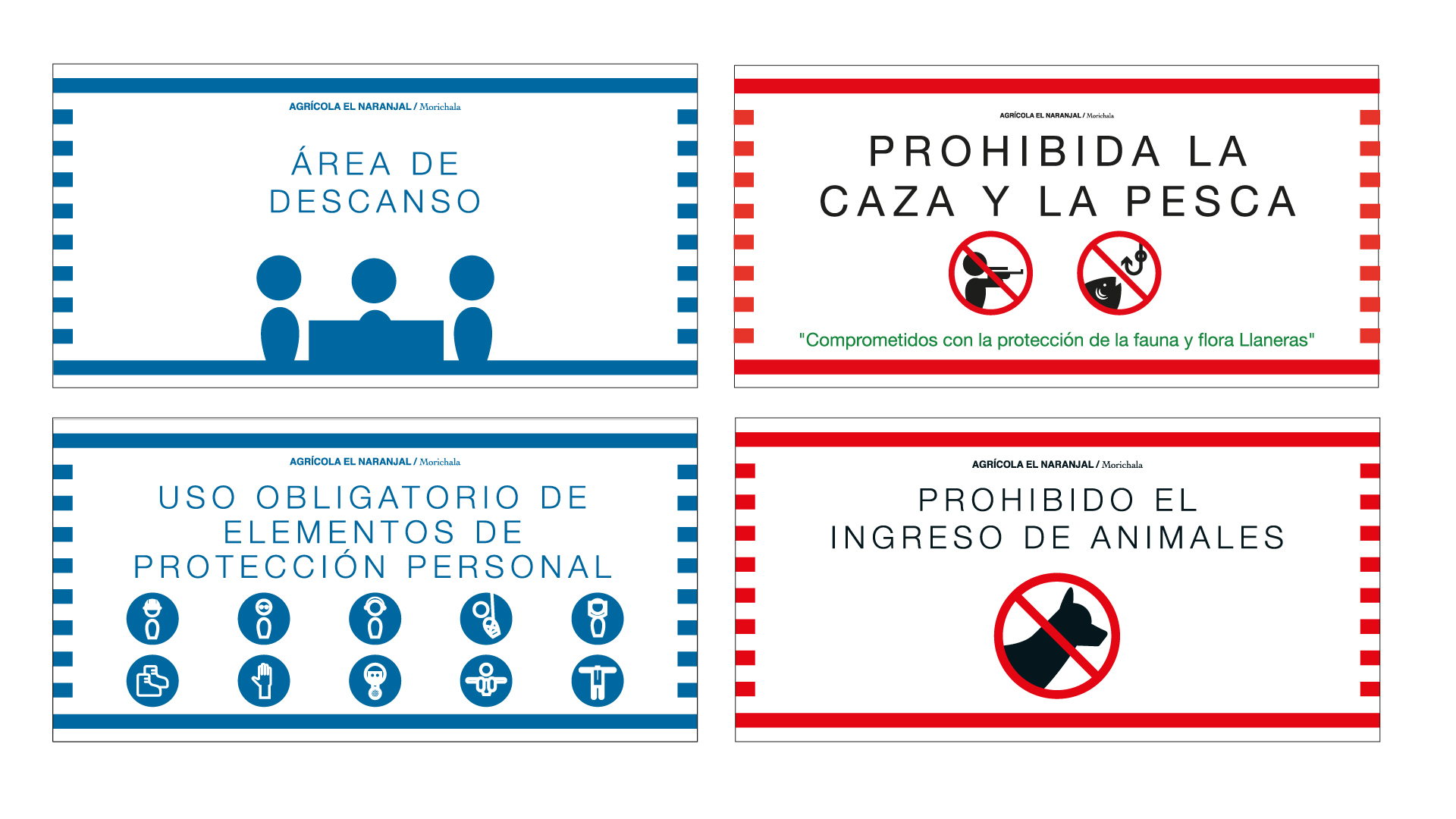
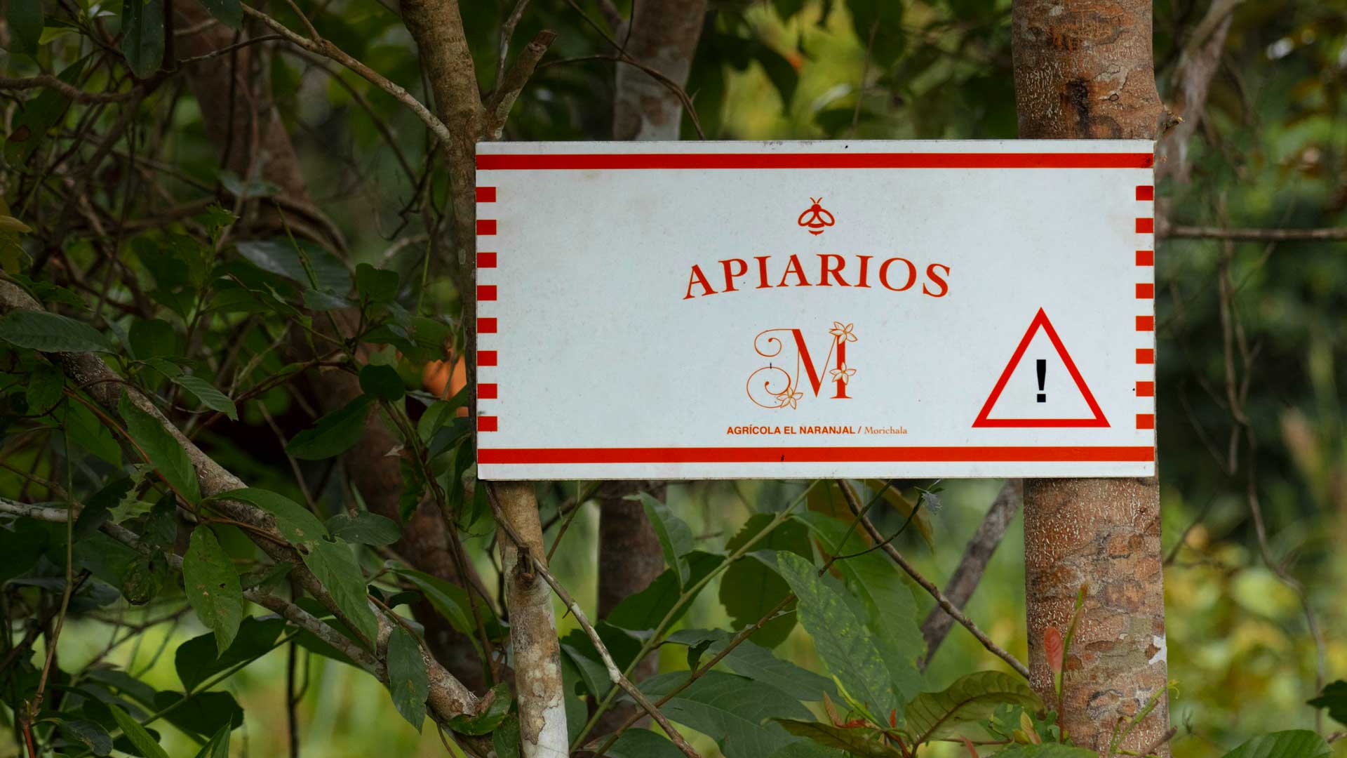
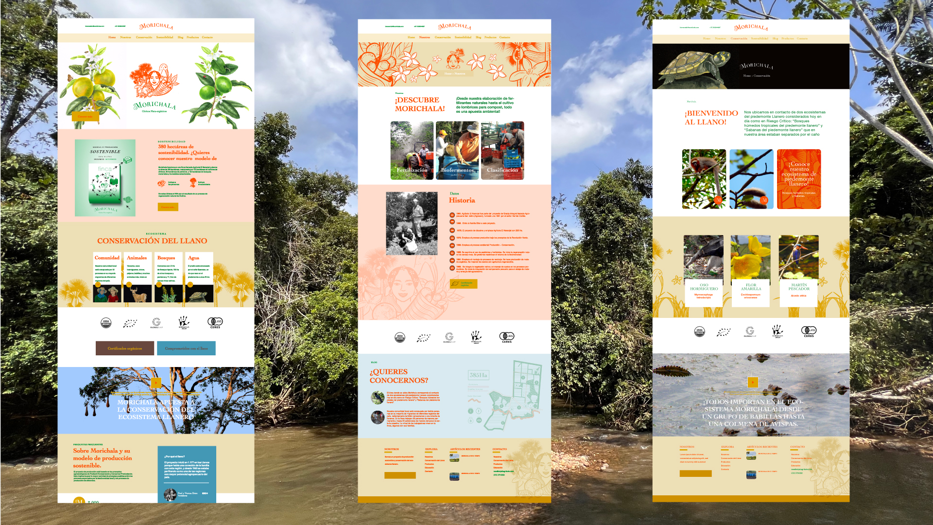
On the other hand, I created numerous illustrations for production diagrams, icons, and signage for the farm using digital vector techniques, which can be seen both on the farm and its website.
The development of this project took approximately two years, from the initial strategy and naming proposal to the farm’s signage, website design, and programming, which was handled by the content office of png.lab.
Our branding project for Morichala aims to convey an authentic and committed image to values such as sustainability, quality, nature, and harmony. We want to inspire people to be aware of their food choices and their impact on the environment, and encourage them to be part of this movement towards a more sustainable and respectful future for the ecosystem.
See the site here
See the illustrator portafolio here
See the programming team site here
Photos: Lucho Mariño
Related Projects