Mêle. Branding design
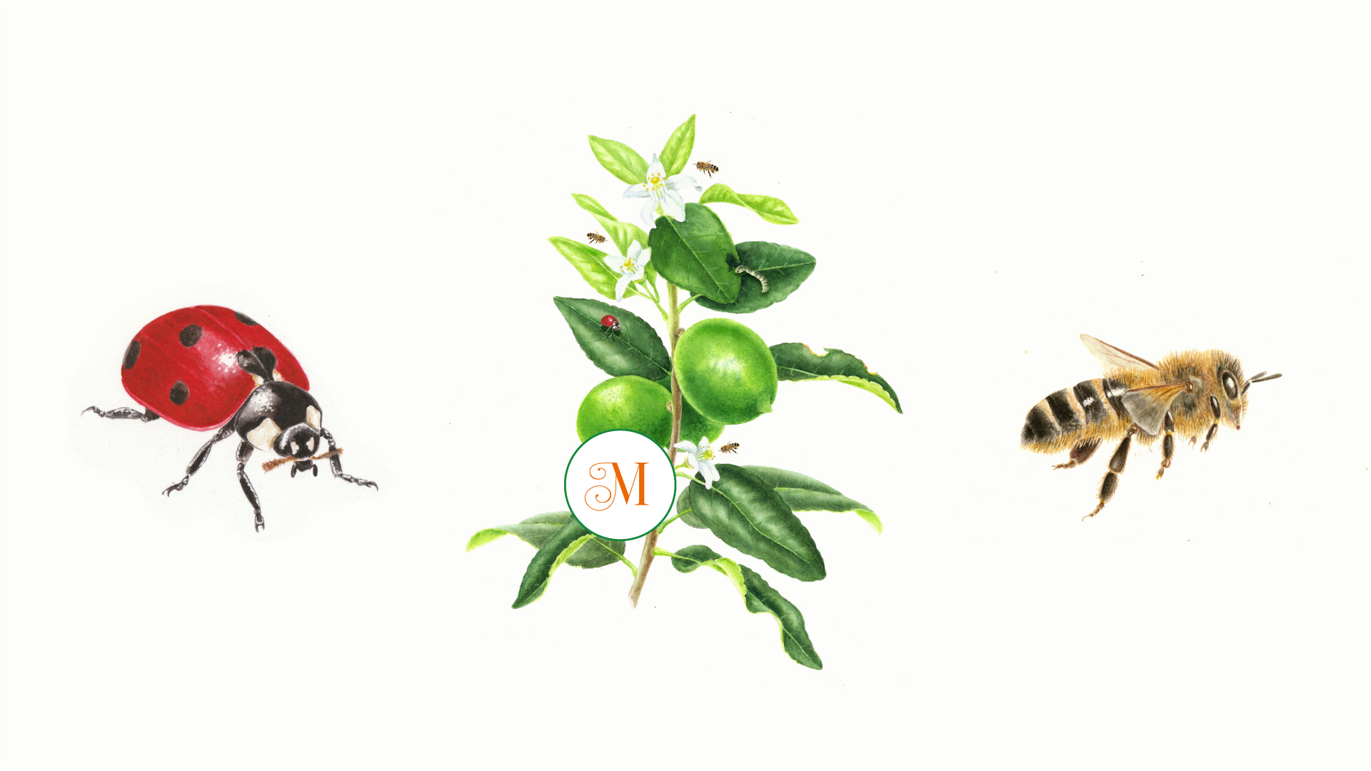
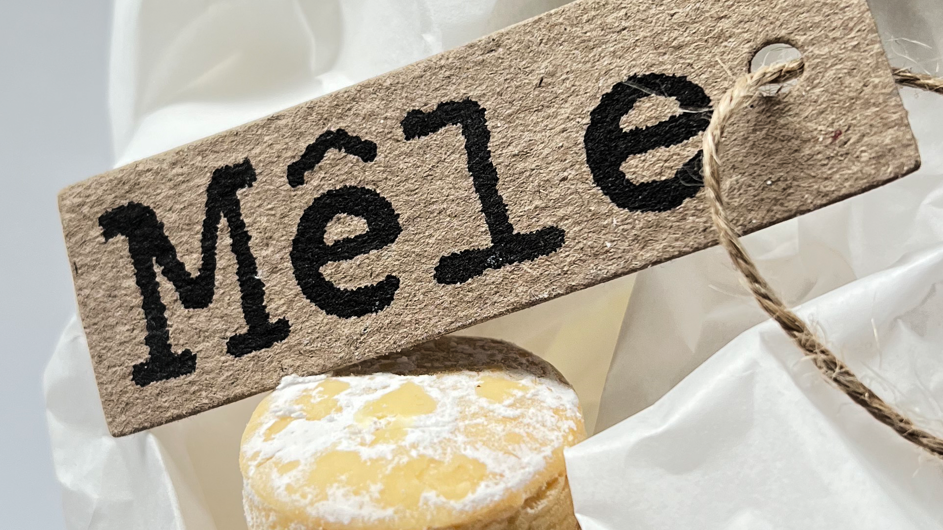
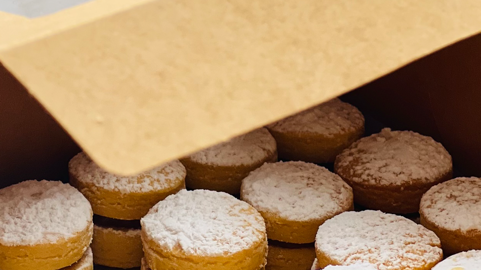
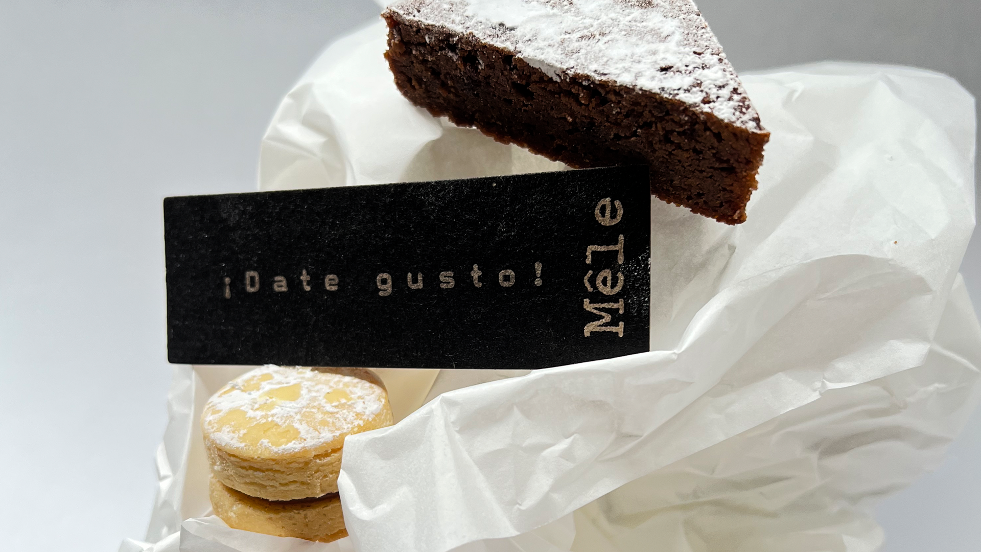
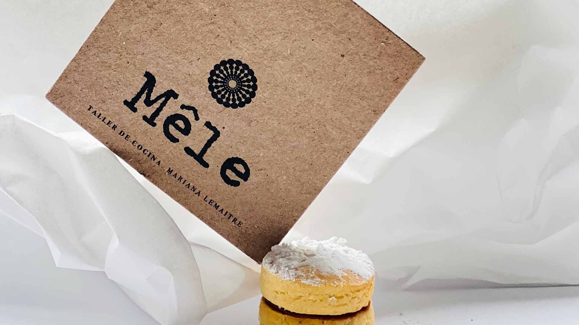
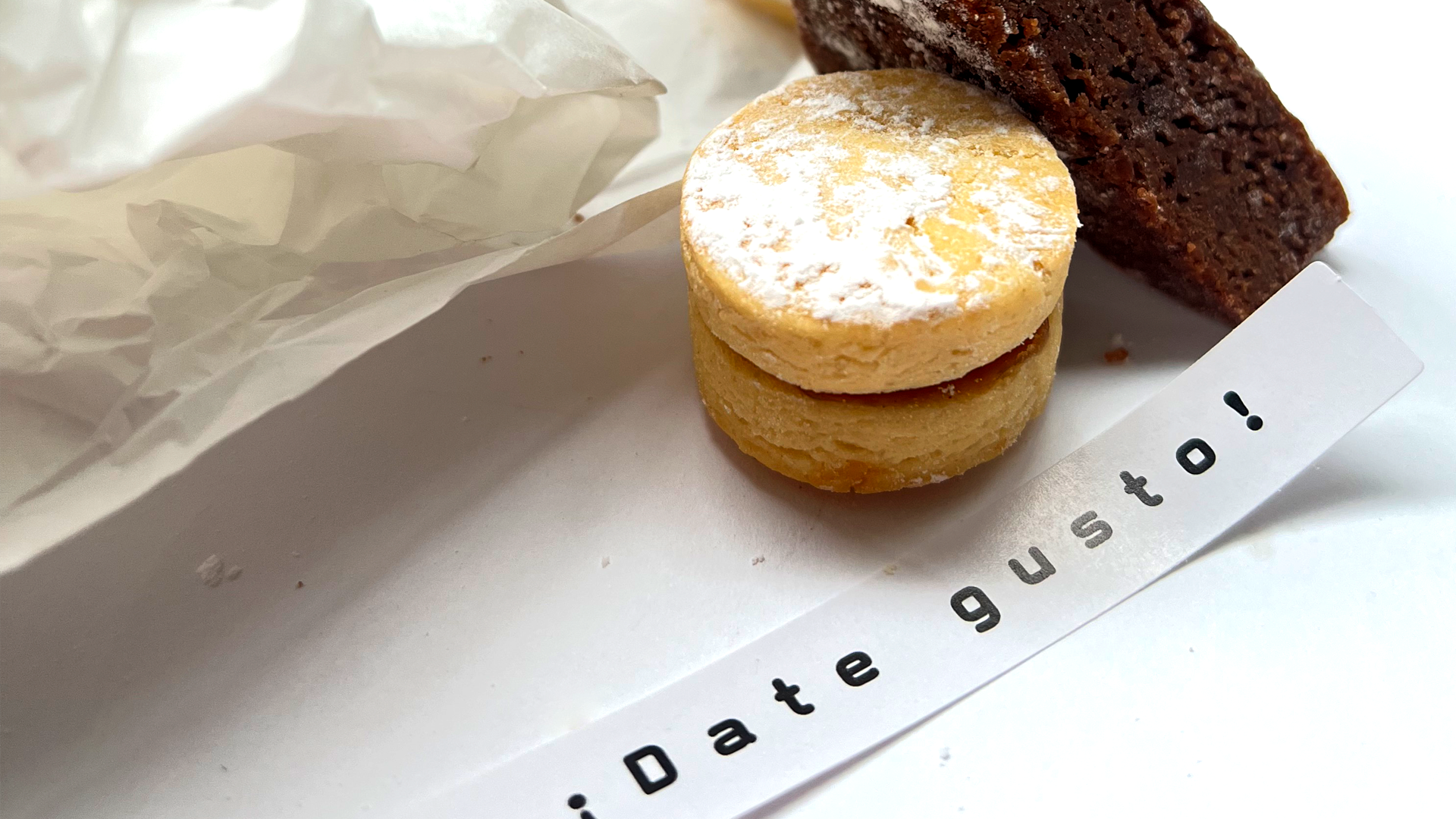
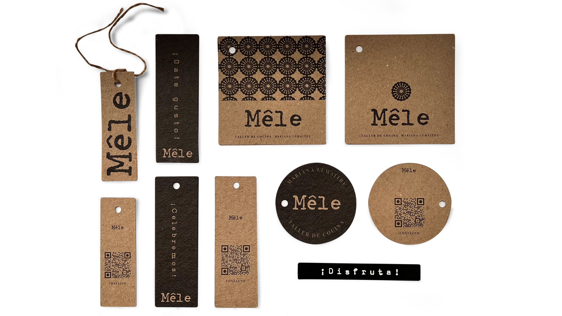
You know I love to design brands for food! This case was not the exception! Mêle is a homemade bakery founded by Mariana Lemaitre. She wanted to be present in the brand name, so I take her initials, “M” “L” and constructed a name based on them. For the visuals, we talk about something traditional with a modern touch, since her recipes are traditional but her presentations are modern. After a quest for style, a type writer logo was the chosen one. I have a type writer machine in home in which I typed the name many times and then I made the digital drawing based on that. I preserved all the analog magic: the different spaces between letters, the different weights of the strokes and the different forms that are revealed once you have written. If you look closely, the two “e” are very different because when you are in a type writer the amount of force you put in each type is, off course, different. This visual clue, also talks us about the artisanal process of the food. Each brownie, each cookie is different and unique. For the labels and cards we print several designs with small differences in order to give the brand´s feeling of “past time” but they have a QR code that brings you to a landing page! The studio also designed some stickers with emotional frases like “enjoy” or “let´s celebrate” that aims people to have a dessert time. This labels are designed with a nostalgic touch as well: a long black tape which remind us the amazing handheld label machine invented in 1958 by Dymo.
Scope:
-Naming
-Strategy
-Logo
-Labels
-Stickers
-Digital assets
If you want to visit Mêle social media here.
Other cake brand project here.

Related Projects