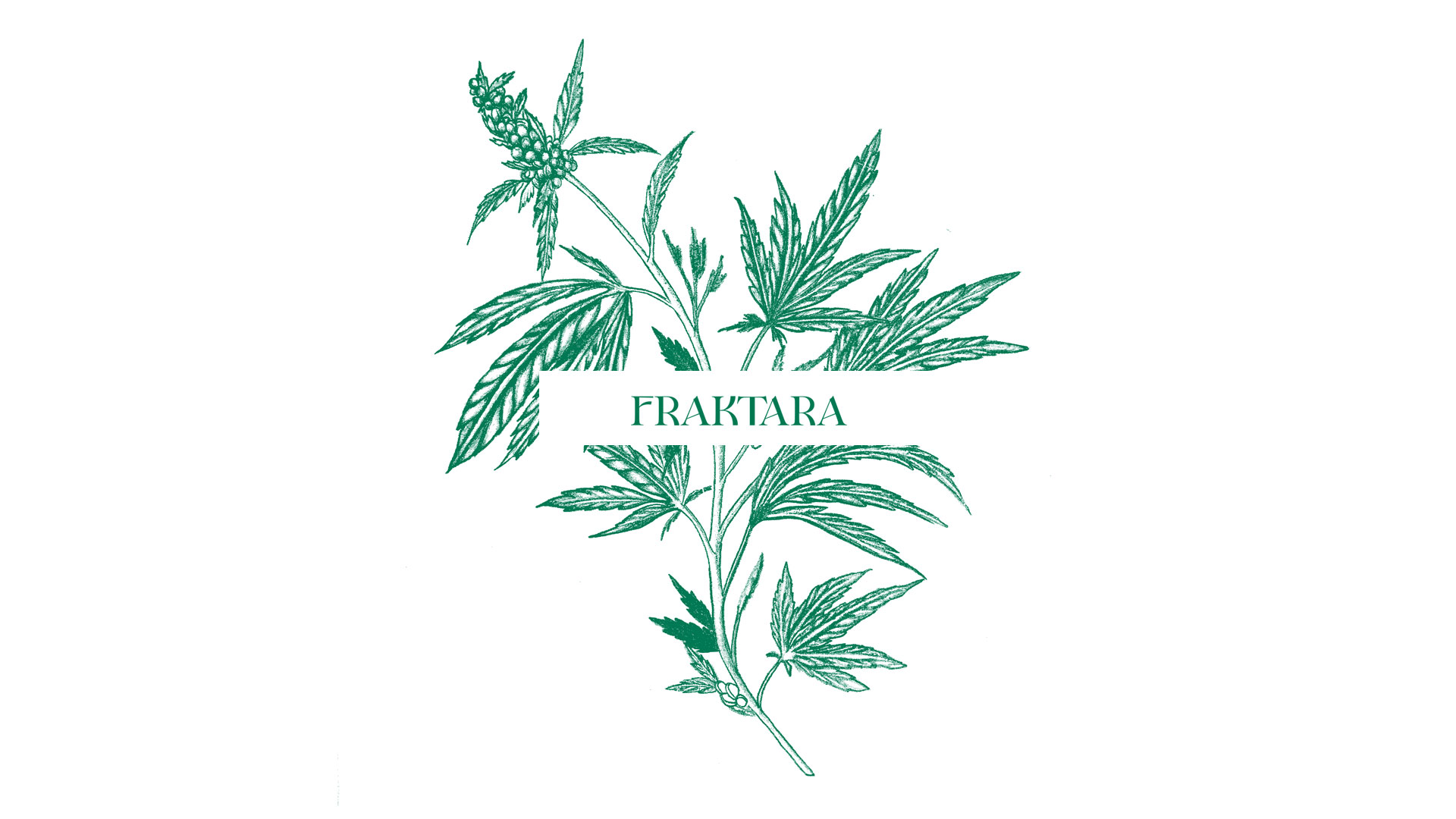
Brand logo for Fraktara
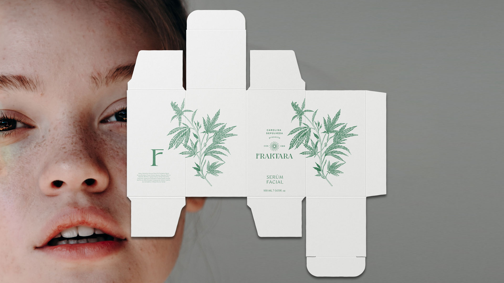
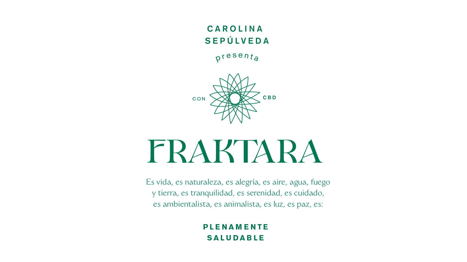
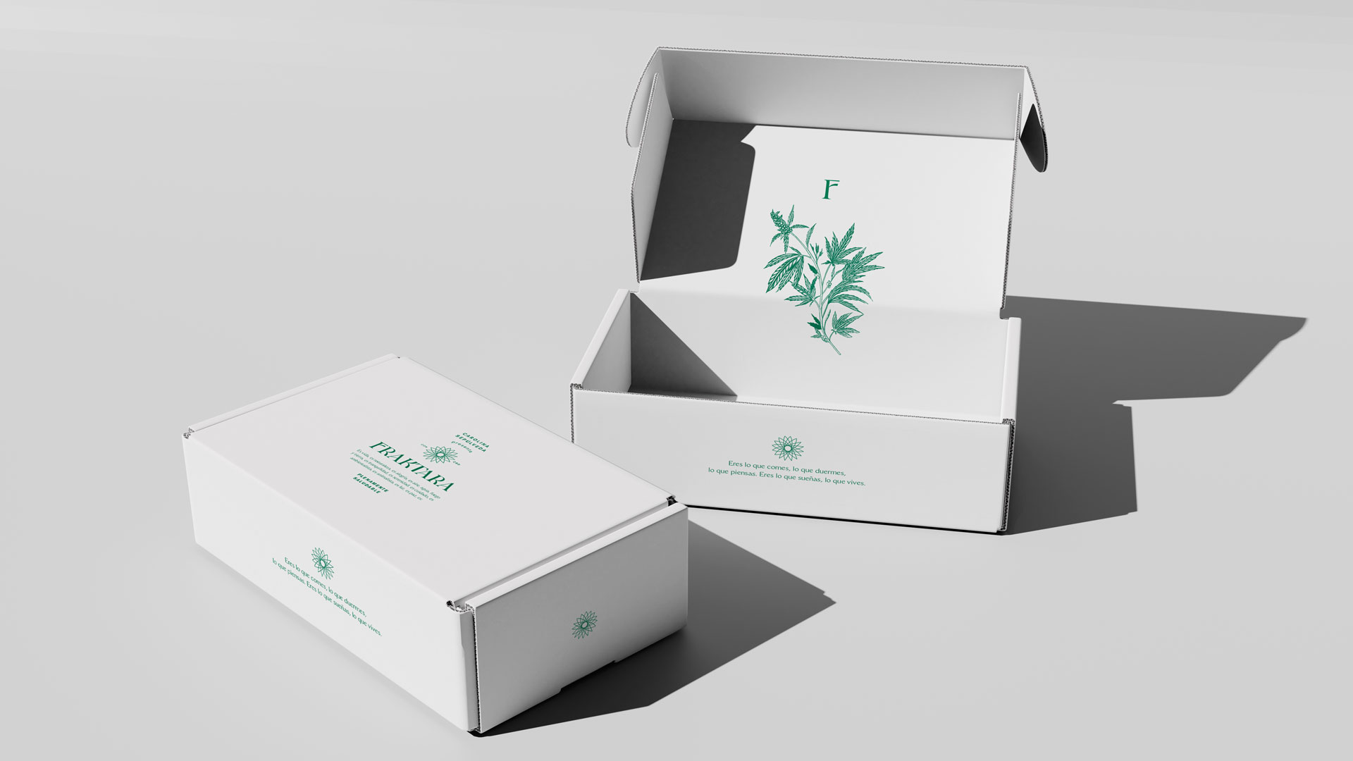
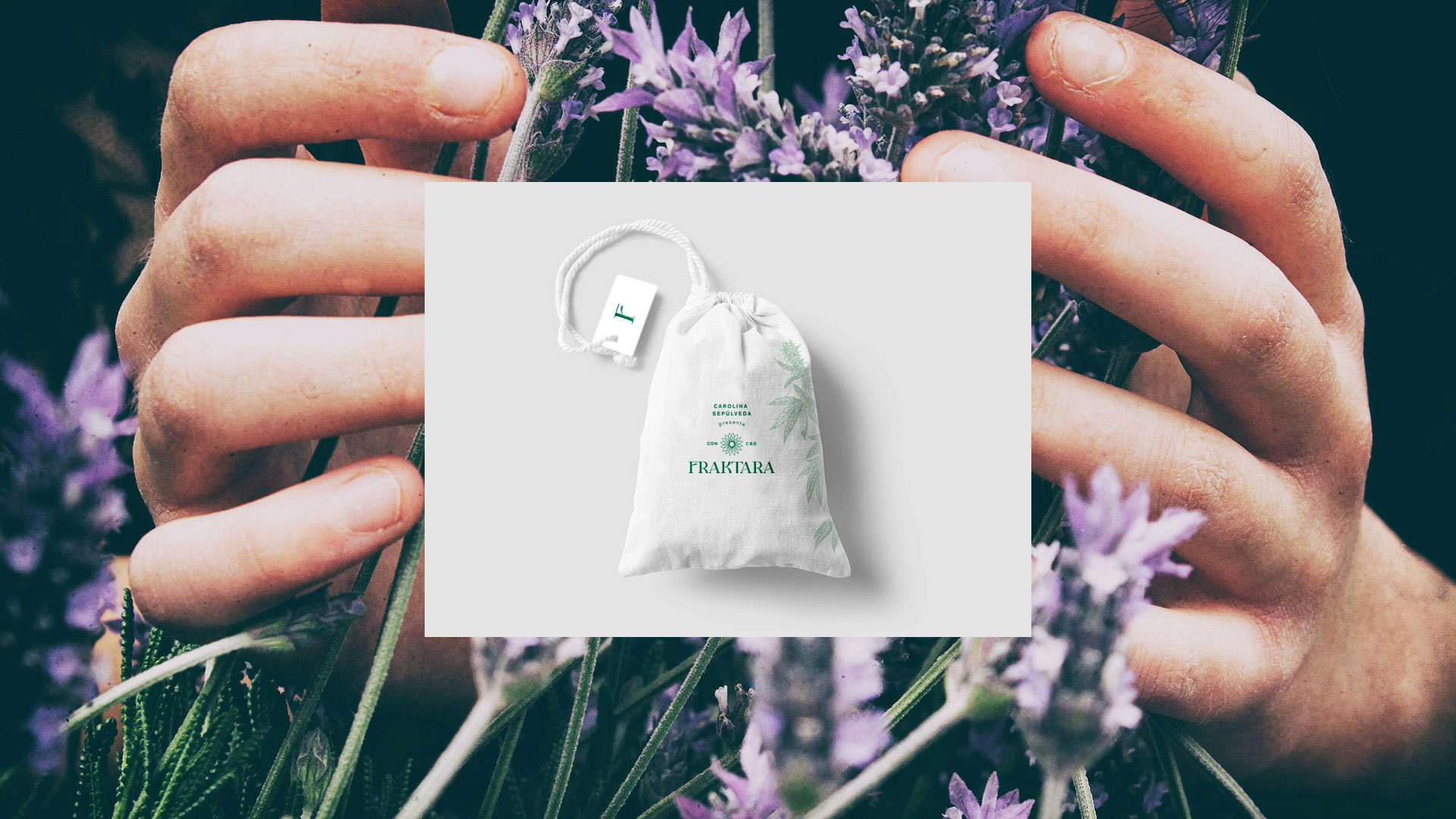
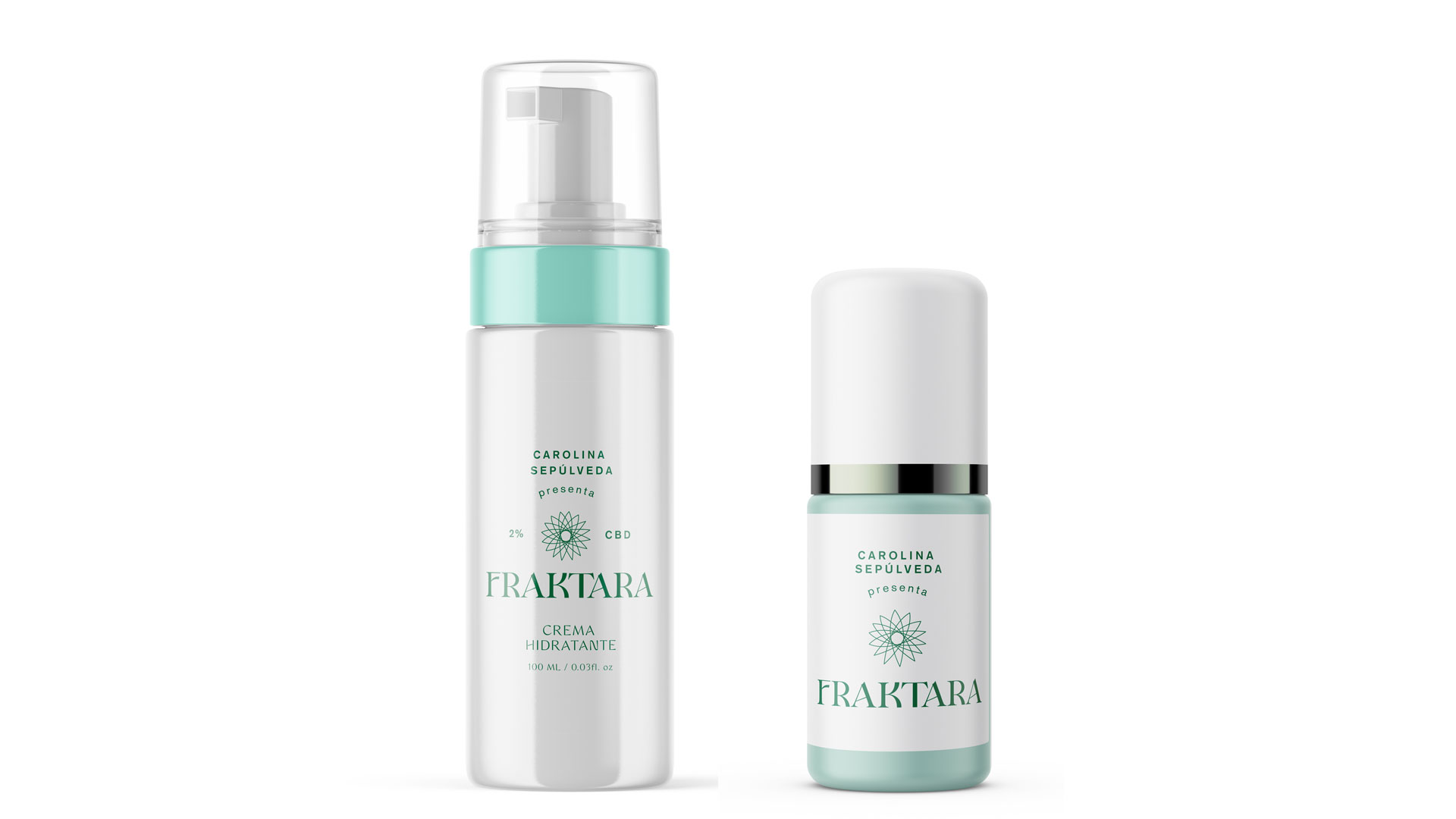
Fraktara is the new entrepreneurship of Carolina Sepulveda; she is mayor known as her work in TV shows as Sin tetas no hay paraíso. She loves to make exercise and to take care of her body. She is a very calm and generous person, reason why she start to develop a new cosmetic line based in the cannabis and its CDB component. We start with the discovery and strategy, in which we found that the style of the brand would be a mix of the botanical imaginary with the medical one; a clean but also warm aesthetic that would give to the audience a feel of trust in the CDB as a serious cosmetic ingredient rather to a mystical one, without losing completely the spirit of the nature as a wise power. We did the logo design with a custom type face, mixing classical and contemporary letter forms in order to express the style of the brand. The symbol was inspired in a leaf shape that was repeated to form an flower – atom that represents the meaning of the name Fraktara (Fractal is: a geometrical or physical structure having an irregular or fragmented shape at all scales). The project took 3 months of development.
Scope:
Logo
Symbol
Brand illustration
Packaging
Brand guidelines
See Fraktara site here
See another cosmetic project here
Info
Date:
August 28, 2022