Brand Strategy for Dignity Coffee Packs
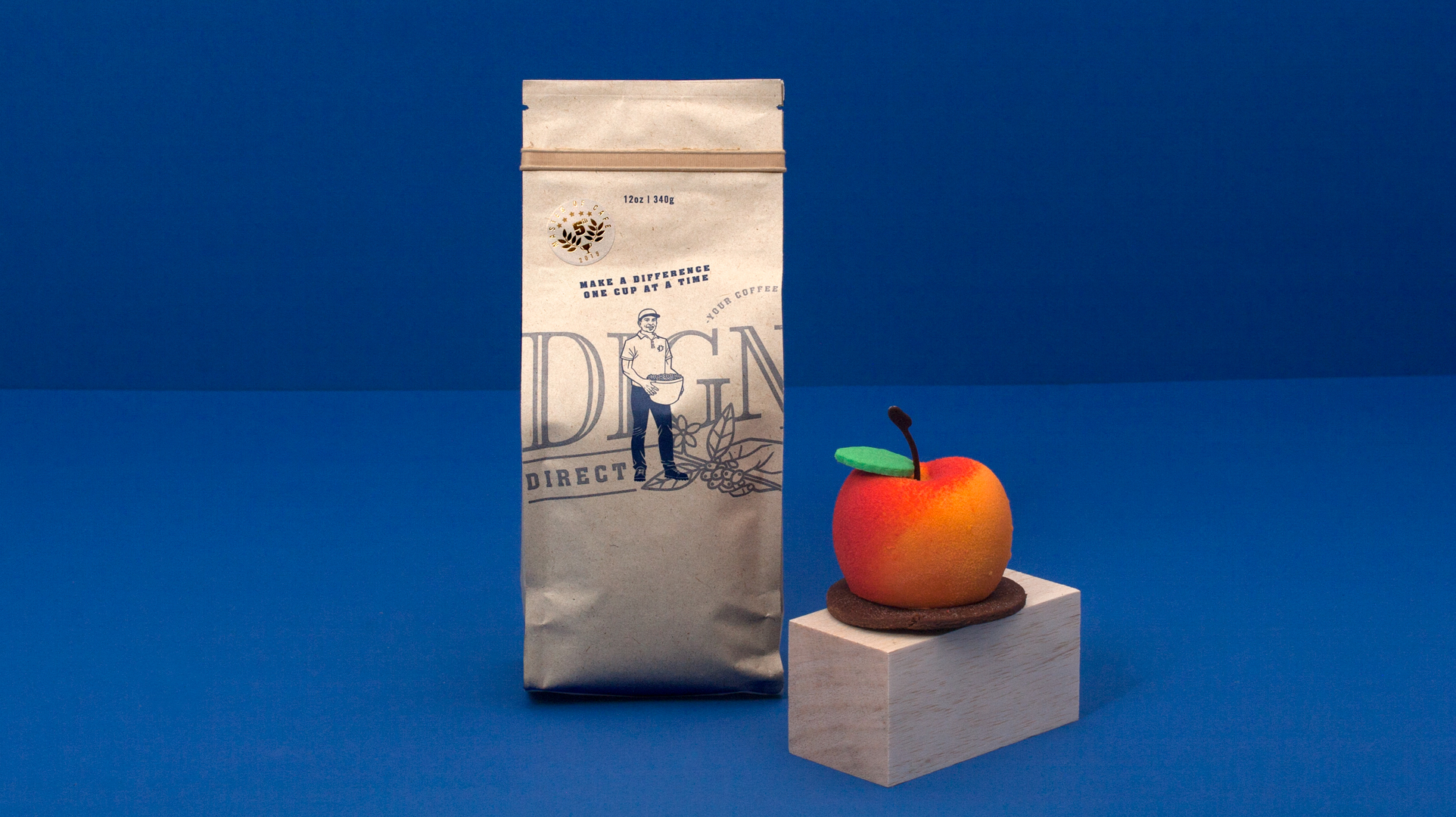
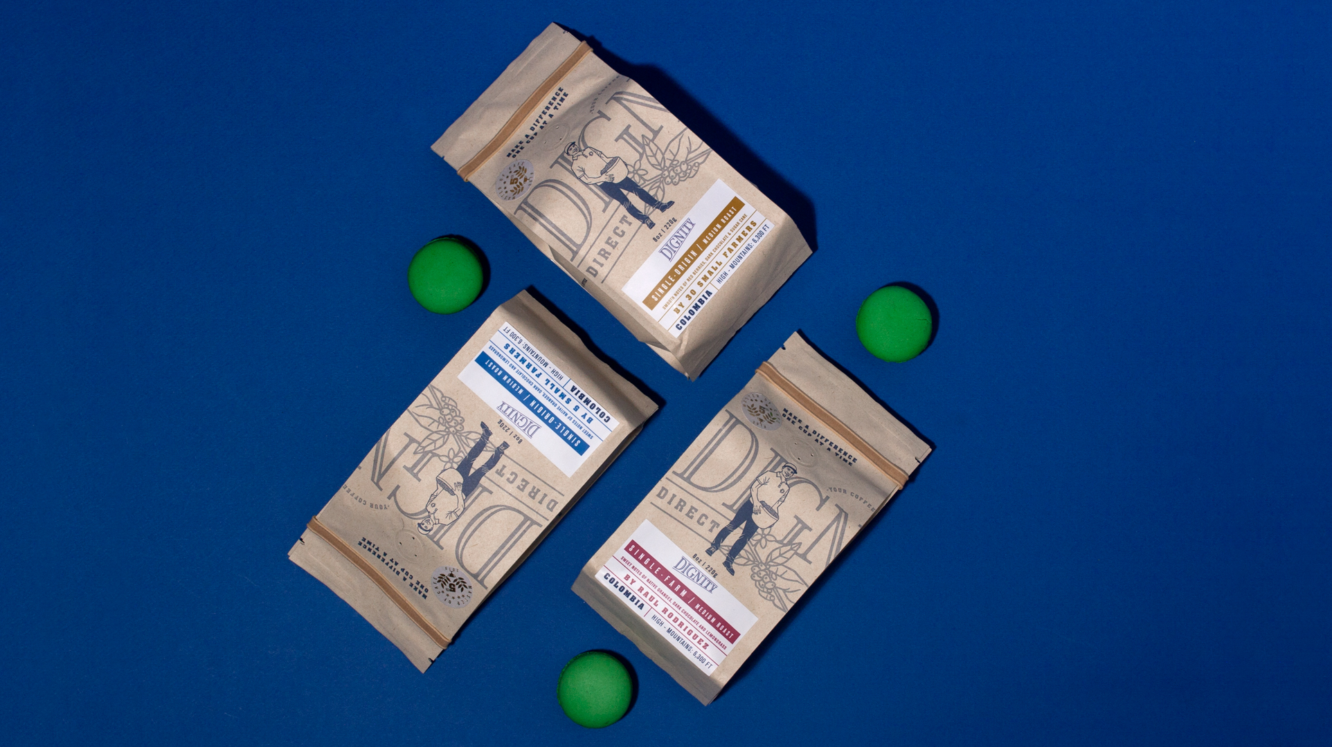
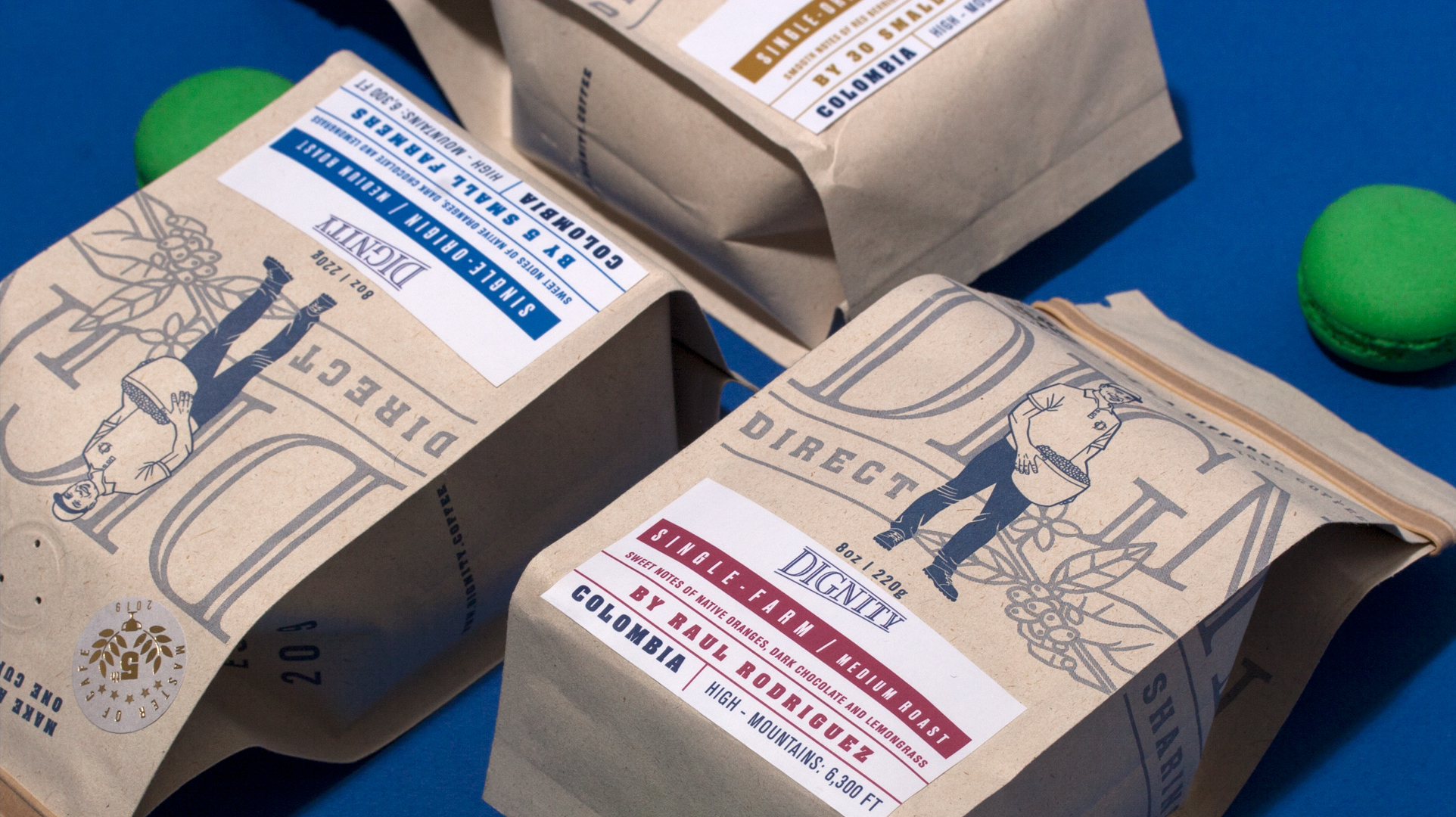
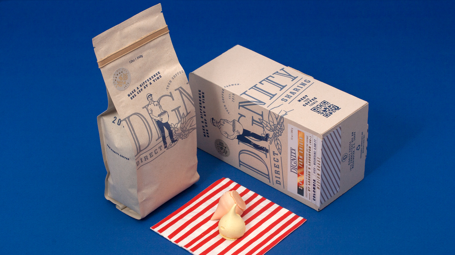
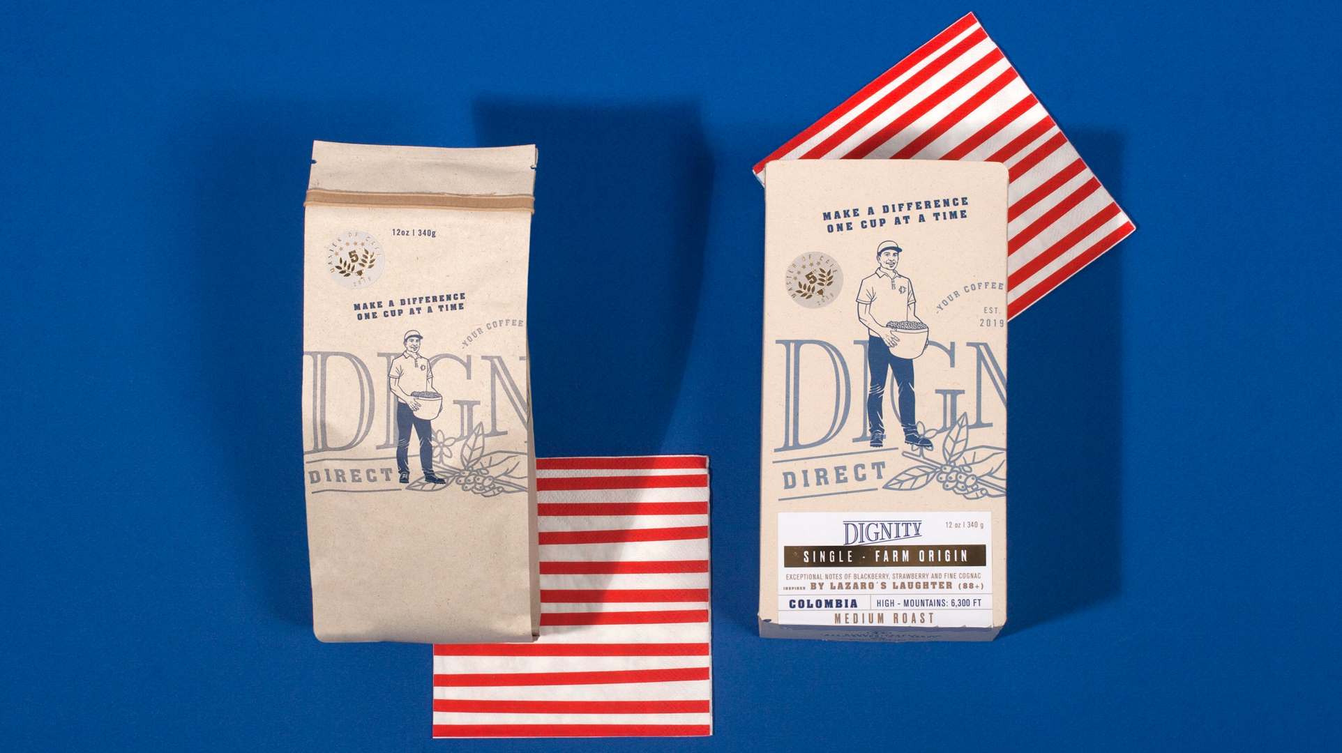
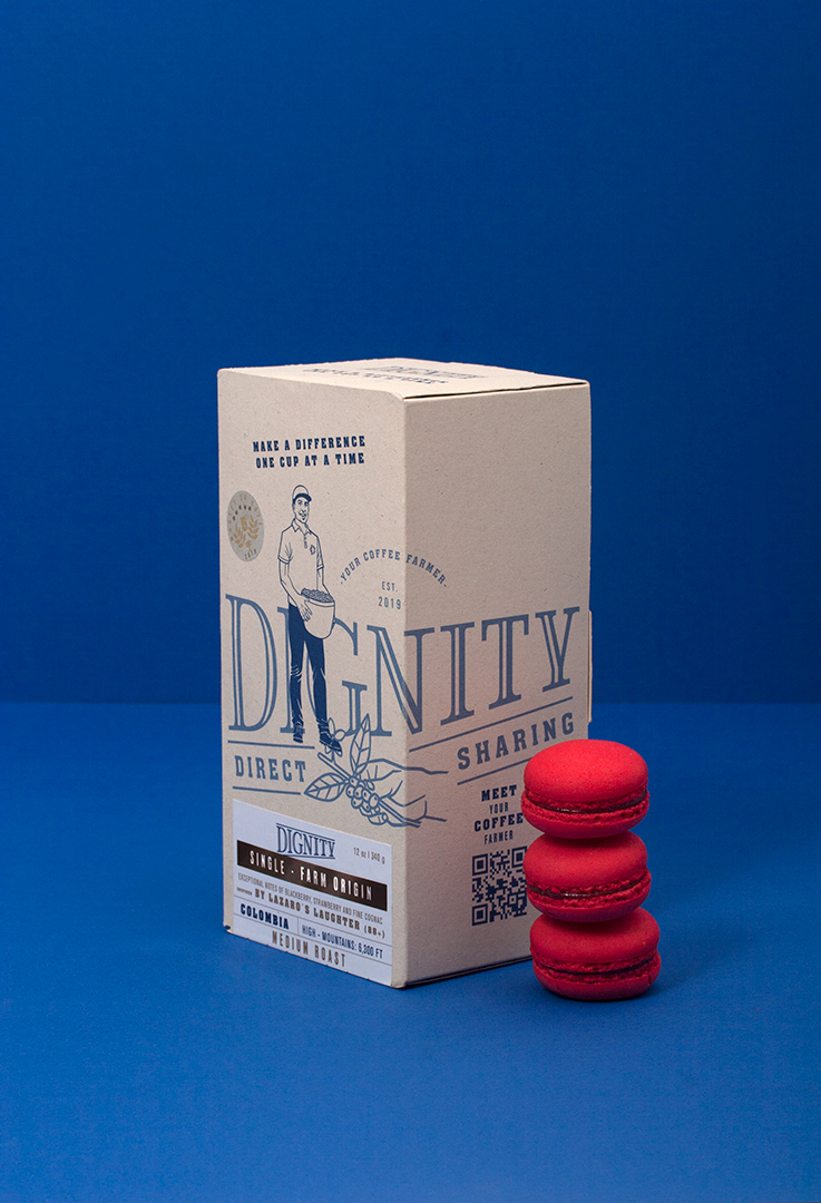
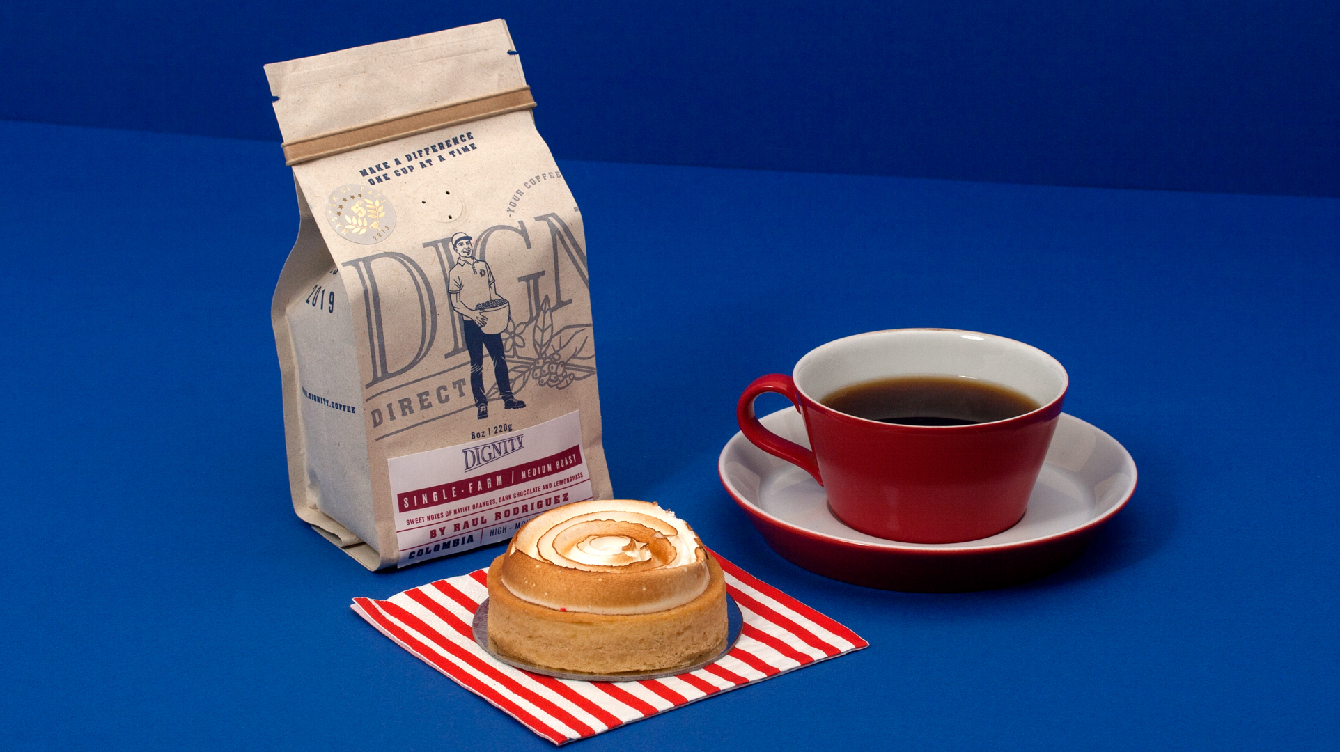
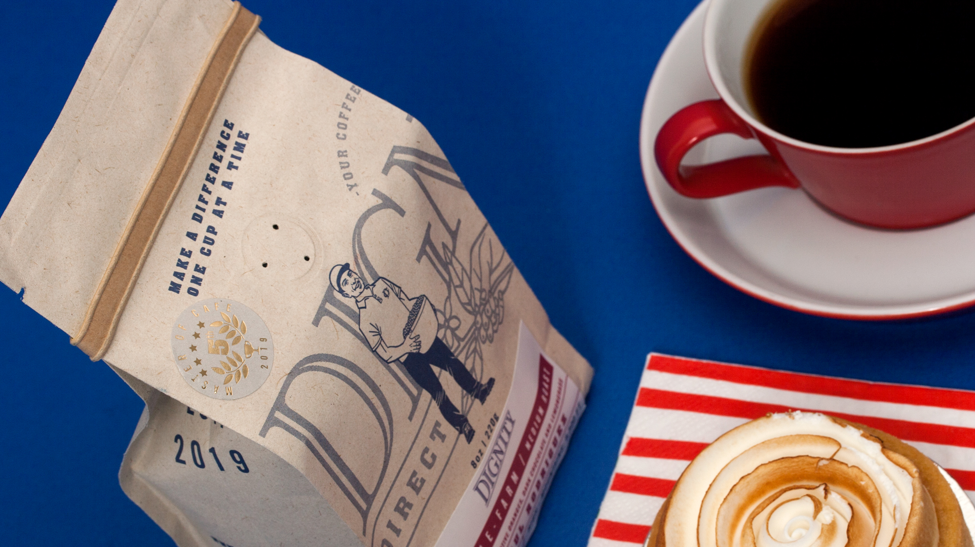
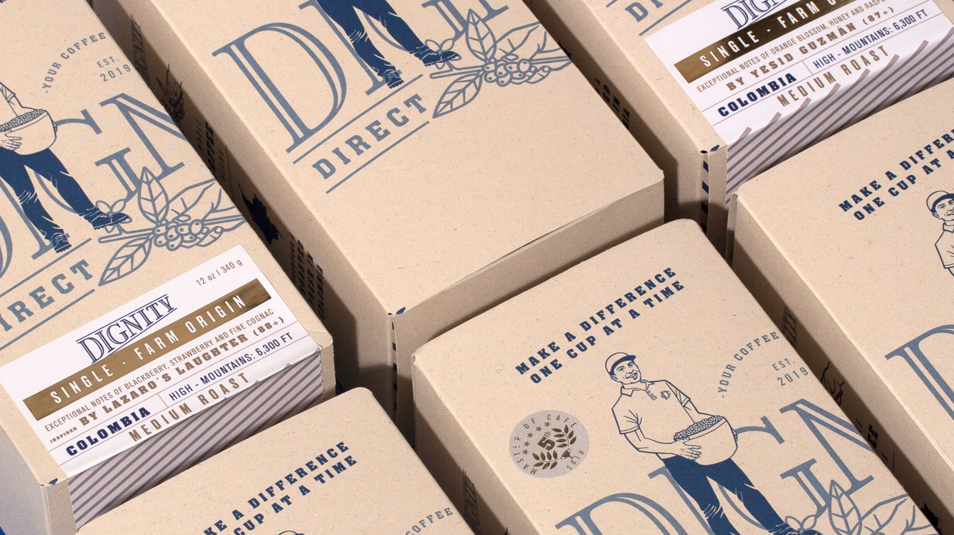
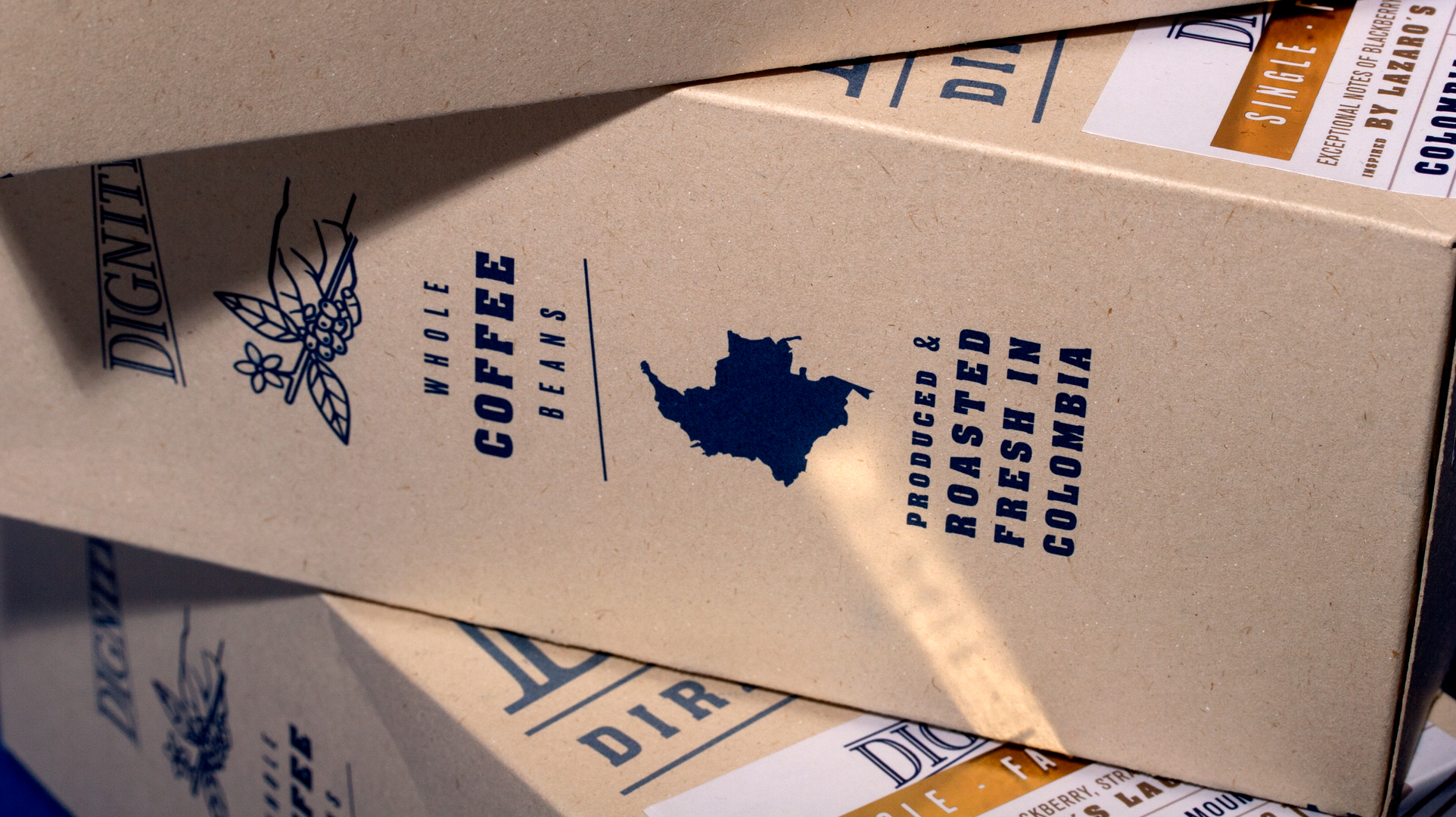
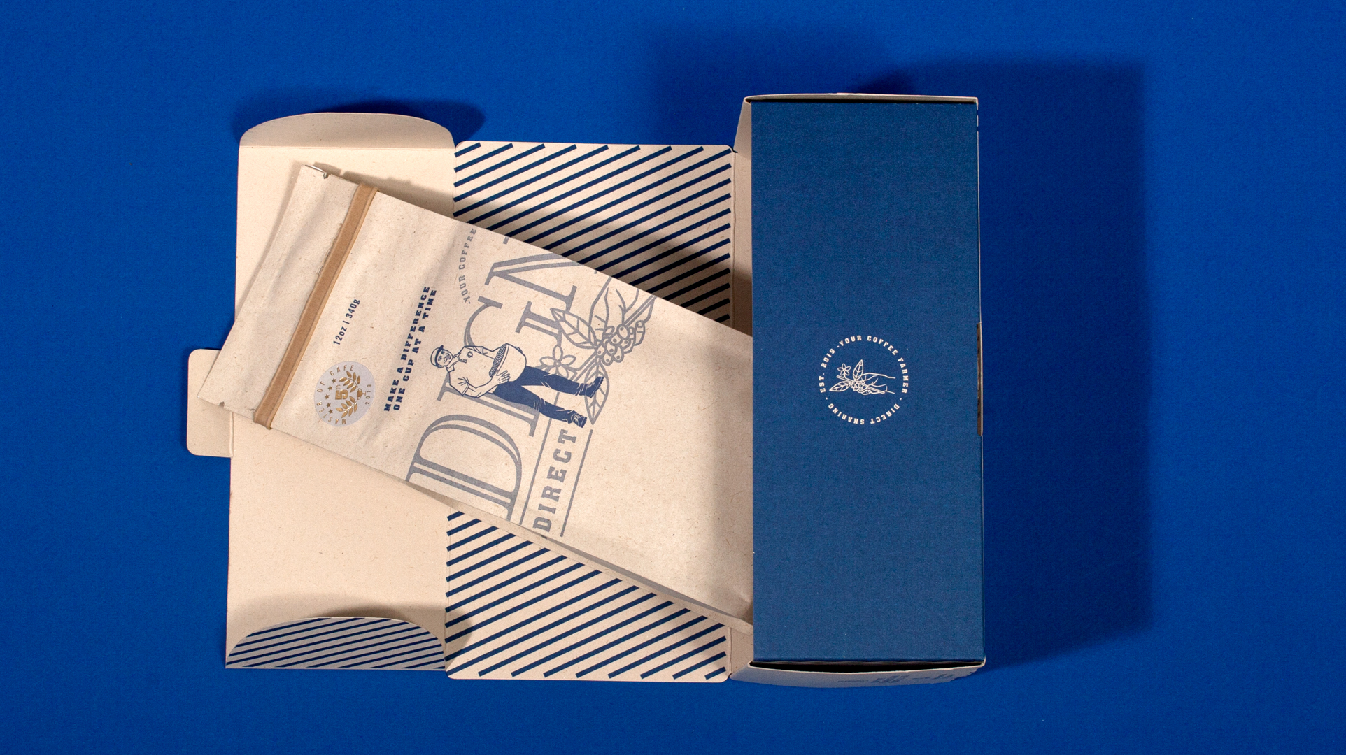
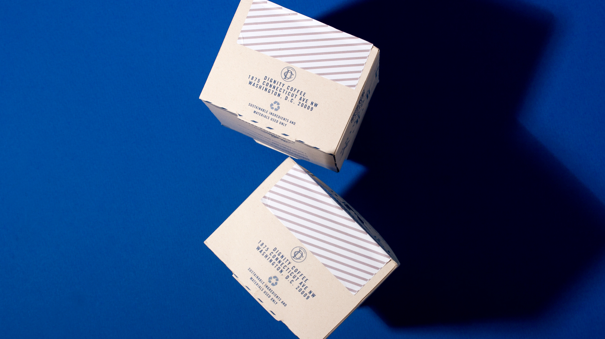
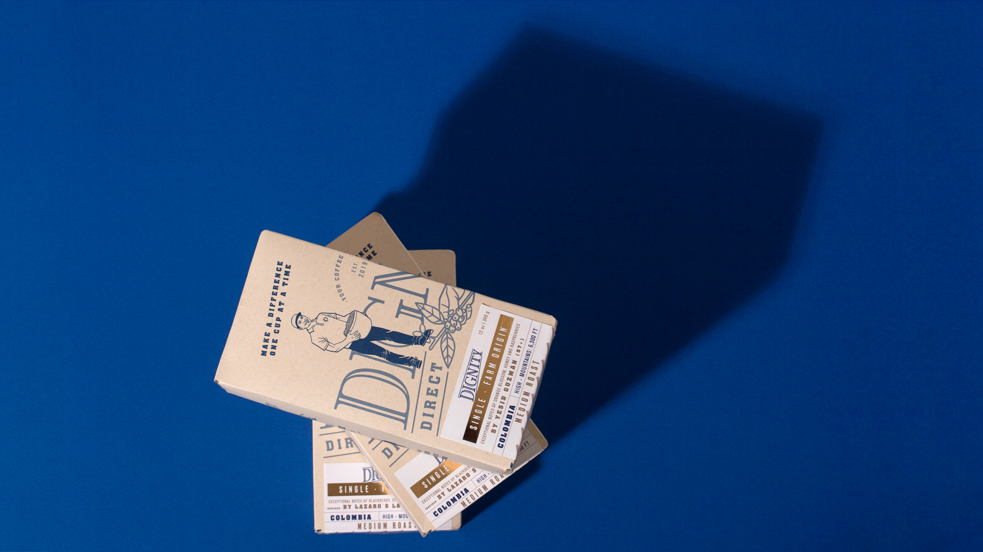
This graphic design was a absolute challenge to me because it is the first time I do a packaging design for the United States. With the help of my client, we built the characteristics of the audience and after we understand how are the persons choosing a specialty coffee in Washington and what the brand stands for, the client suggested a simple design that shows the farmer in first place. It was a risk not to have the logo for a brand that will be launched for its first time, so I proposed to put it big, but behind the farmer and in a low percent of the ink, so the people could read both. Printed on sustainable paper. One ink.
We did:
-Bag design
-Box design
-Tag design
See the entire branding system!
Featured in packagingoftheworld.com
Featured in designersbookshop
Info
Date:
May 26, 2019

