Branding Design & Brand Strategy for bonbonite
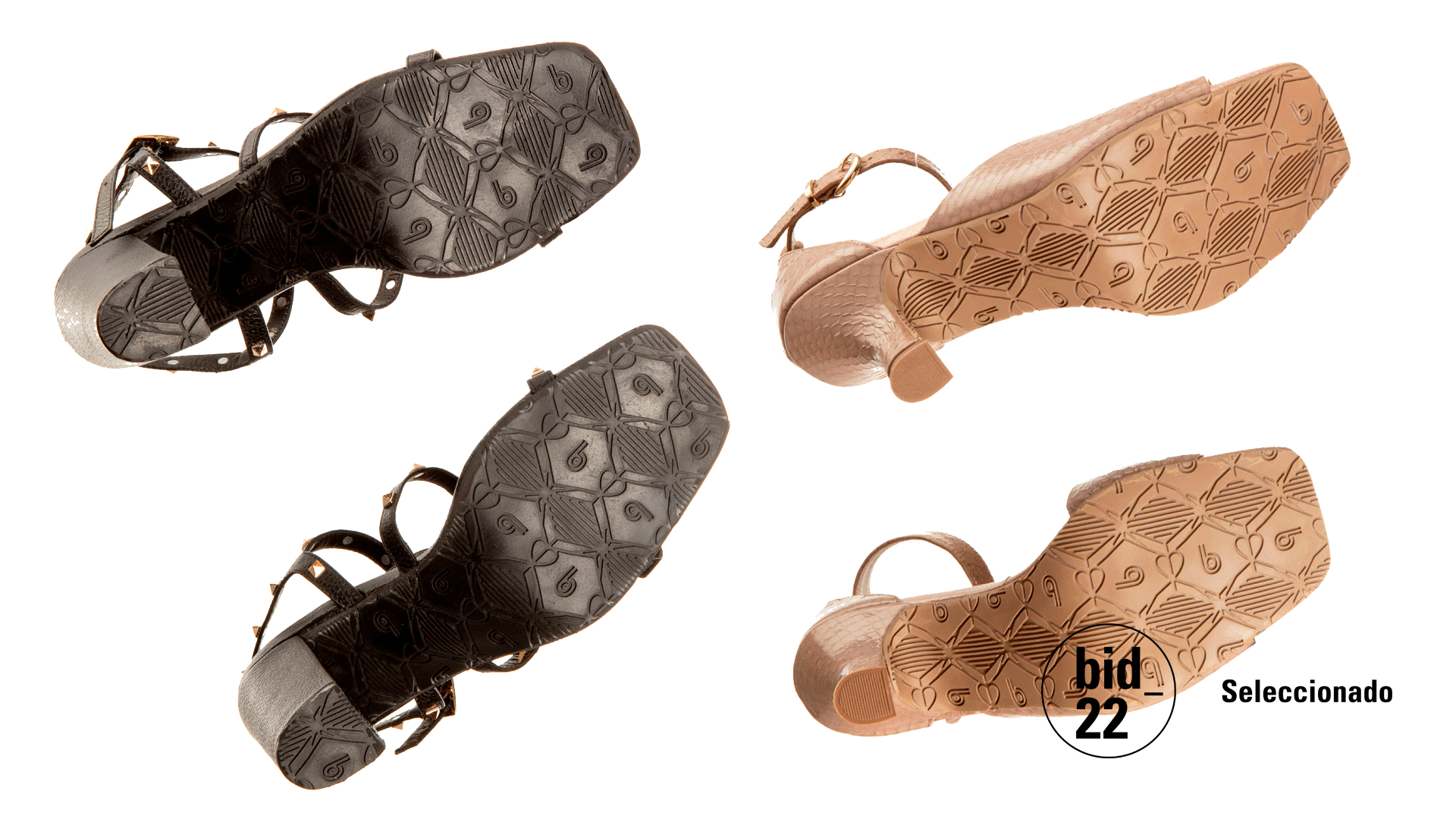
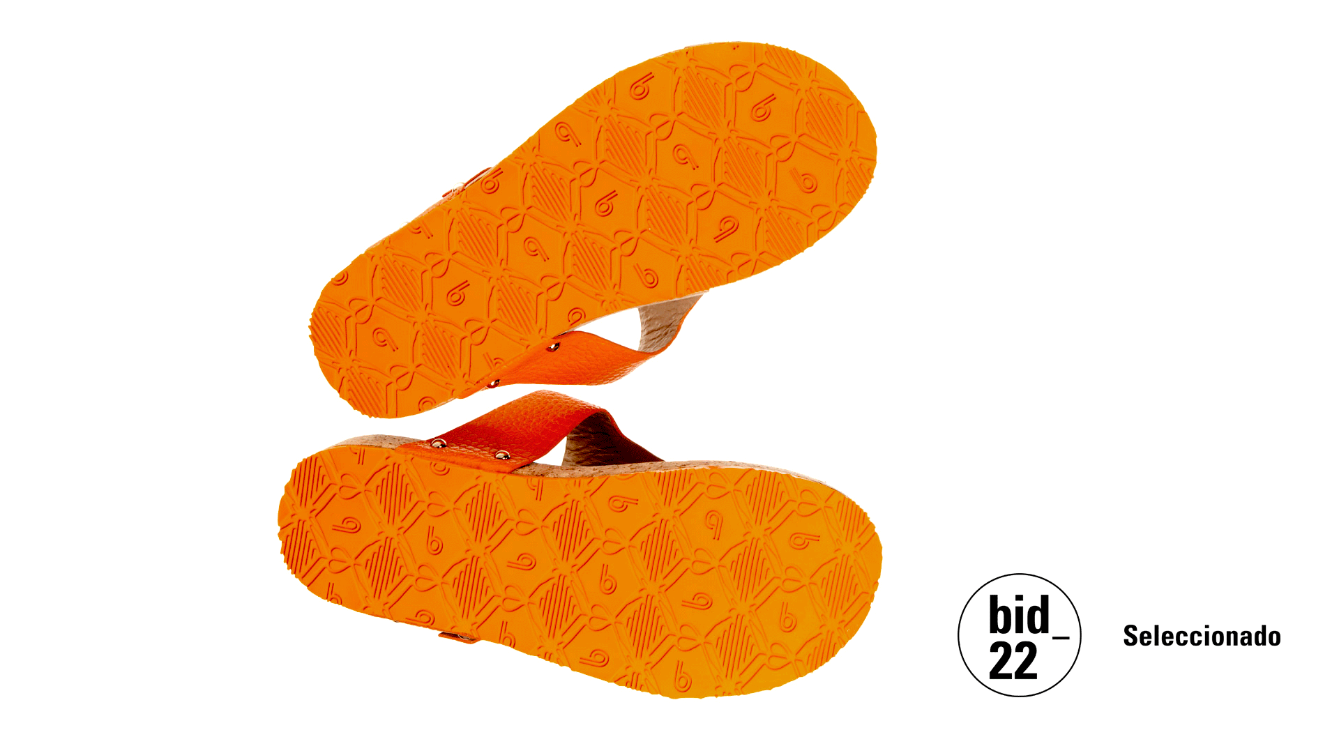
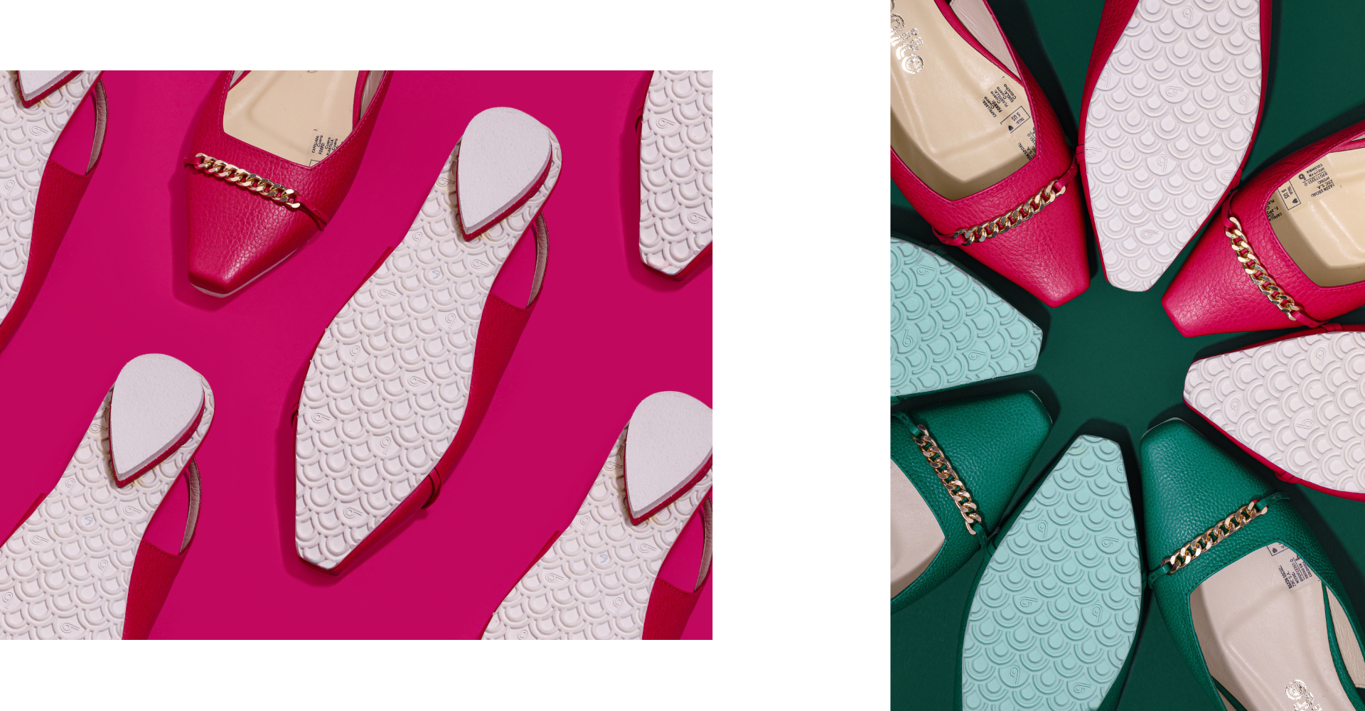
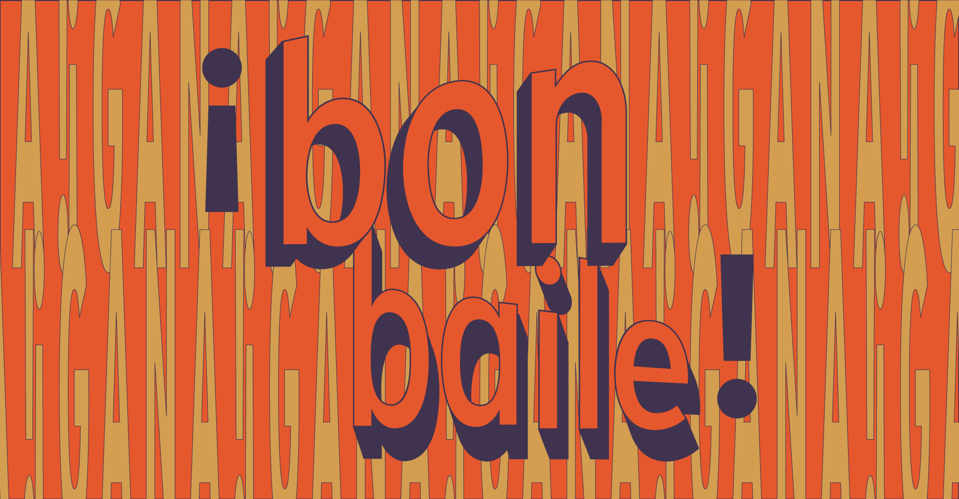
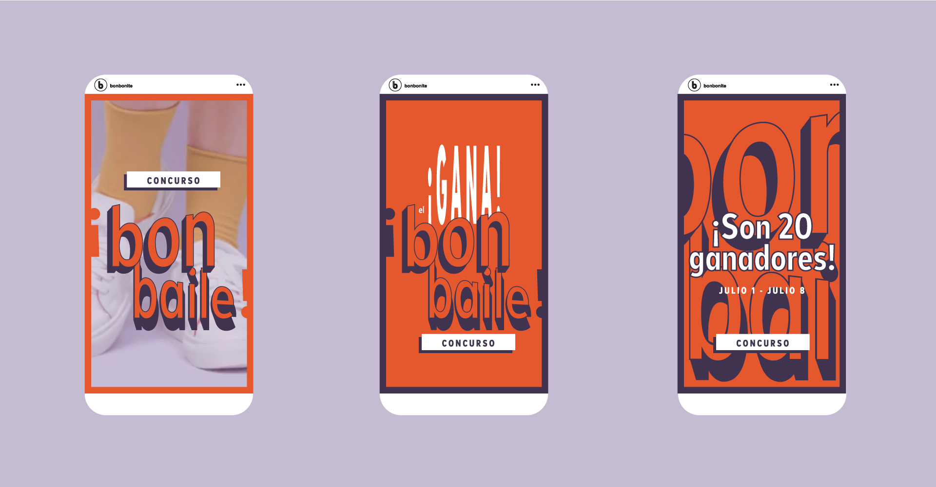
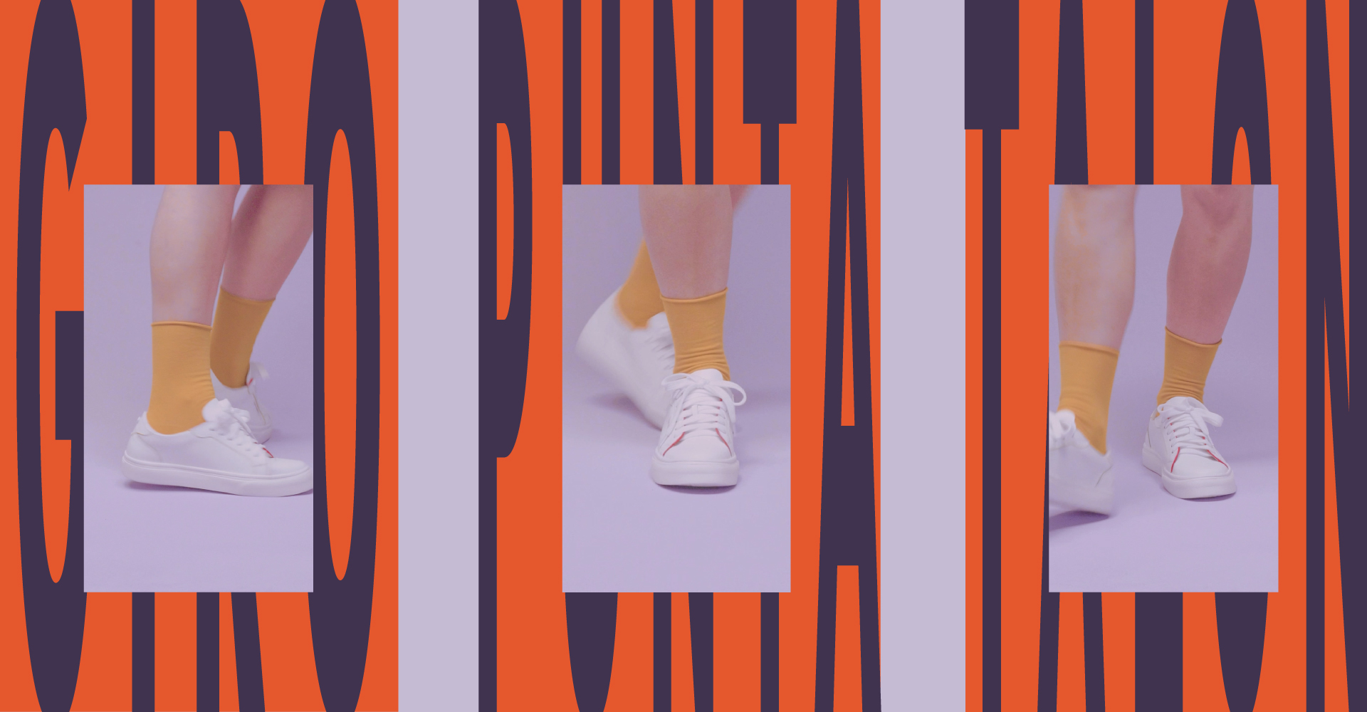
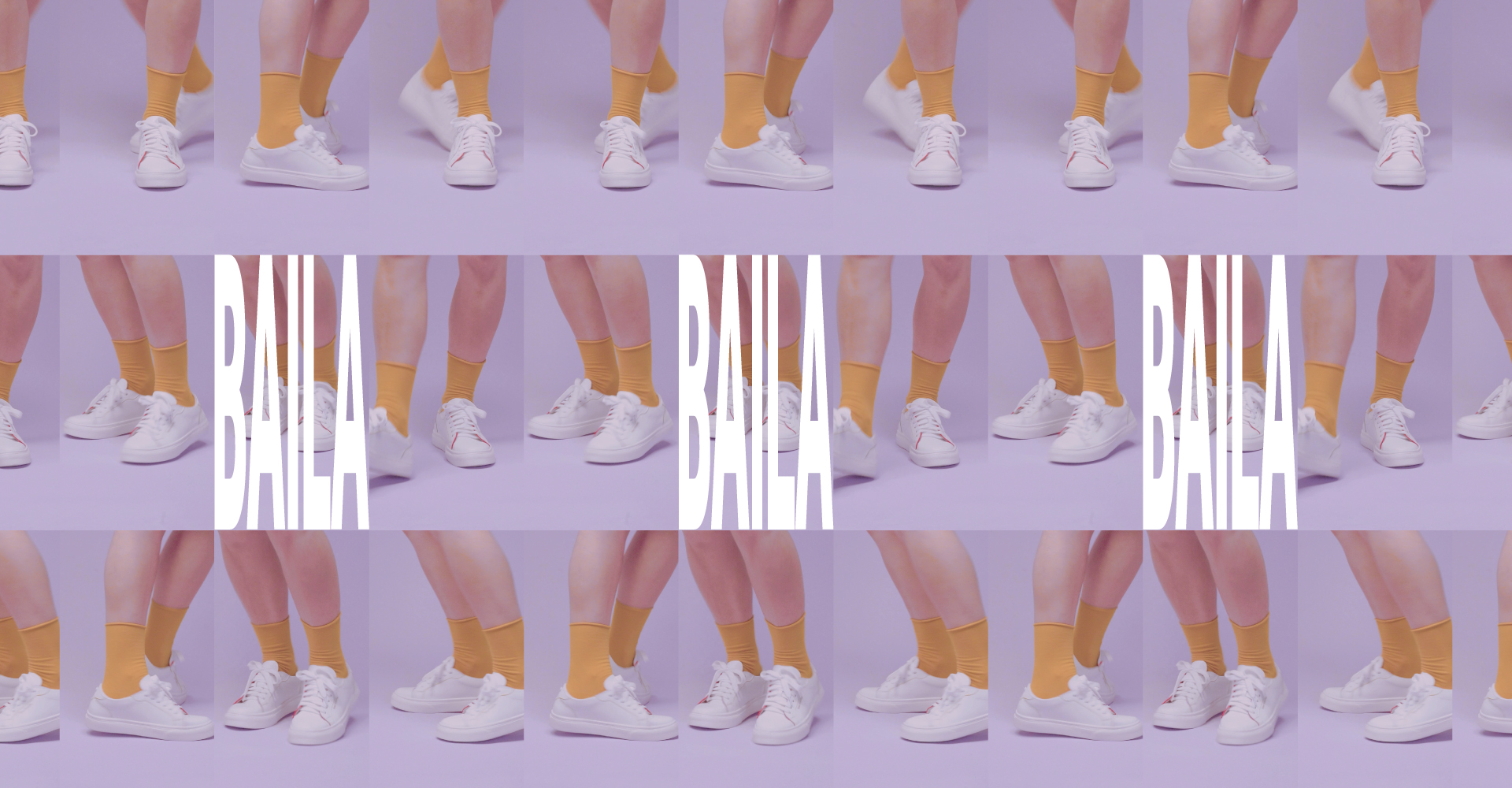
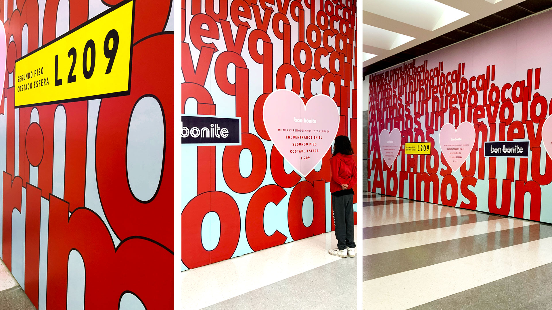
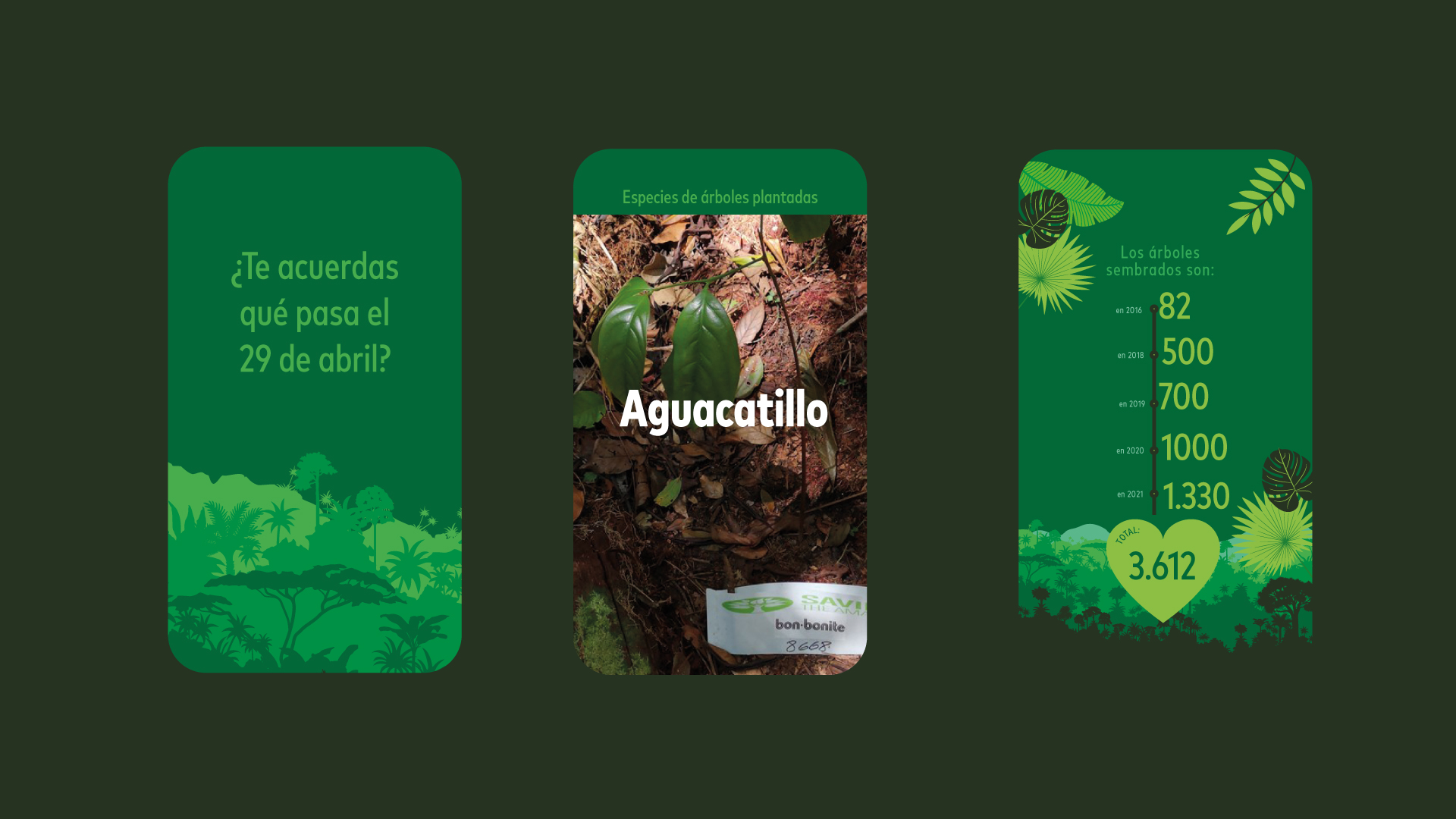
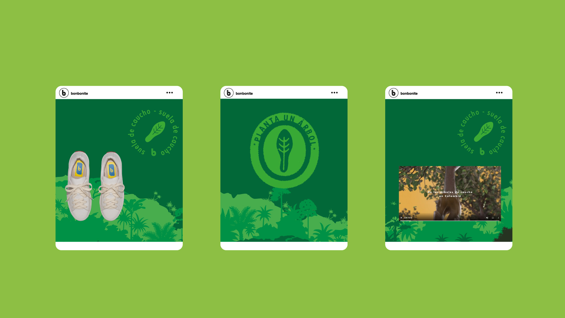
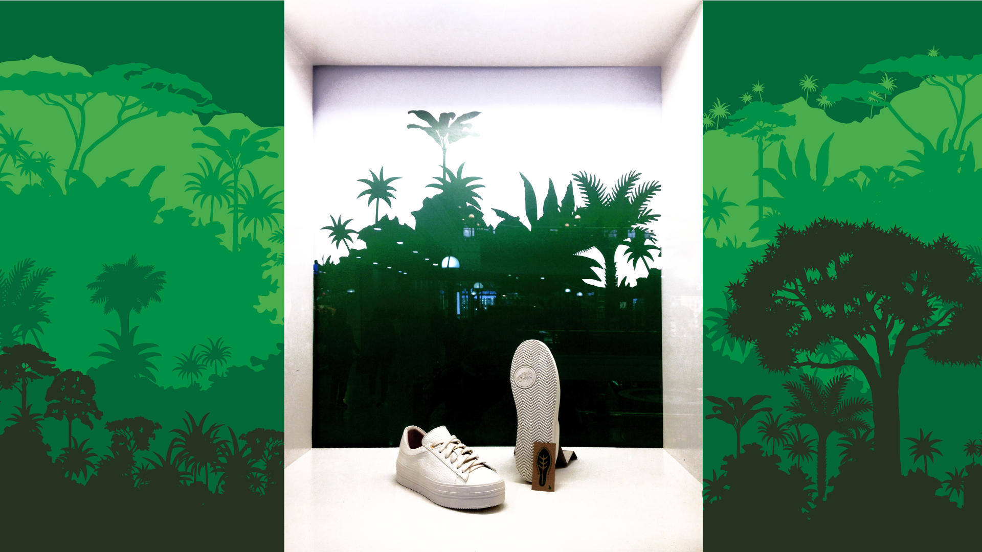
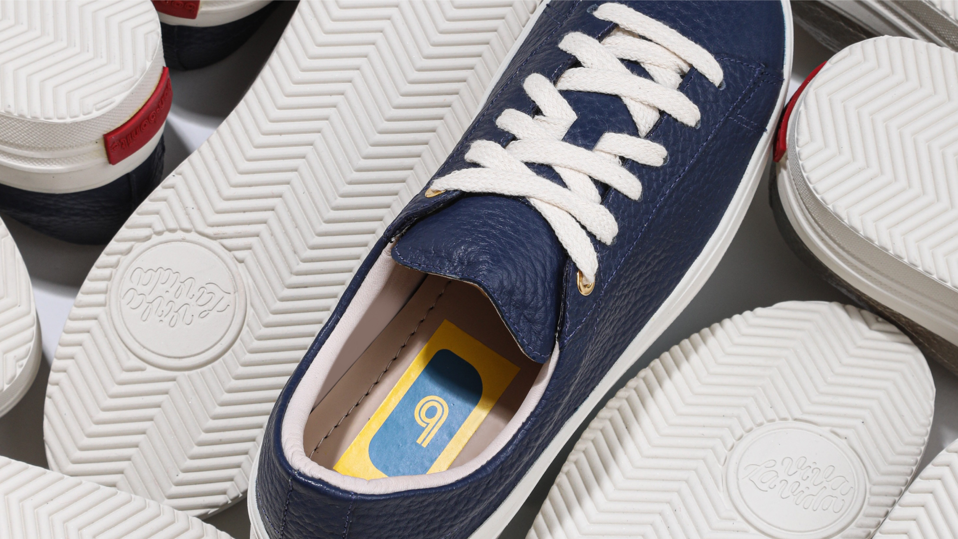
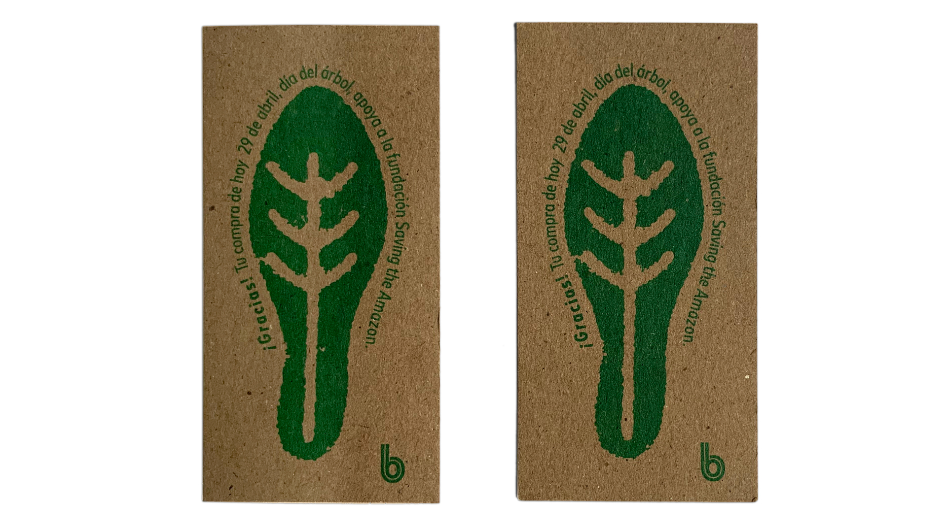
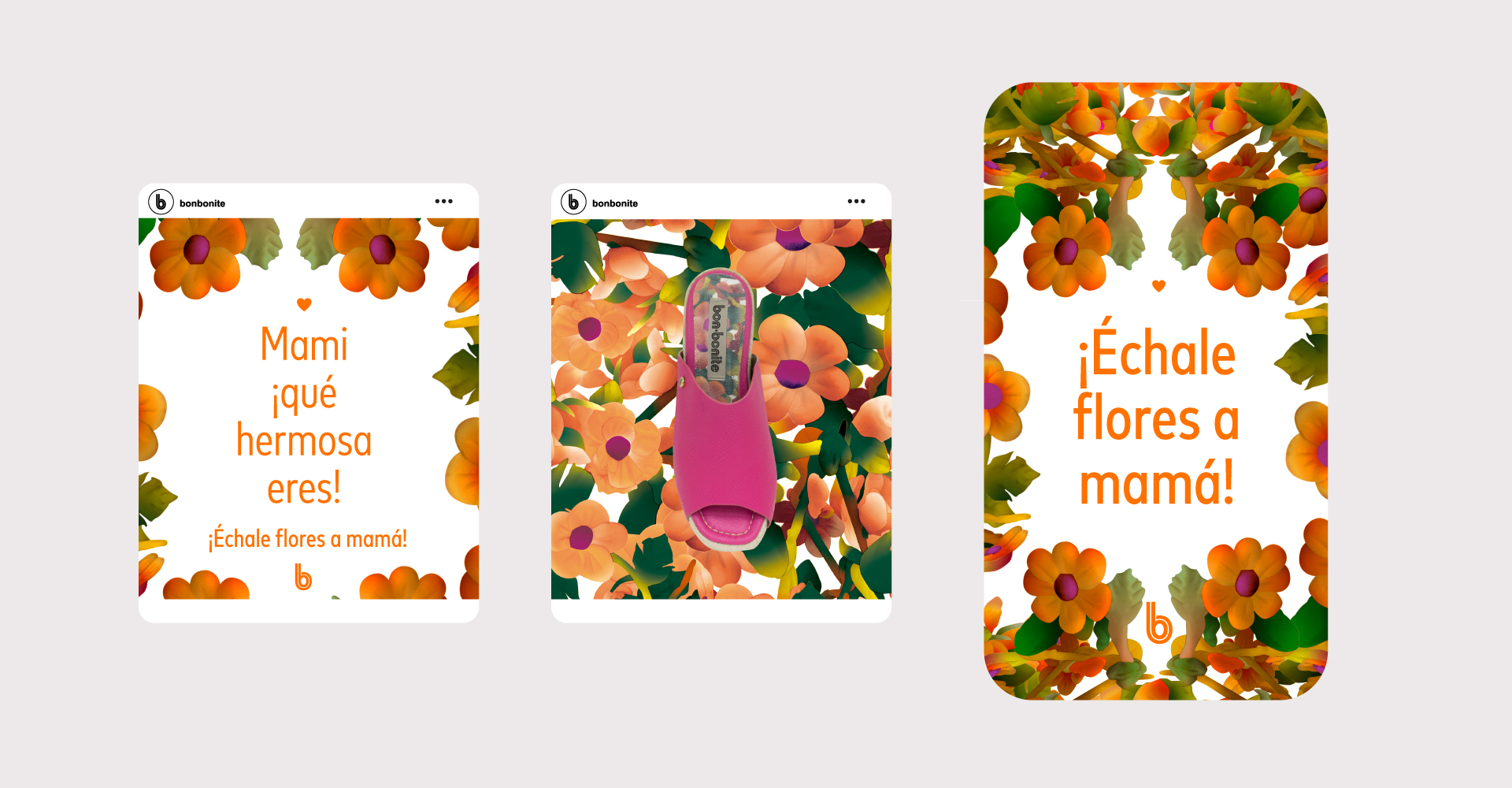
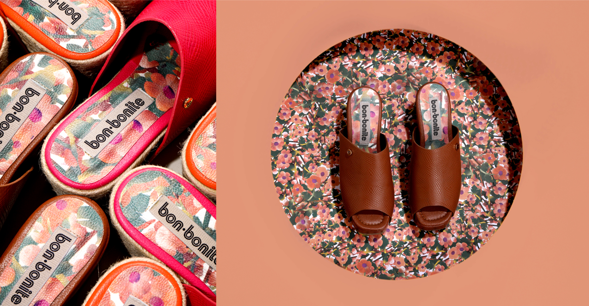
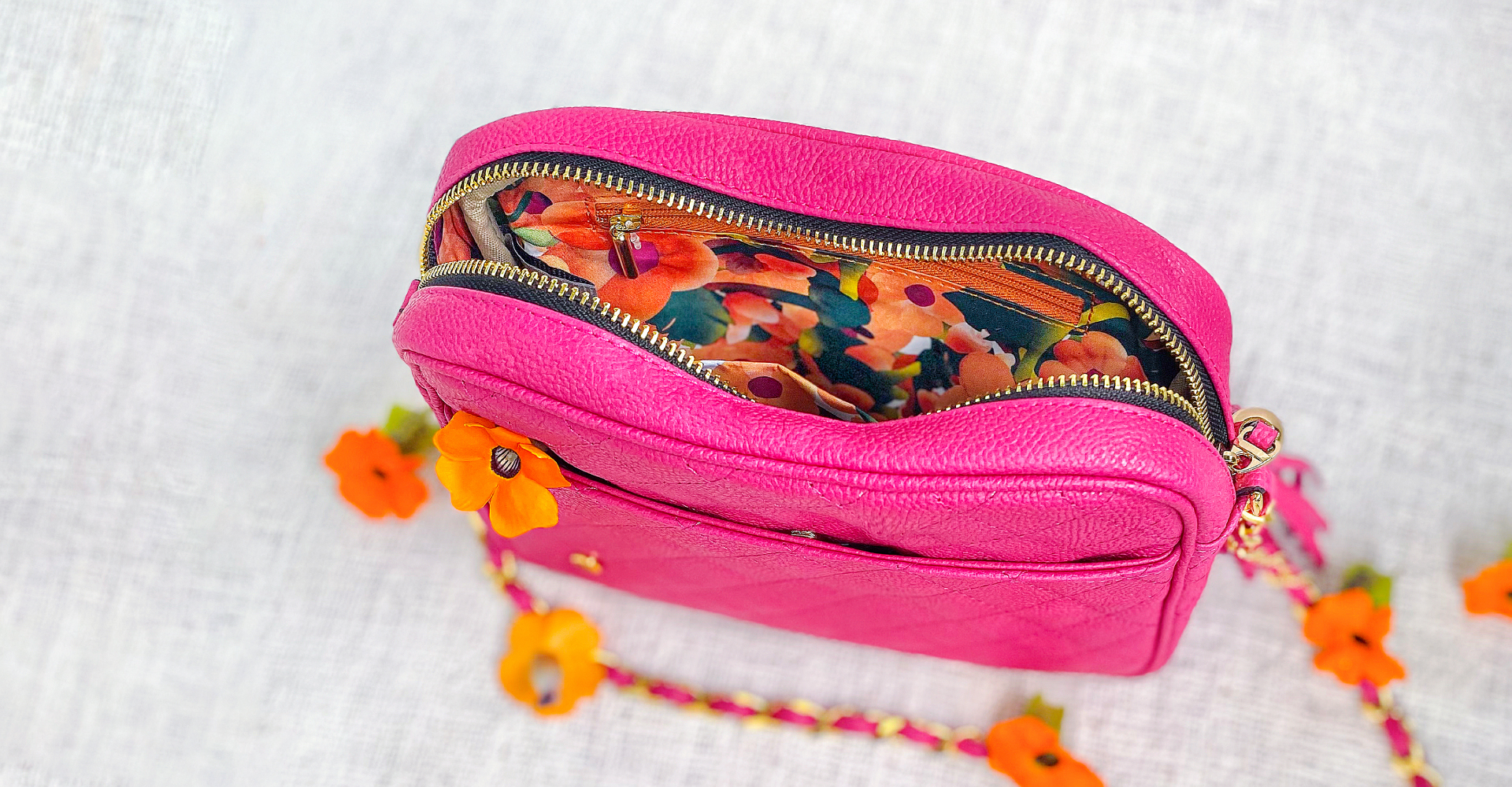
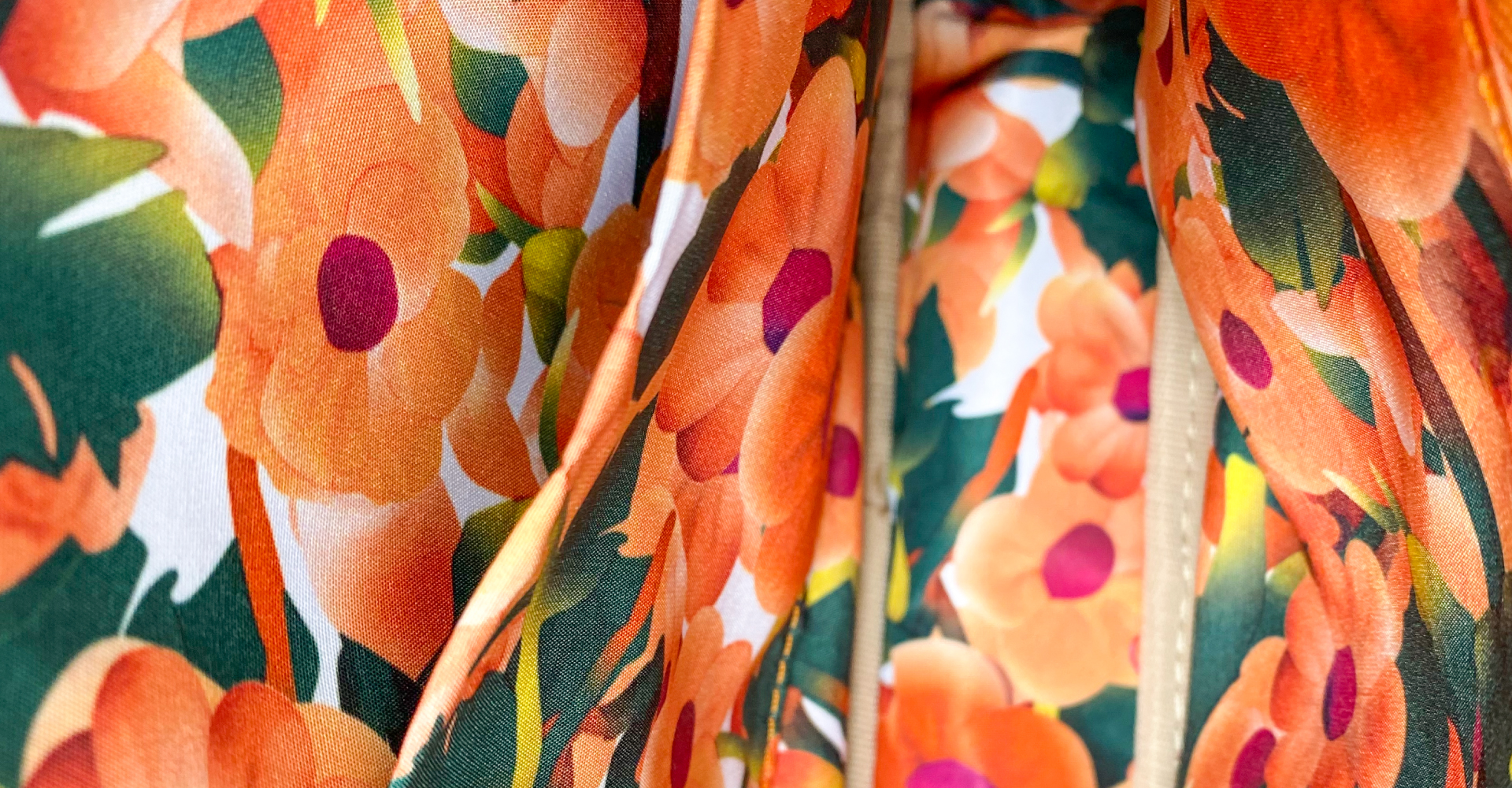
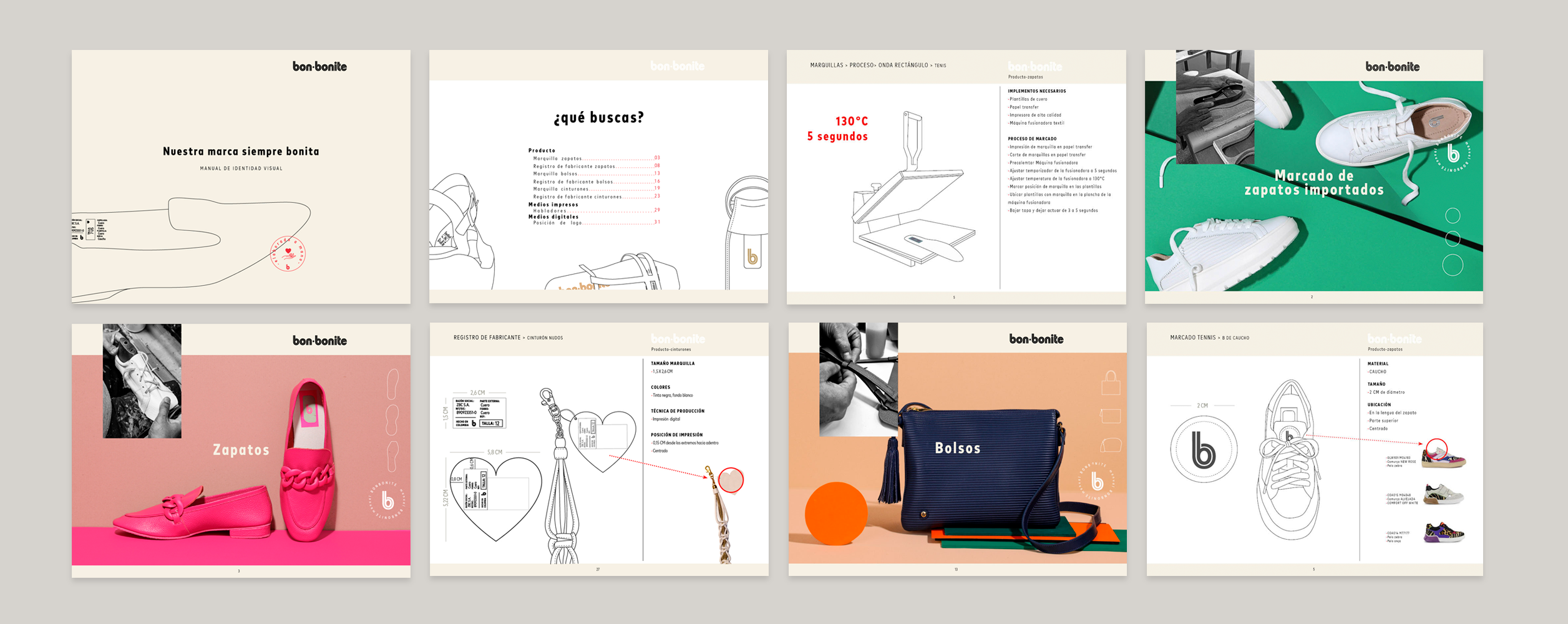
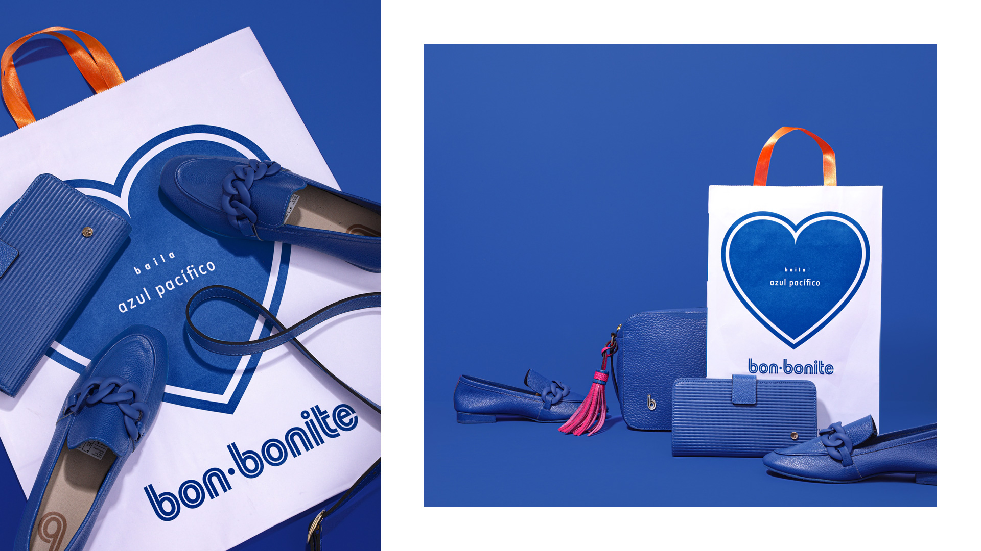
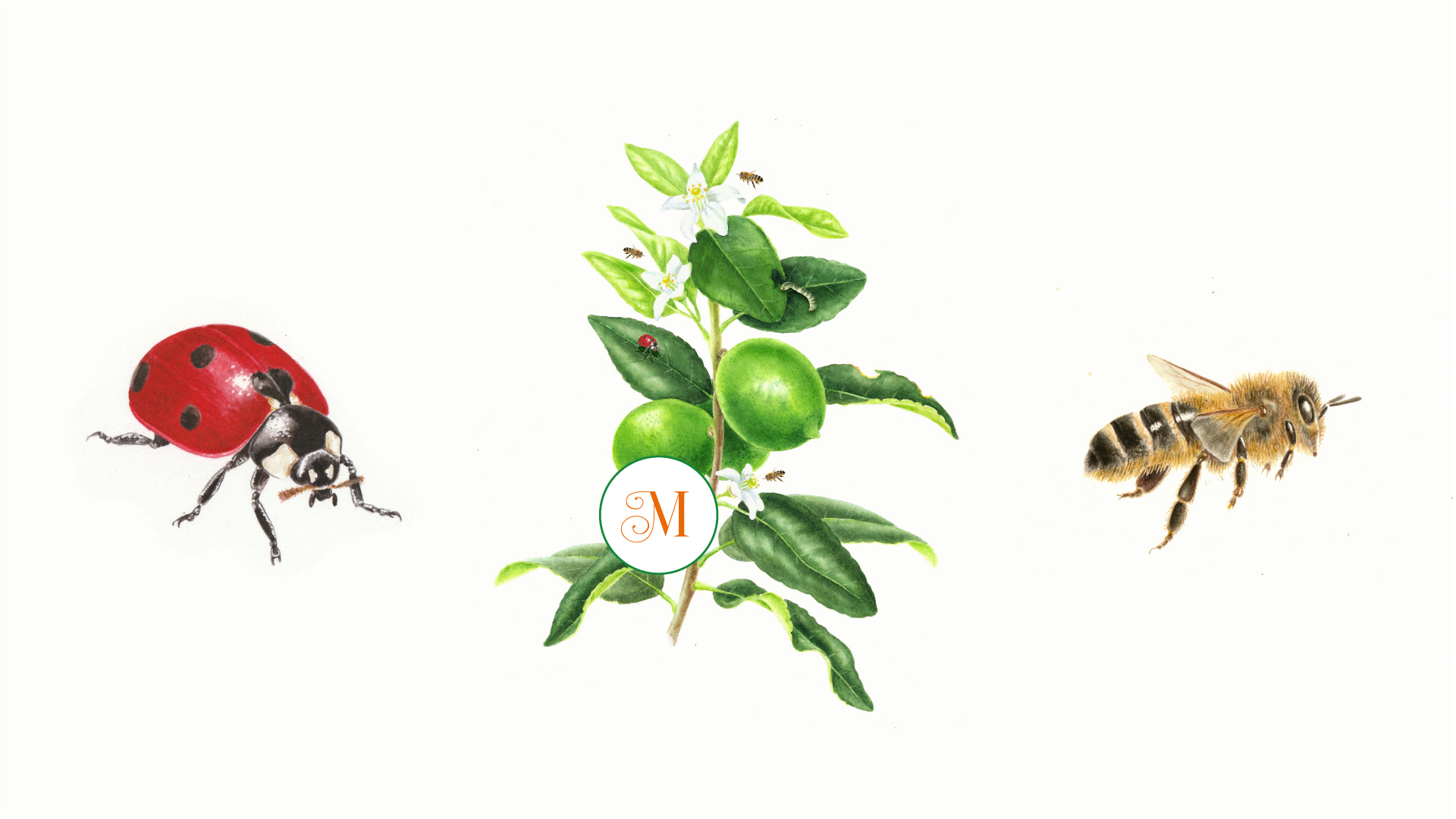
For the fifth consecutive year, the studio continues to be in charge of the communication strategy and visuals for the fashion brand bonbonite. With a very daring use of color, we try to give each campaign a particular design that makes it stand out from the others. We also handle typography in a very expressive way. In the case of bonbaile, (we created the name too) we can see a logo that uses perspective and volume to create a strong visual impact. Also in this campaign, we lengthen and repeat the lyrics to communicate the plasticity and joy of the dance.This year, we have focused on tactical campaigns, which aim to highlight the main themes of the brand (ecology, women’s celebration dates and dance, among others). Each campaign has digital media posts that range from interactive questions to animations and 3D videos. The stores also participate and we make the showcase, a card and a talker. The product could not be missing in the campaigns. For Saving the Amazon, a special Amazon rubber sole was developed and for mothers, a flower pattern was printed on fabric for bag linings and on leather for shoe insoles. One of the favorites this year are the soles. This is a very nice work to me and I am so happy to tell you that this design is in the oficial selection of Bienal de Madrid, in representation of Colombia. Other pieces, such as grocery bags, bag tags and new fabrics for products, have also been made this year.
bienal site
www.bon-bonite.com
Previous bonbonite designs: arutza bonbonite
Bon-baile: Logo and graphic design: Arutza Rico Onzaga / Animation y banner web design: Laura París / Video: Gabriel Leaño Casas MONTE
Saving the Amazon. Créditos: Photo: No visual design / Lettering sole: Marianna Rezk / Animation: Laura Paris / Illustration selva: Montenegro
Mother´s day: Flower illustration: Arutza Rico Onzaga / Animation: Laura París / Bag Photo: Arcal / Shoe Photo: No visual design
Manual: Art Direction: Arutza Rico Onzaga / Graphic Design and Illustrations: Laura París / Fotografías: No visual design
Motion “Season color”: Laura París
Soles Photography: Lucho Mariño
Info
Date:
June 30, 2022

