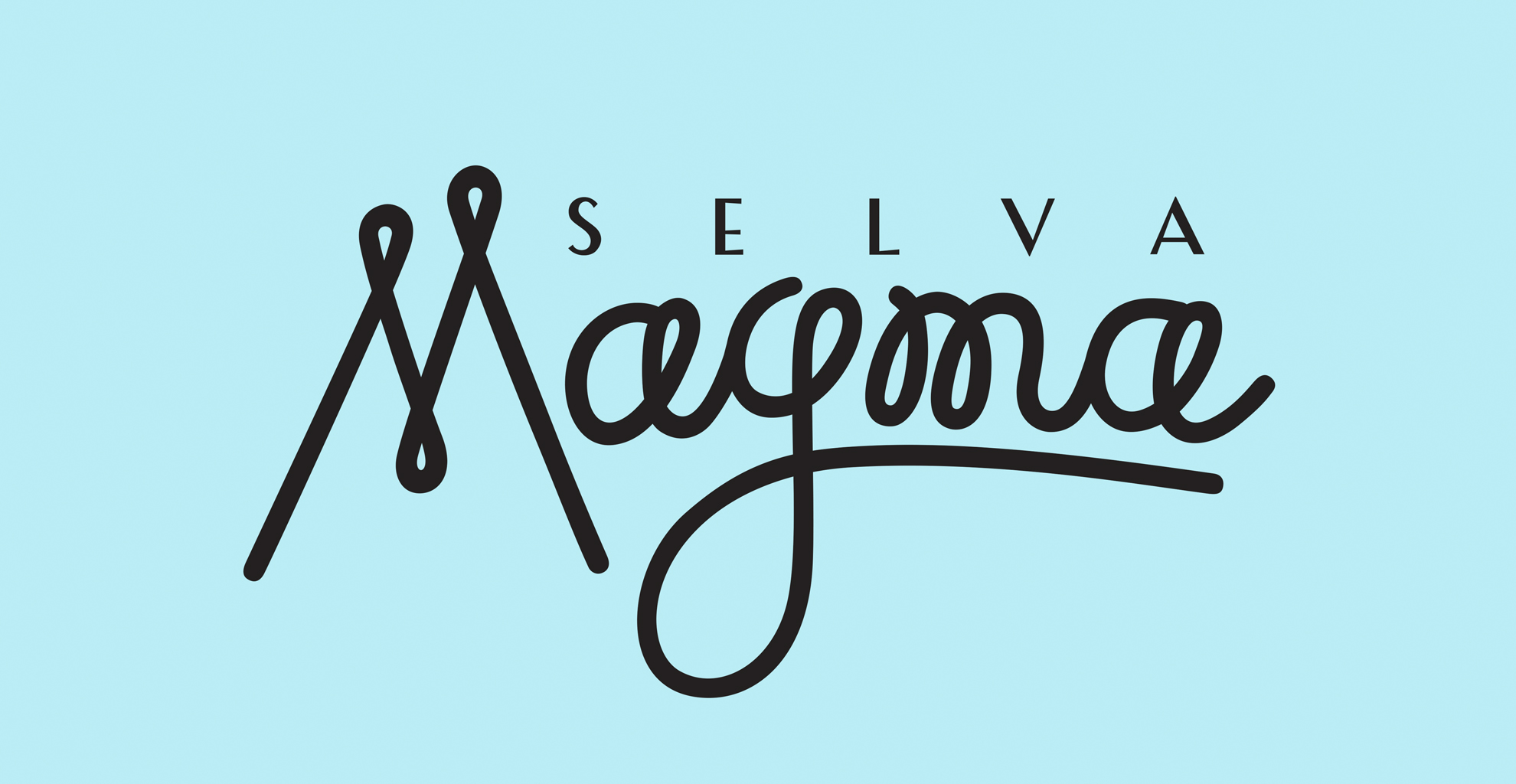
Packaging design and branding for Selva Magma
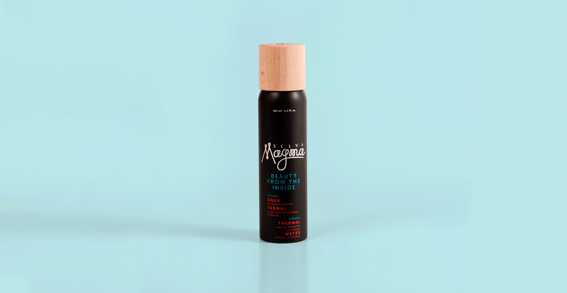
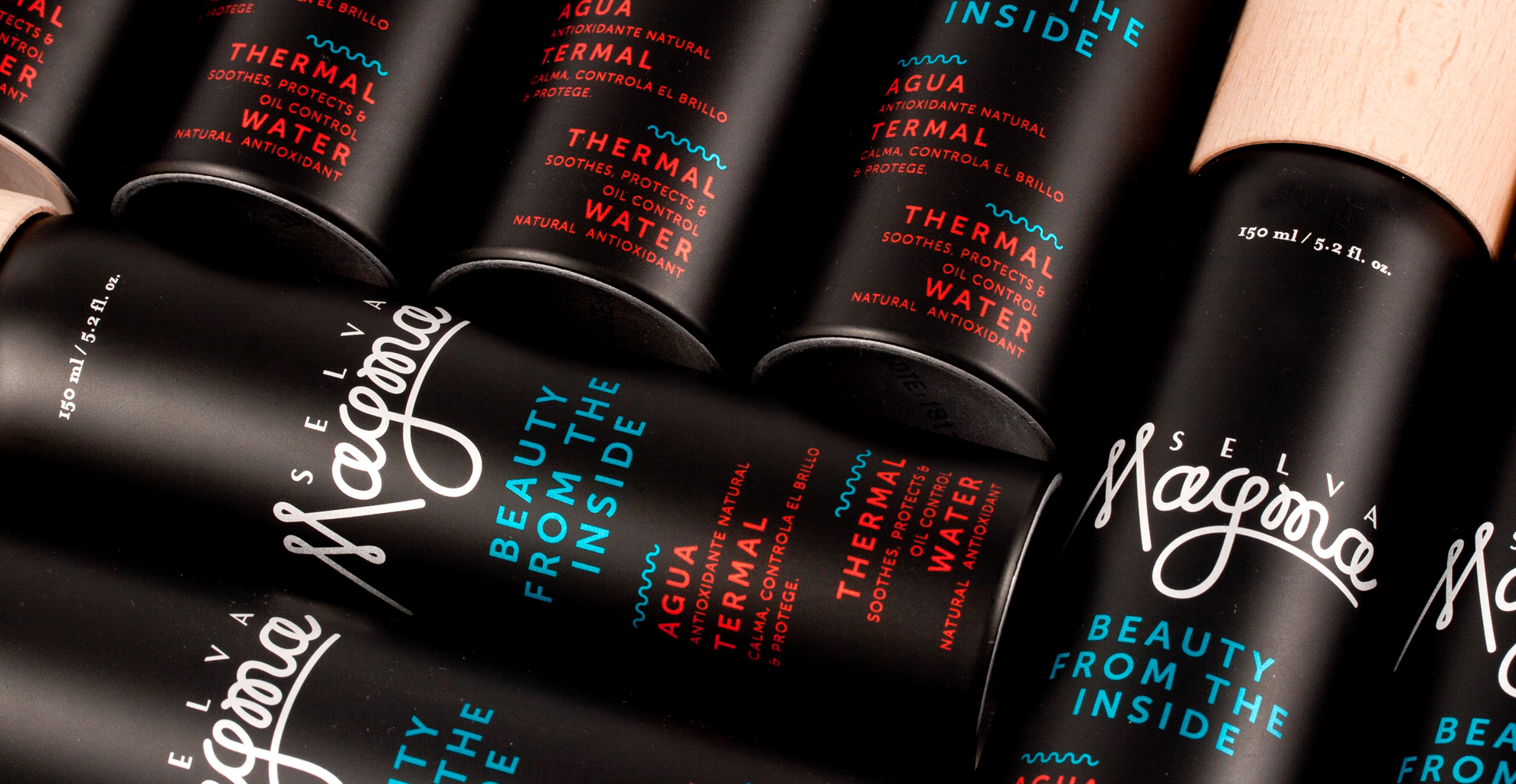
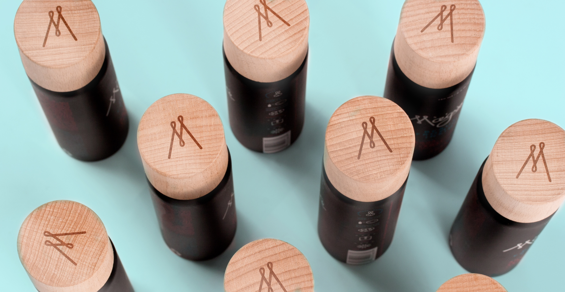
This is a complete project that starts with the strategy and market research for the product. When our client arrived at the studio, she had a packaging idea that did not fit the needs of the product or the packaging of the competition. Through an investigation carried out by PNG LAB, we were able to analyze that the best way to pack and preserve thermal waters were aluminum jars, which preserve the product in an ideal state that does not allow light to enter. We also proposed that these bottles have an atomizer that would facilitate the experience of use. After finding this packaging, we started working on the name. We use our own methodology that works on emotions and brand attributes in it. Selva Magma, is a poetic name that takes you to exotic, volcanic, primitive places. For this name I designed the letters with a contemporary and fun style that would encourage young women to use the product. The range of colors is quite a volcano! Black, orange and blue, represent the colors of earth, magma and water.; the ingredients that make this thermal liquid a different, unique product.
What we did?
1. Strategy
2. Research
3. Name
4. Logo (lettering)
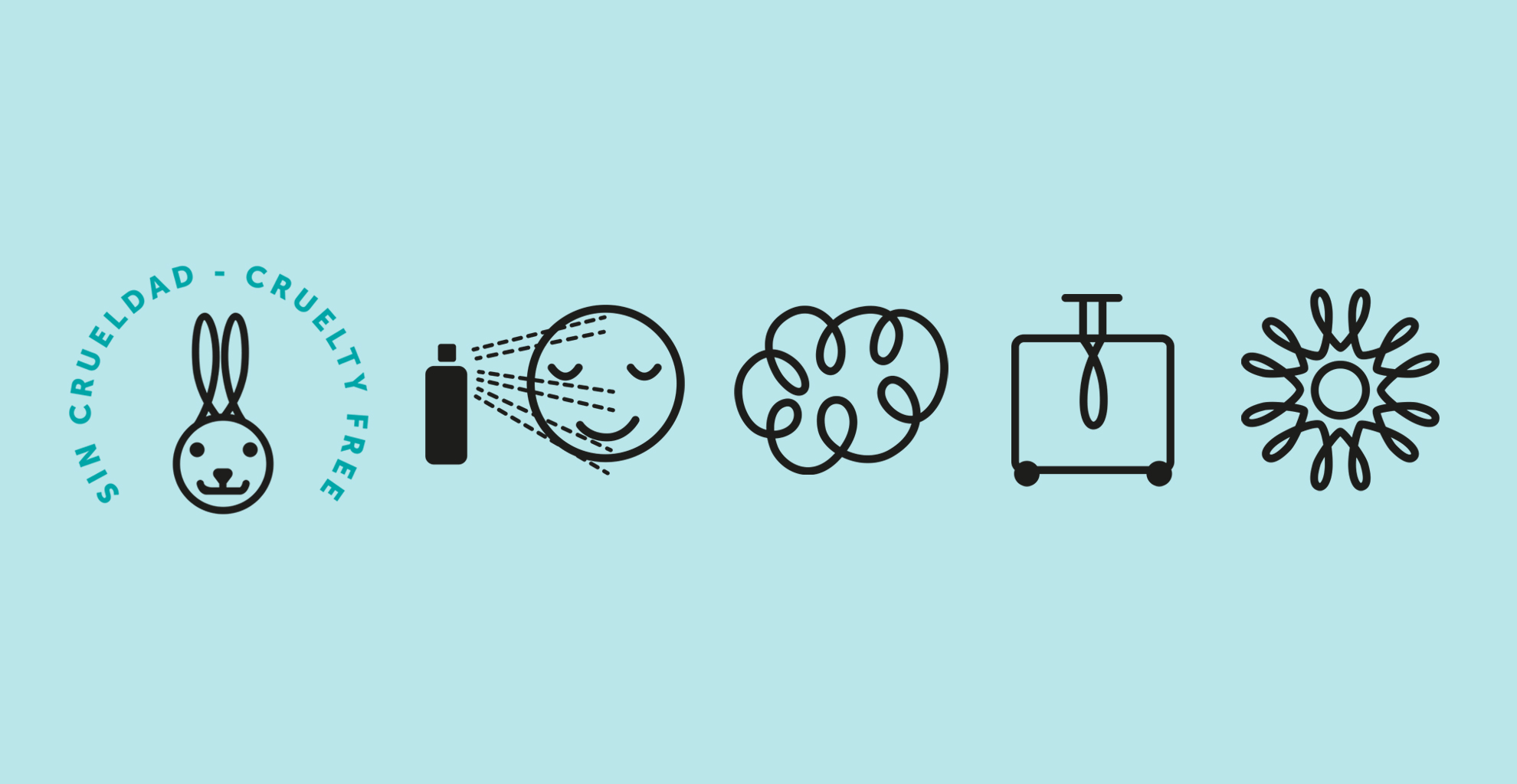
5. Icon Design
6. Slogan
7. Packaging
See the Sharks speaking about our brand here!
See another packaging project here

Related Projects