Brand strategy design for Water Revelation
Water Revelation is an art project created by the Colombian artist Venuz White. She came to the studio looking for an identity that reflected the sacred of his work in which she captures the divinity of Water. She serves like a medium between the divine and the human realm. When she first told me this I was a little nervous because working for an artist is always a challenge. But for my surprise, the branding methodology of the studio suited perfect on her project. This project took 6 months in its development because it is a SUPREME branding package that has strategy, basic visual identity and piece development like the film credits and the poster. Always when you have real stuff you will need more time. SCOPE: Strategy / Logo / Color Palette / Typography / Film Poster / Film Credits / Book Cover / IG feed template / Stationary
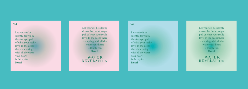
C O L O R P A L E T T E
The studio proposed a very romantic colorful system with enough colors for the many products of the brand.

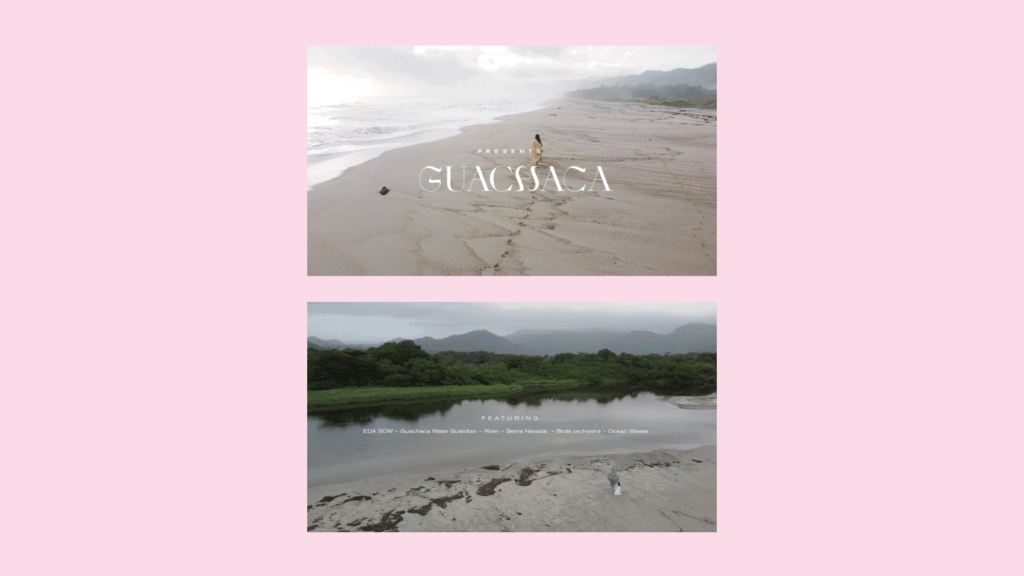
F I L M C R E D I T S
They were proposed to put them 2 minutes after the video had started, because we wanted to be more poetic and have a different approach that make feel the film more independent.
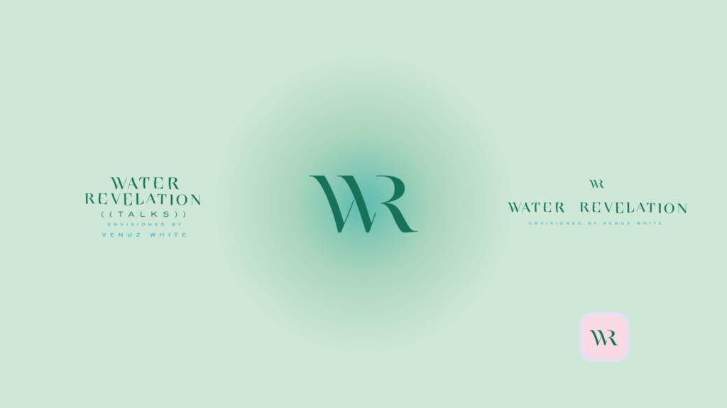
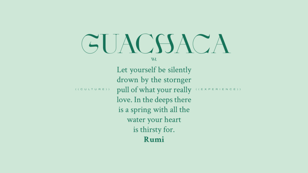
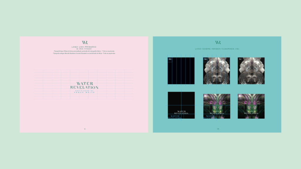
T Y P O G R A P H Y
We choose 3 different fonts for this brand. A Display one for amazing and big titles. A very modern and stylish serif font for texts. And one of my favorites: a extended font for subtitles. This richness of shapes gives to the brand a wide feeling of elegance and mysticism. Each font has its goal in the system. Fonts are so important because it is not the same to have a regular and generic font that saids nothing to the audience that to have a beautiful and designed font that you do not see all the time. I think this creates distinction and branding is all about that!
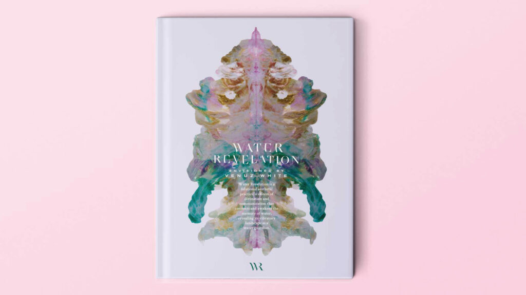
B O O K C O V E R
P R E S E N T A T I O N G U I D E S , W E B , S T A T I O N A R Y, G U I D E L I N E S S
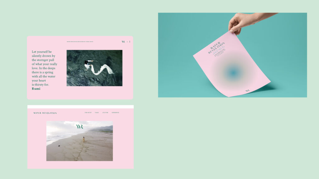
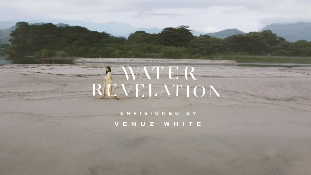
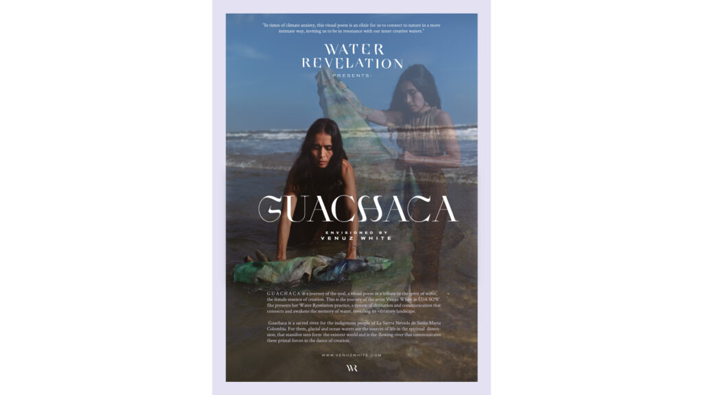
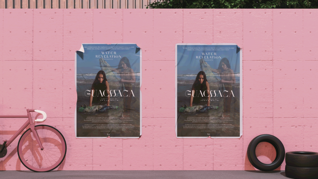
F I L M P O S T E R
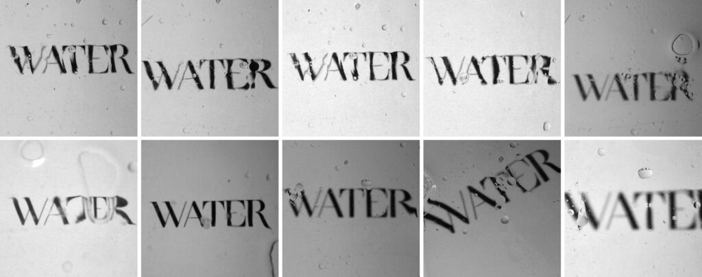
P R O C E S S
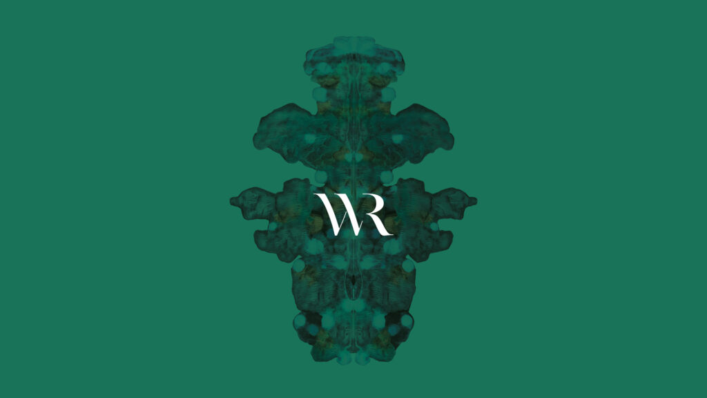
A minimalistic and poetic style were the solution we gave to all the visual of this brand. I made several experiments with water and typography in order to discover how this liquid changed the shapes of the letters. I took photos of this process and then I make the logo entirely digital starting from a font that I manipulate until I had the desire design. Venuz loved this methodology because it was close to her work in which the water express and make the guardians.
Related Projects