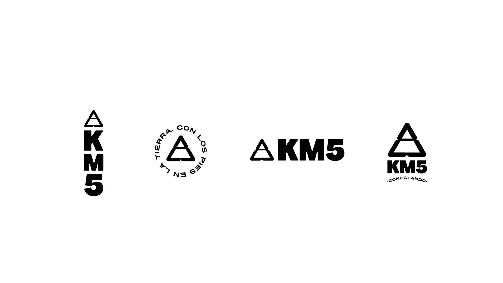
KM5
This is a new brand of sneakers that wants to compete in the hectic and very interesting market of white shoes. The first thing we did was to ask ourselves why do people like white sneakers so much if we know that they get dirty? Researching to answer this question we found that they are worn by athletes, presidents, designers and young people; in elegant parties such as the Oscars, in Prada fashion shows, at school, in the street… in other words, by everyone all the time! We understood that this particular type of footwear represents for western society that much sought-after idea of equality among human beings. That’s why KM5’s slogan: CONNECTING. Connecting cultures, friends, thoughts and ideas. The visual system was made with an inclusive street style image in mind: urban lettering, popular messages and a black and white color palette. The lettering for the logo was custom-made with the idea that it would be used on labels, soles, shoes and clothing. I designed a heavy-weight dry stick structure with rounded tips that conveyed warmth, friendliness and confidence. The icon was the idea of my client who wanted to work with the triangle since it represents in alchemy the 5 elements of nature. And this was a great challenge because the triangle figure has been used a lot in branding! In this work we did: communication strategy, visual system and brand book that included among others the cover of the first mix and music compilation of the brand made by the Bogota DJ Trippulante Jet. Project duration 3 months.
Info
Date:
July 16, 2021

Related Projects