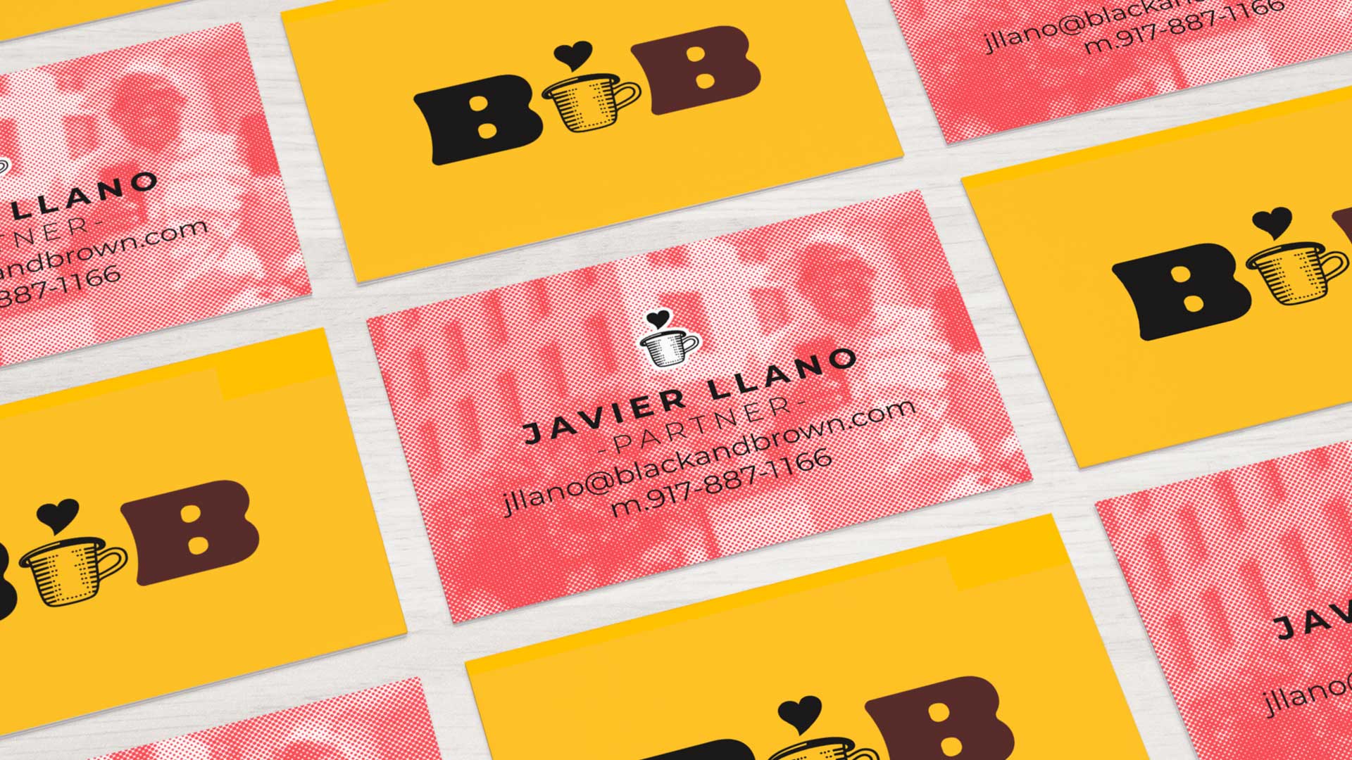
Logo branding for BB Coffee House
The owners of this Coffee House company located in the United States are an African-American and a Latino. In USA most of the business owners of coffee are white and most advertising and brands are aimed at that population. BB Coffee House seeks to generate empathy and give a voice and money to Afro and Latino communities of the United States through a high quality coffee (Specialty Coffee) at a very fair price.
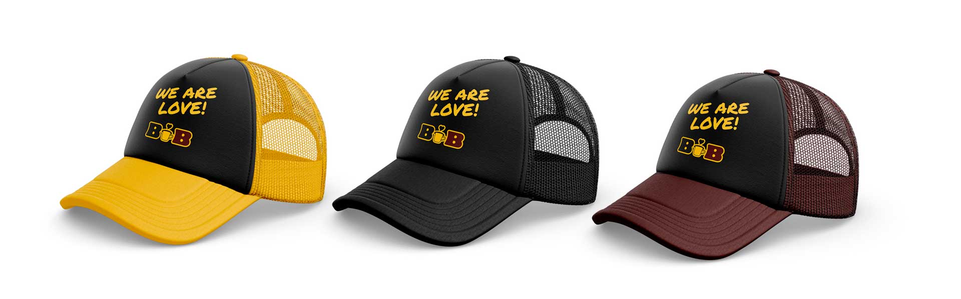
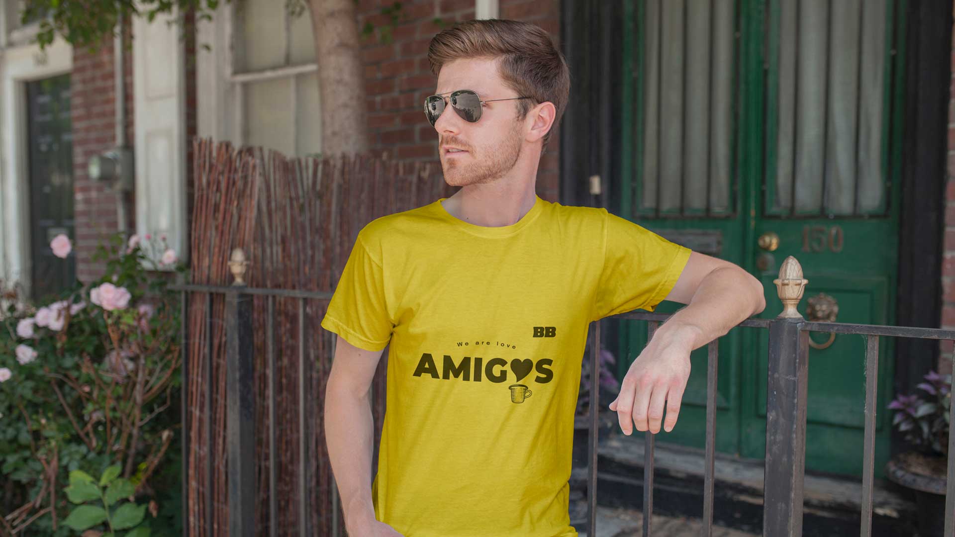
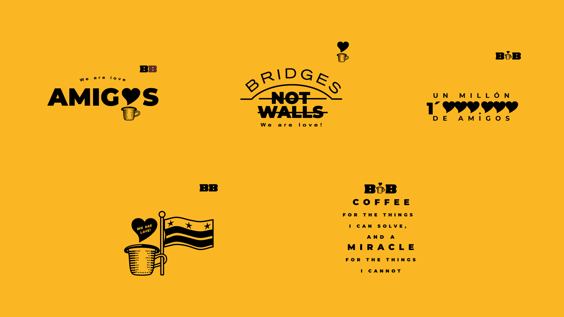
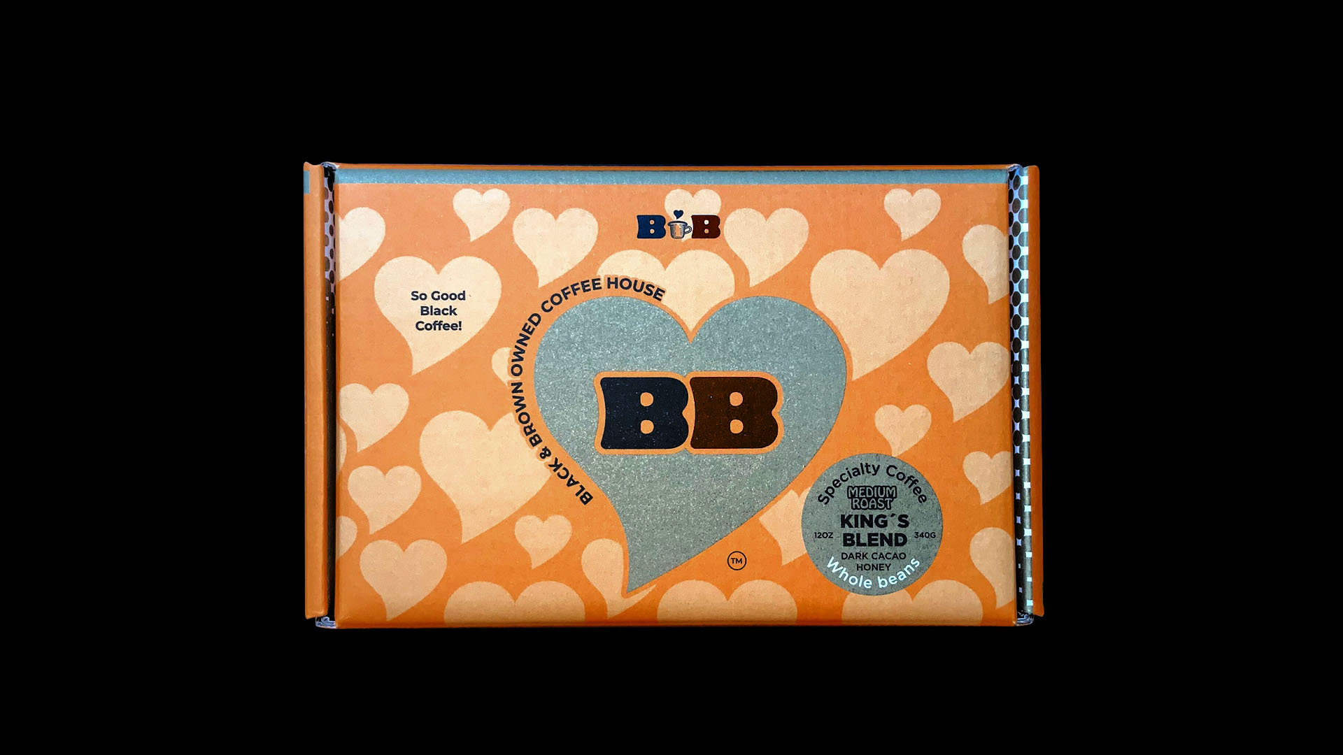
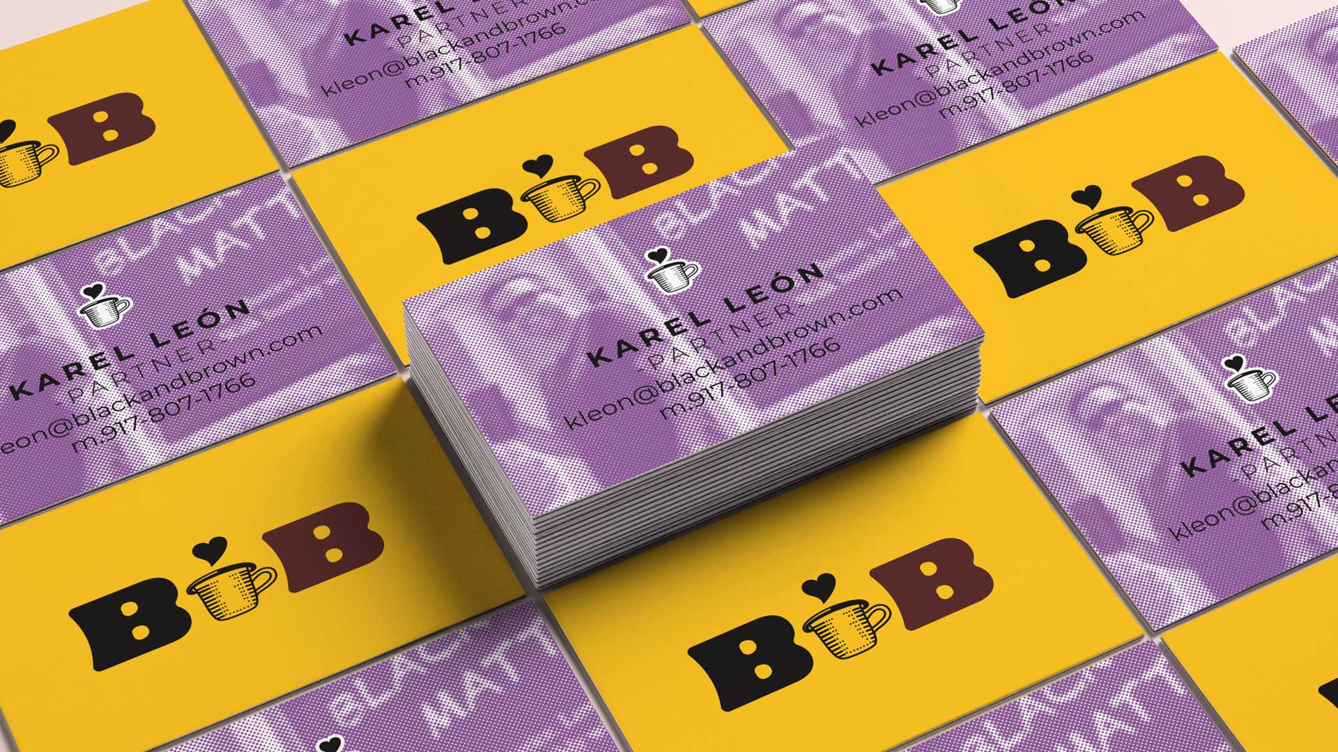
The visual identity that I developed is inspired by the visual elements of the Black Live Matters movement, how the yellow color and the letters written by hand among others. We wanted the brand to see more how a social movement than a coffee business. We wanted people to generate empathy and respect for minorities. I knew it was very important to generate a powerful icon, easy to remember and with a strong idea. That’s why, in the process it occurred to me that a black heart could come out of the coffee cup! My clients understood the idea immediately and felt emotion when seeing the logo.
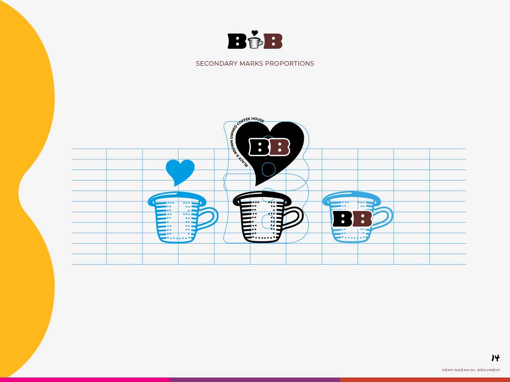
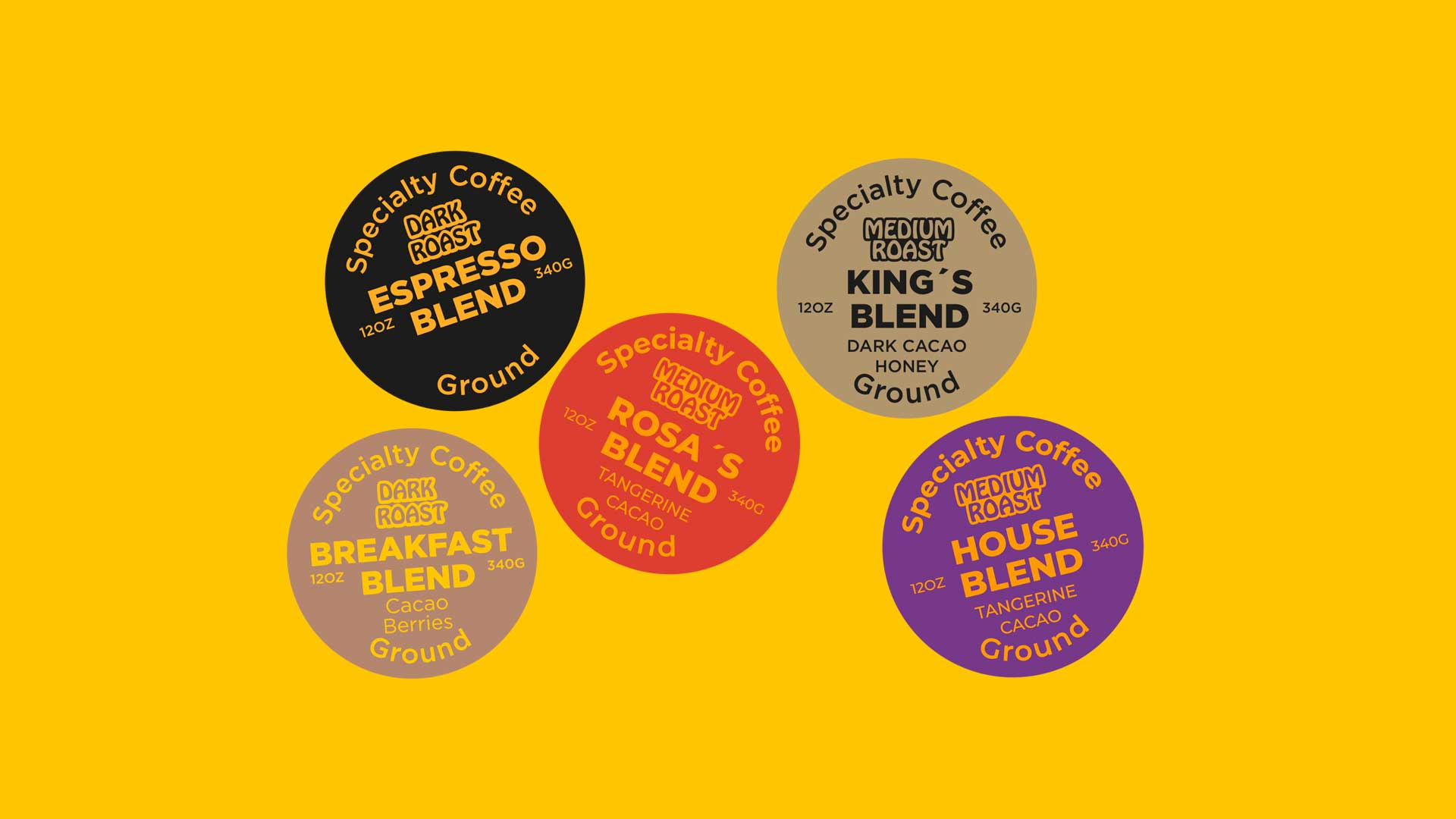
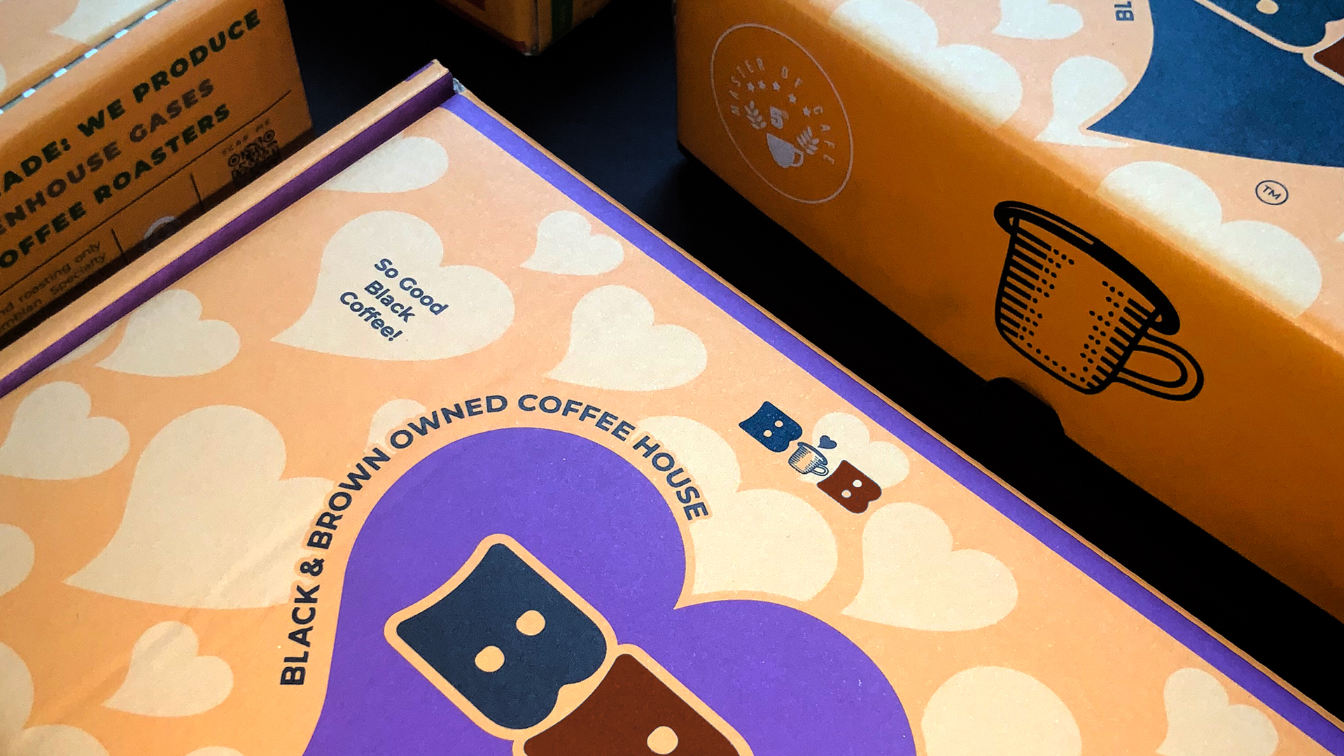
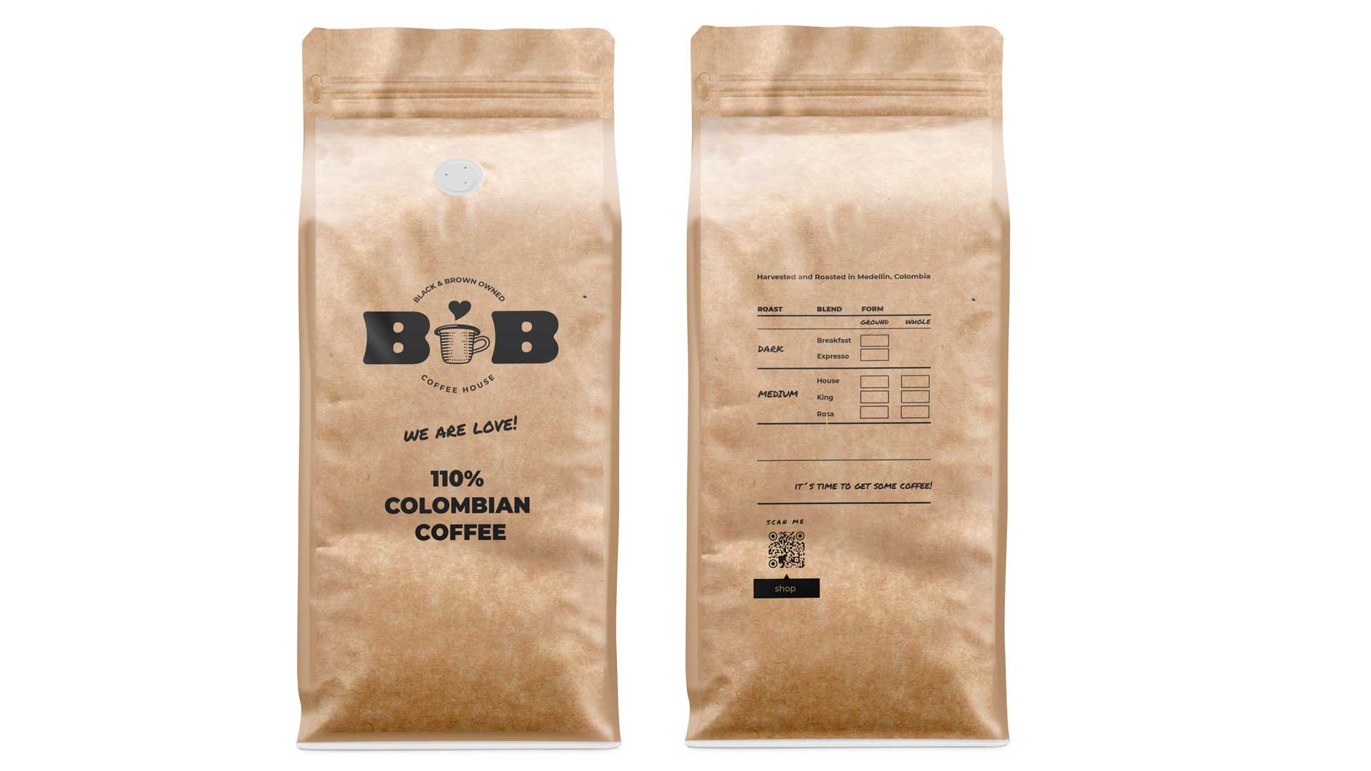
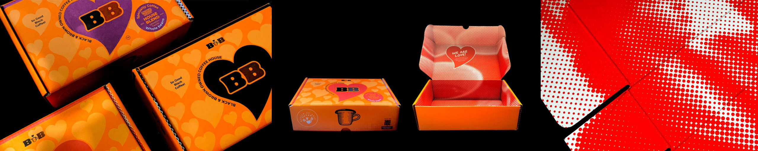
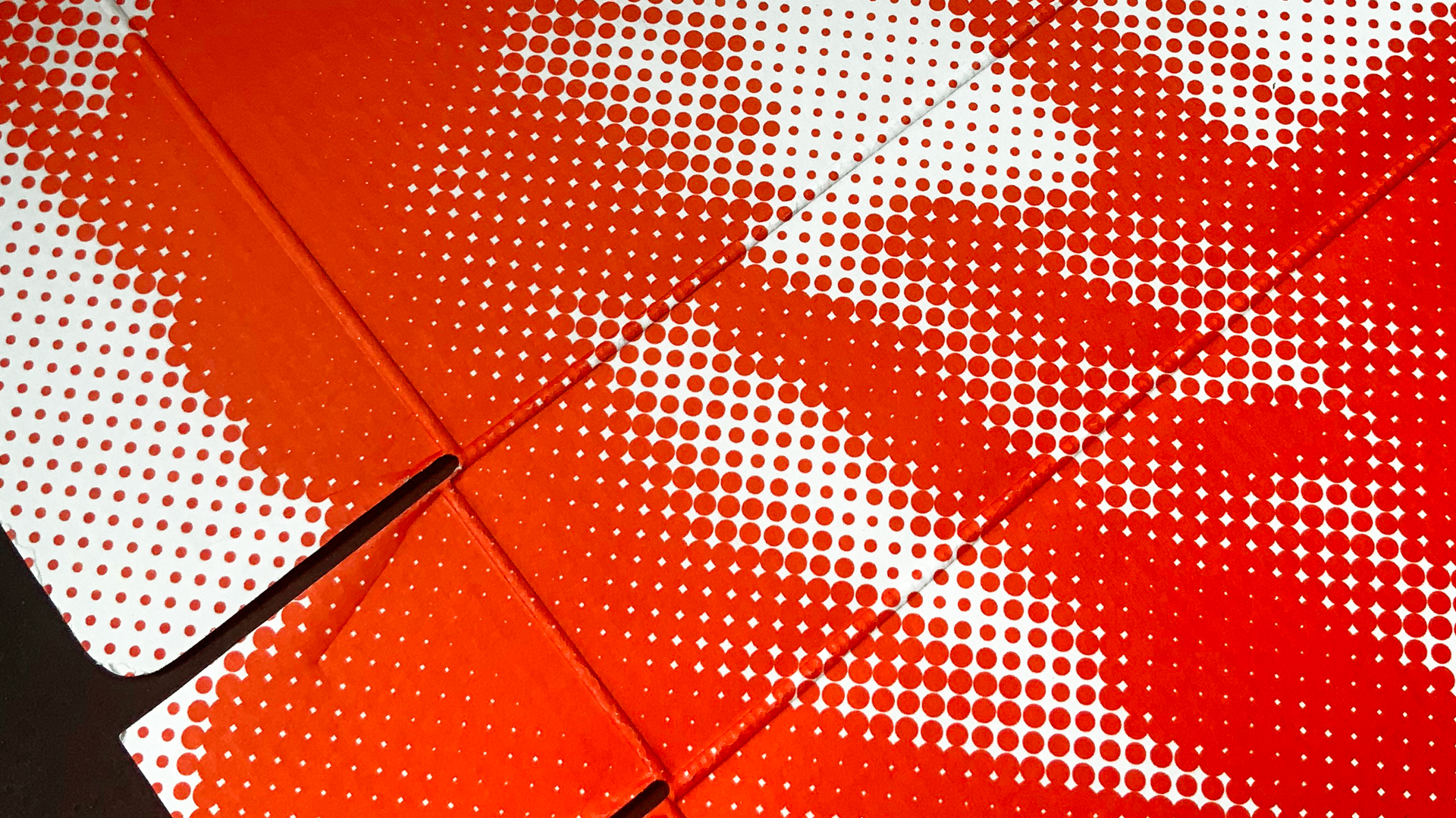
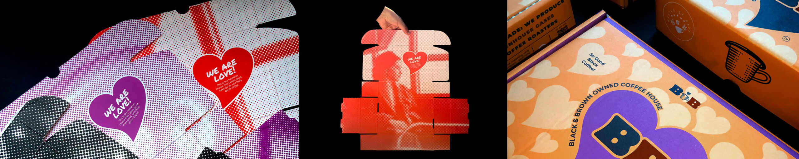
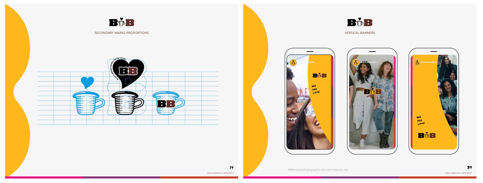
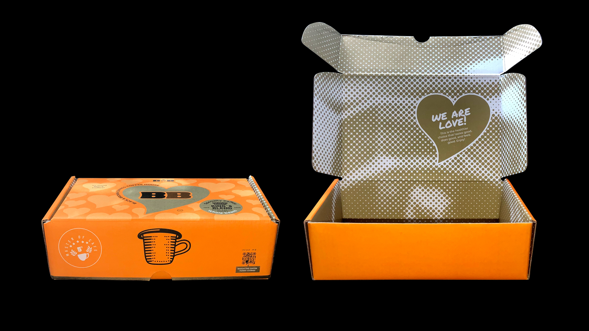
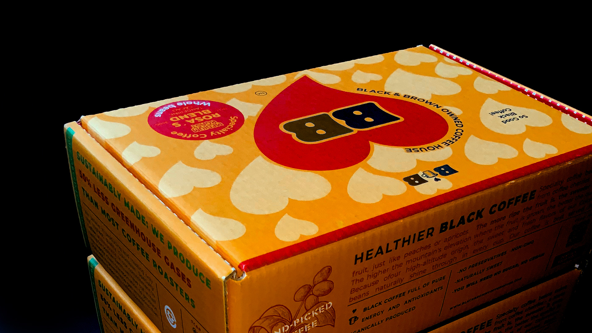
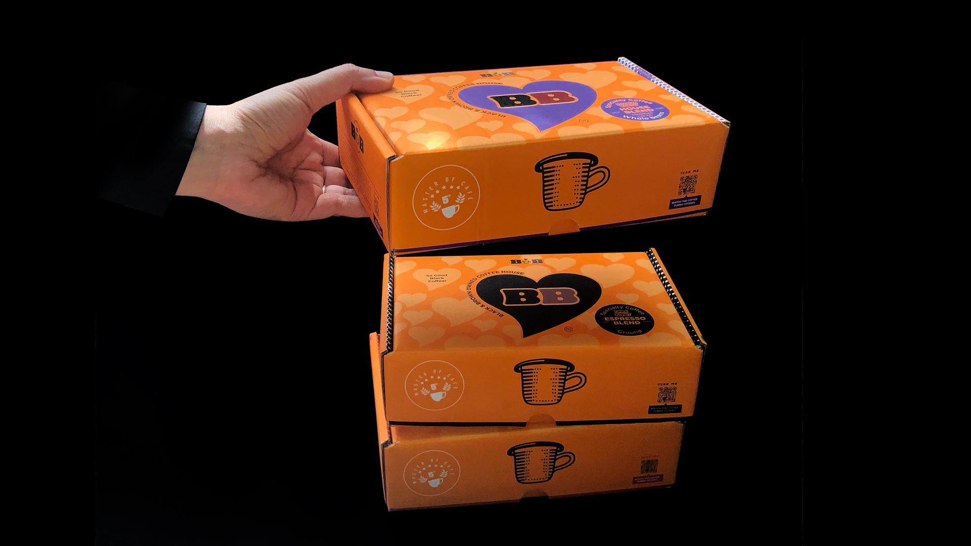
The BB letters were designed exclusively for the brand with round and chubby shapes that had enough reading already outside in small sizes such as web or large sizes how are the packaging. The icon was drawn to pencil first and then vectorized in Illustrator. We wanted the design style to be inclusive and quick to understand. The development of this project contemplated: logo, packaging in stock market and box, templates for social networks and brand manual. The development time was 9 weeks. The coffee´s box is full of hearts, representing the love we want to spread between all people. When it is open a playful halftone image appears. Each flavor has its color and the boxes are full with details like the African textiles. All the packaging is a tribute to the black and latino esthetics.
Info
Date:
June 23, 2021

Related Projects