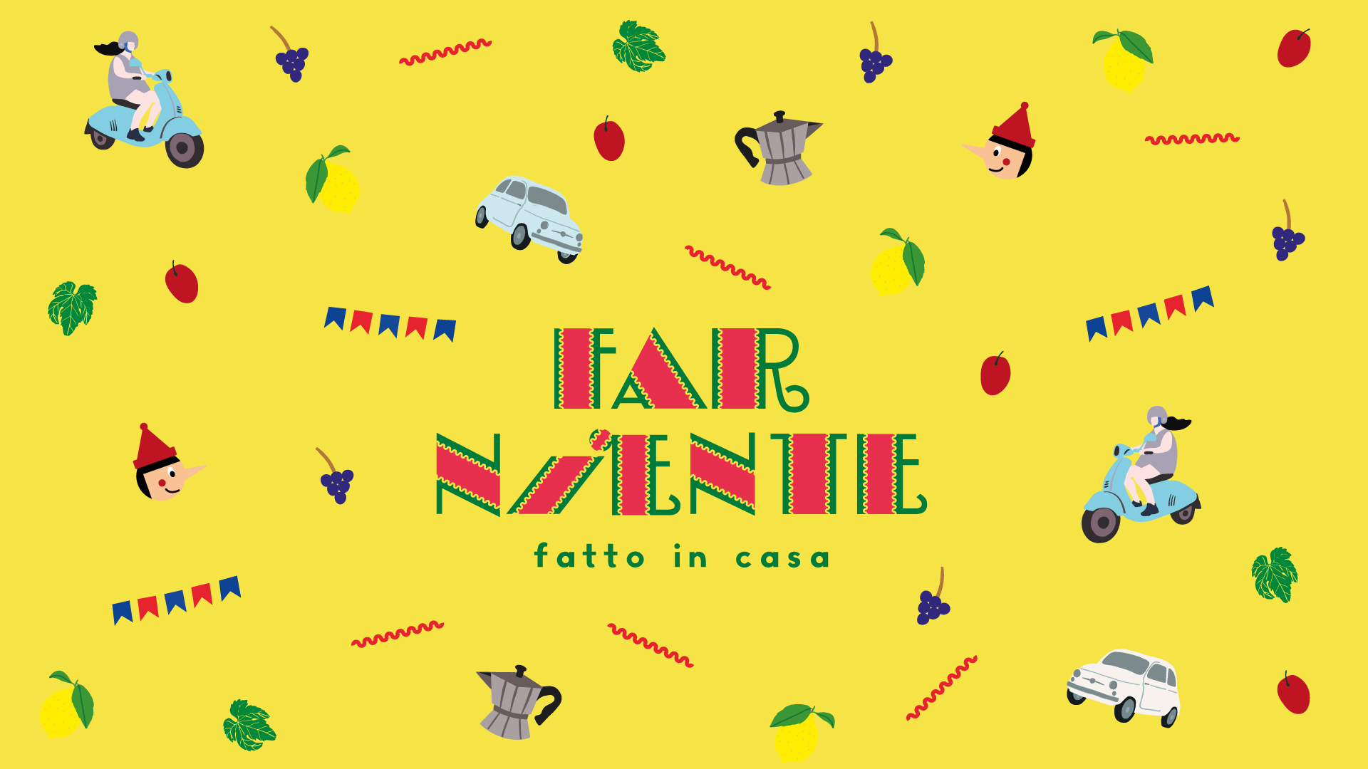
Branding Design for Far Niente Restaurant
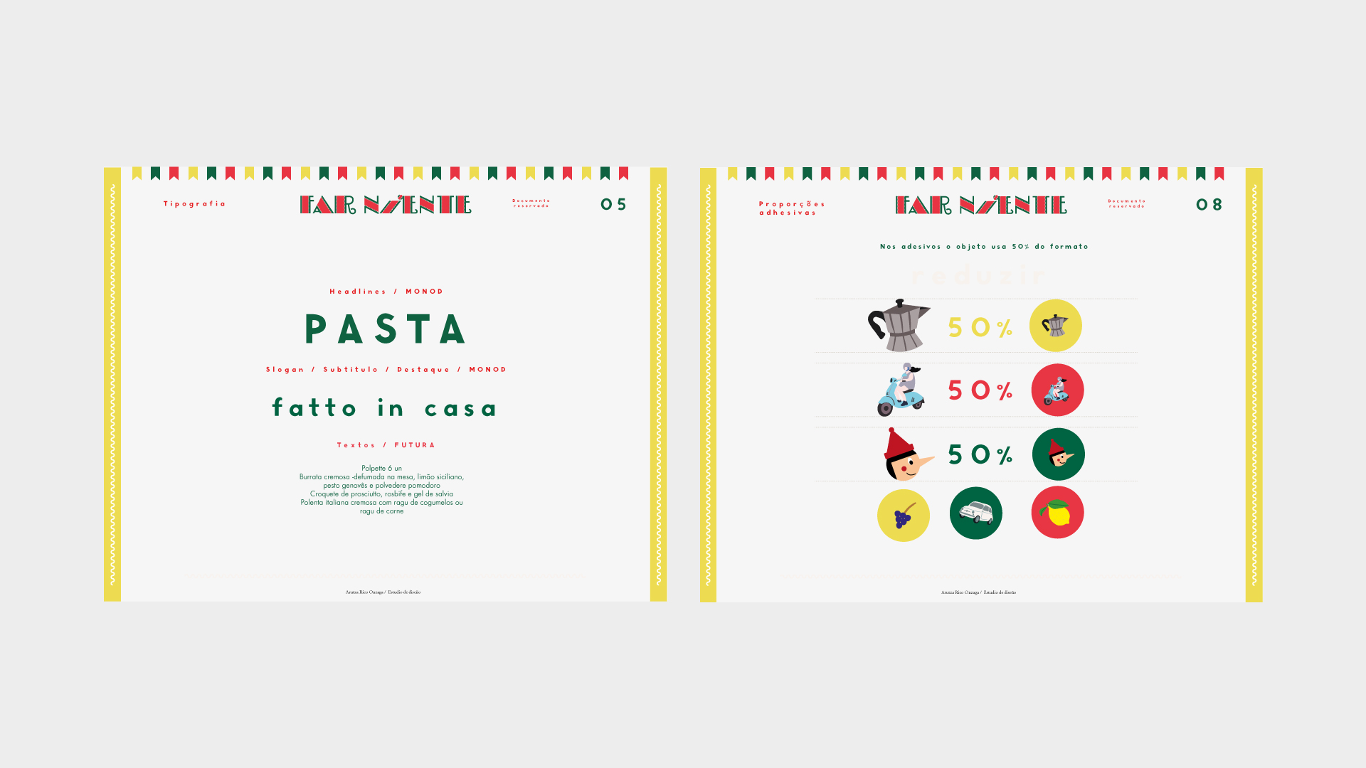
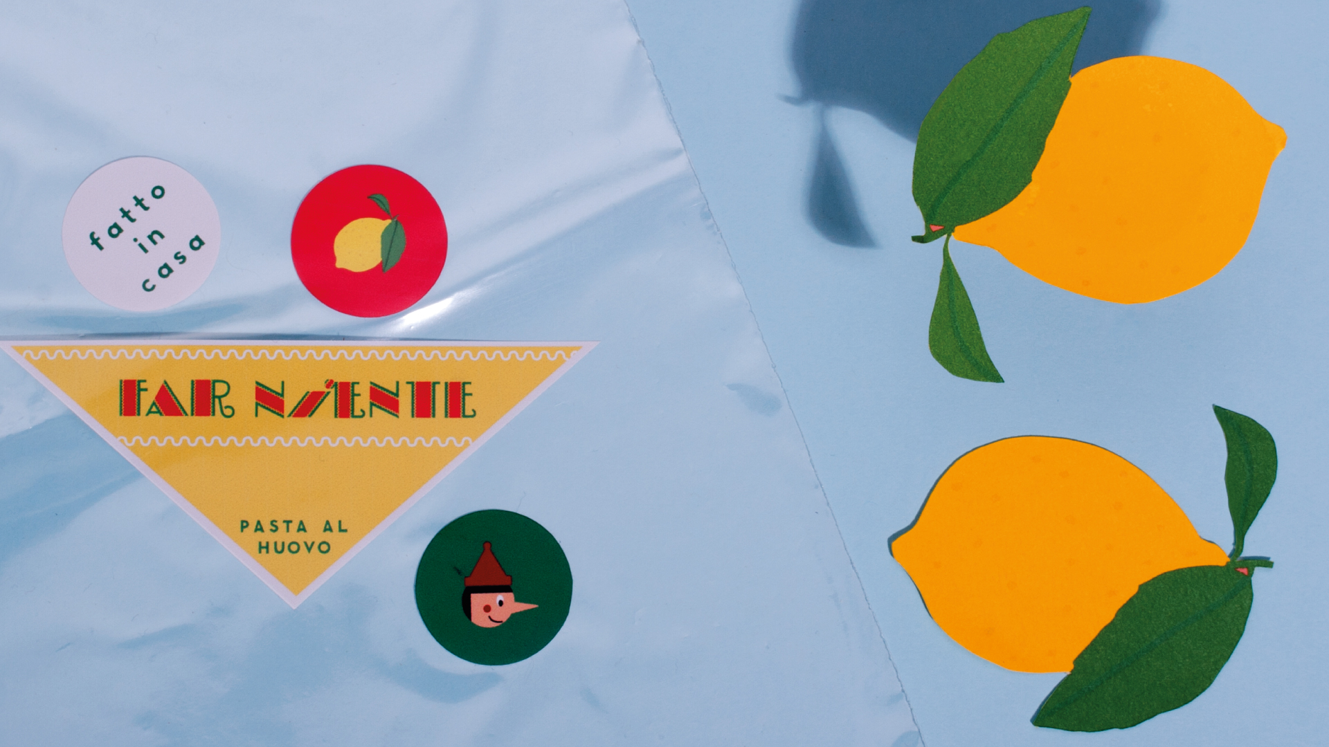
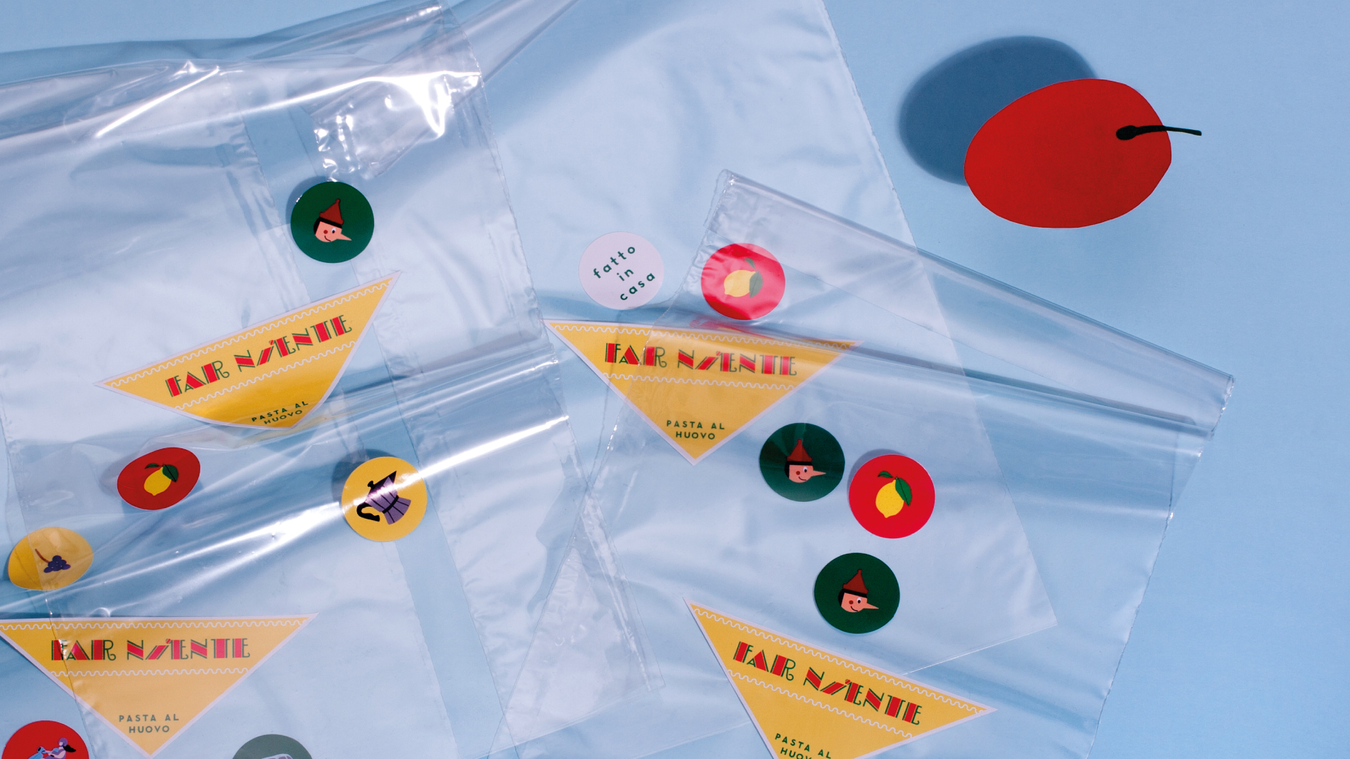
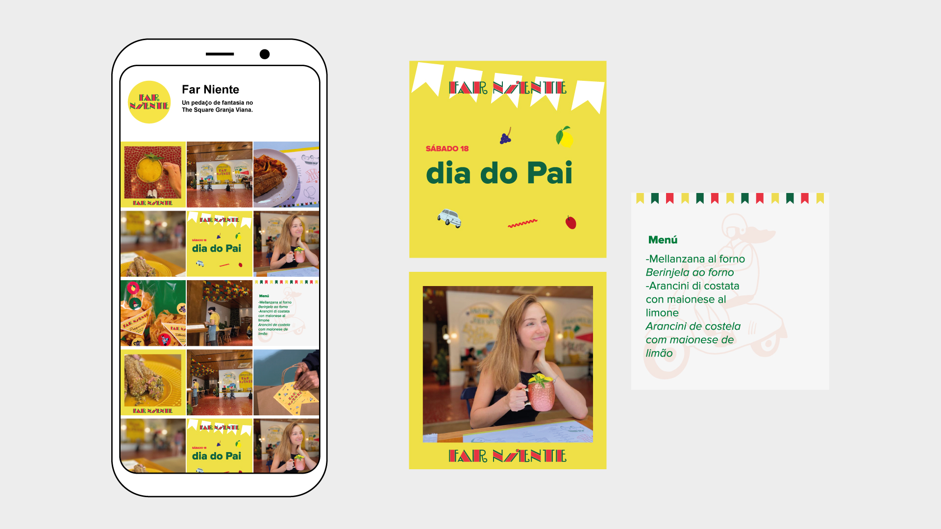
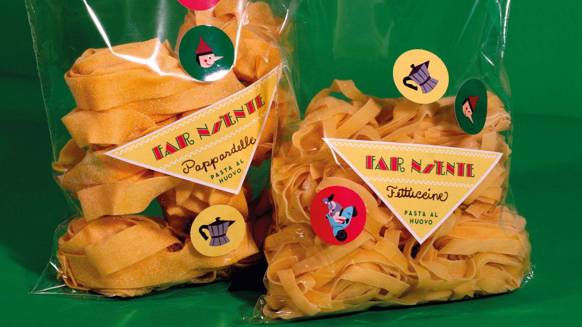
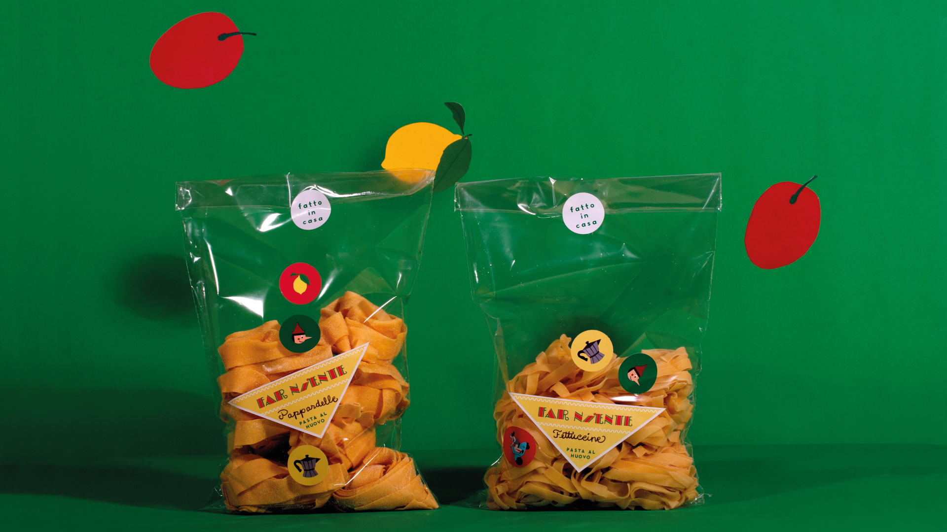
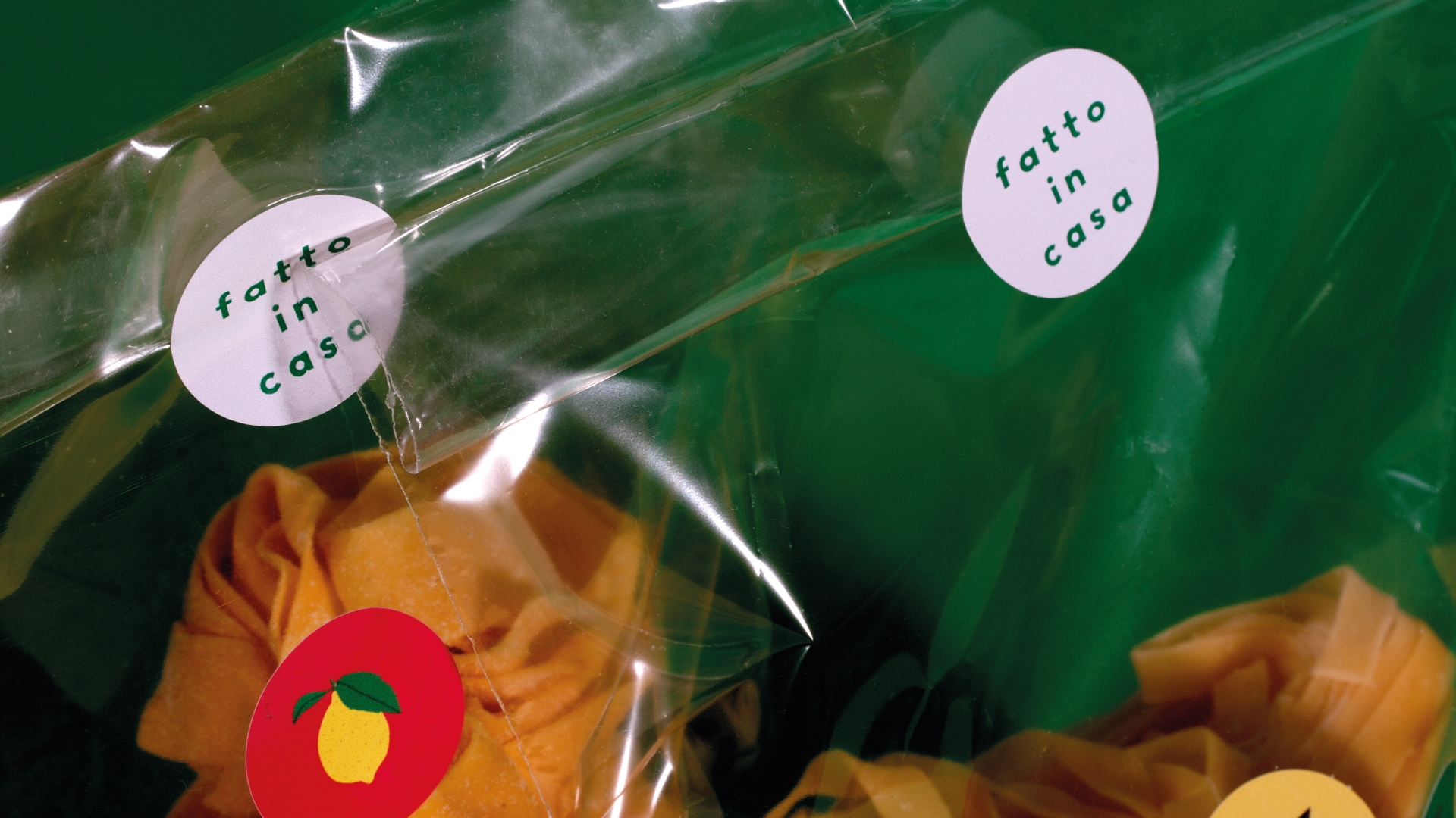
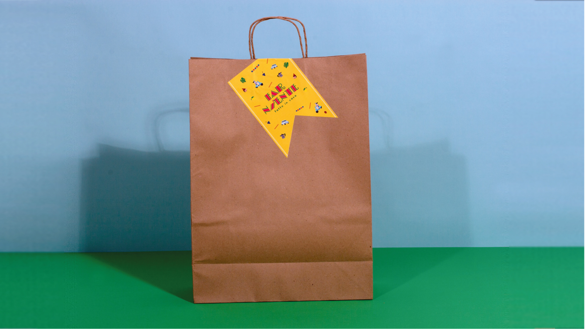
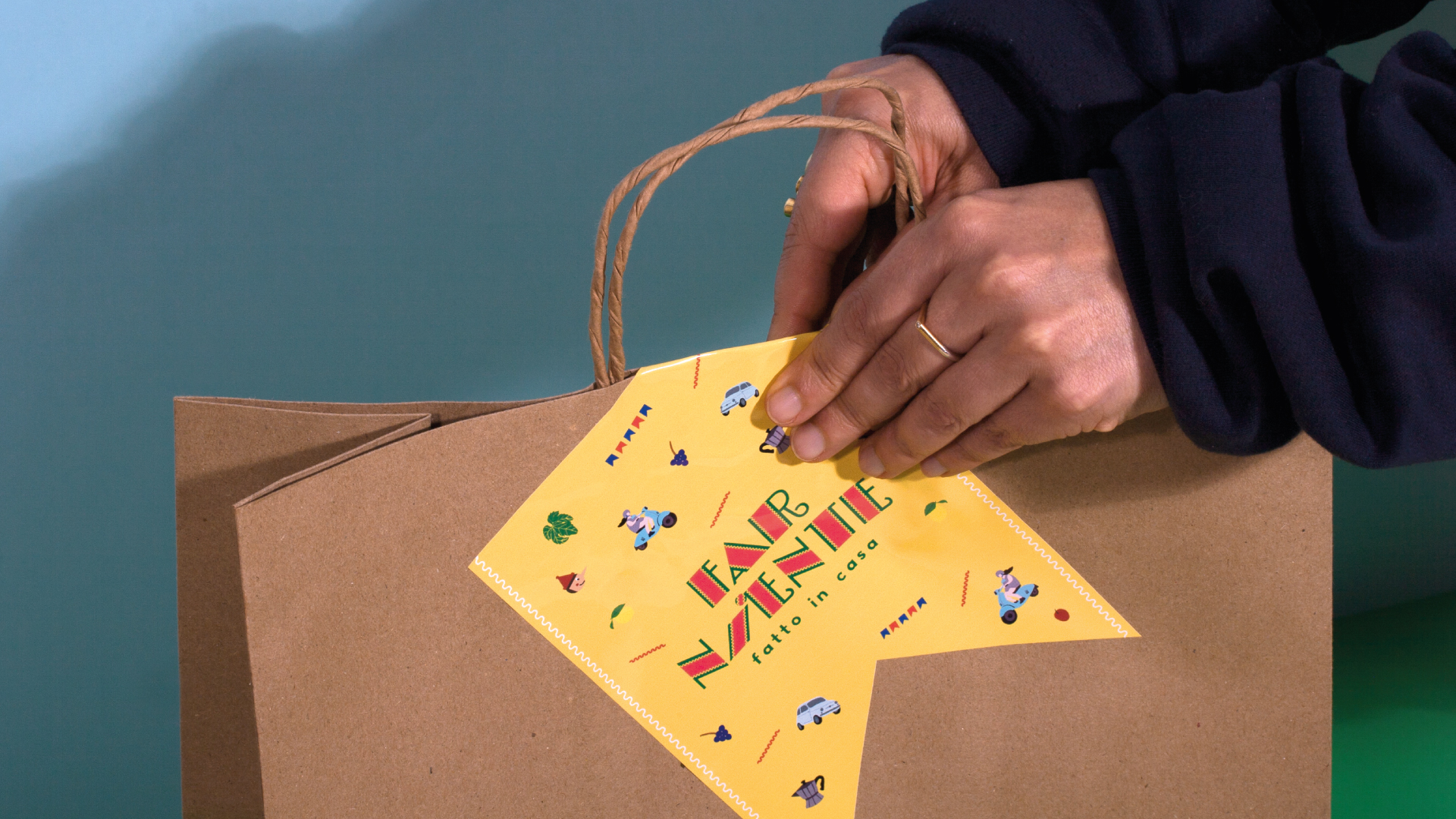
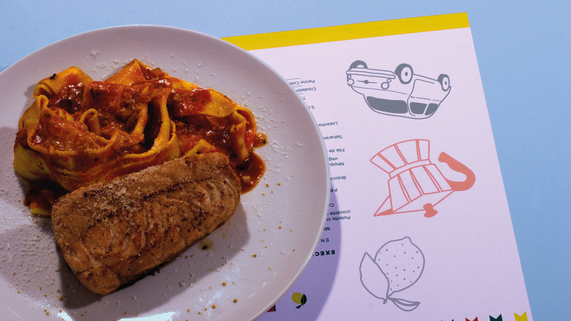
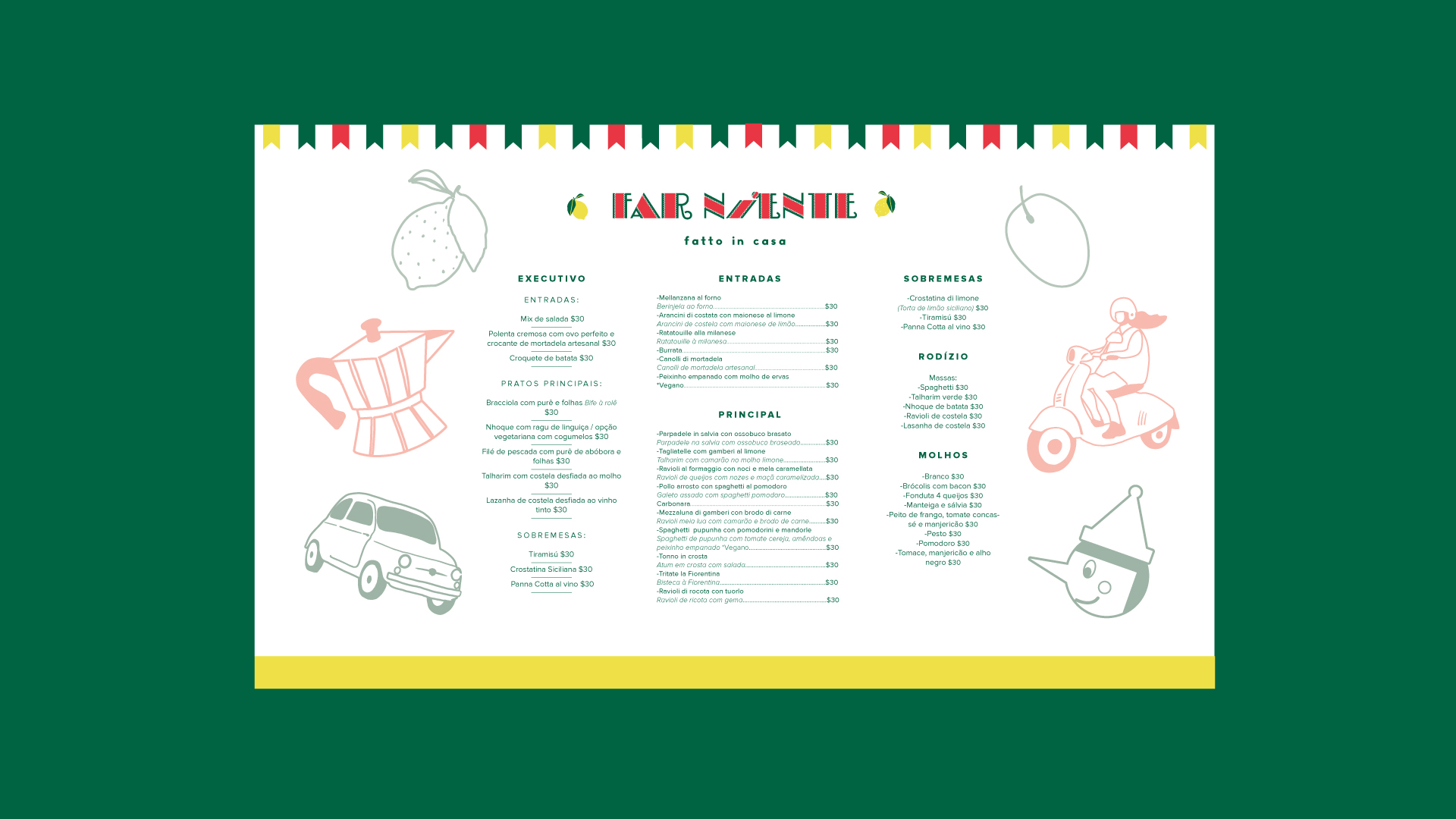
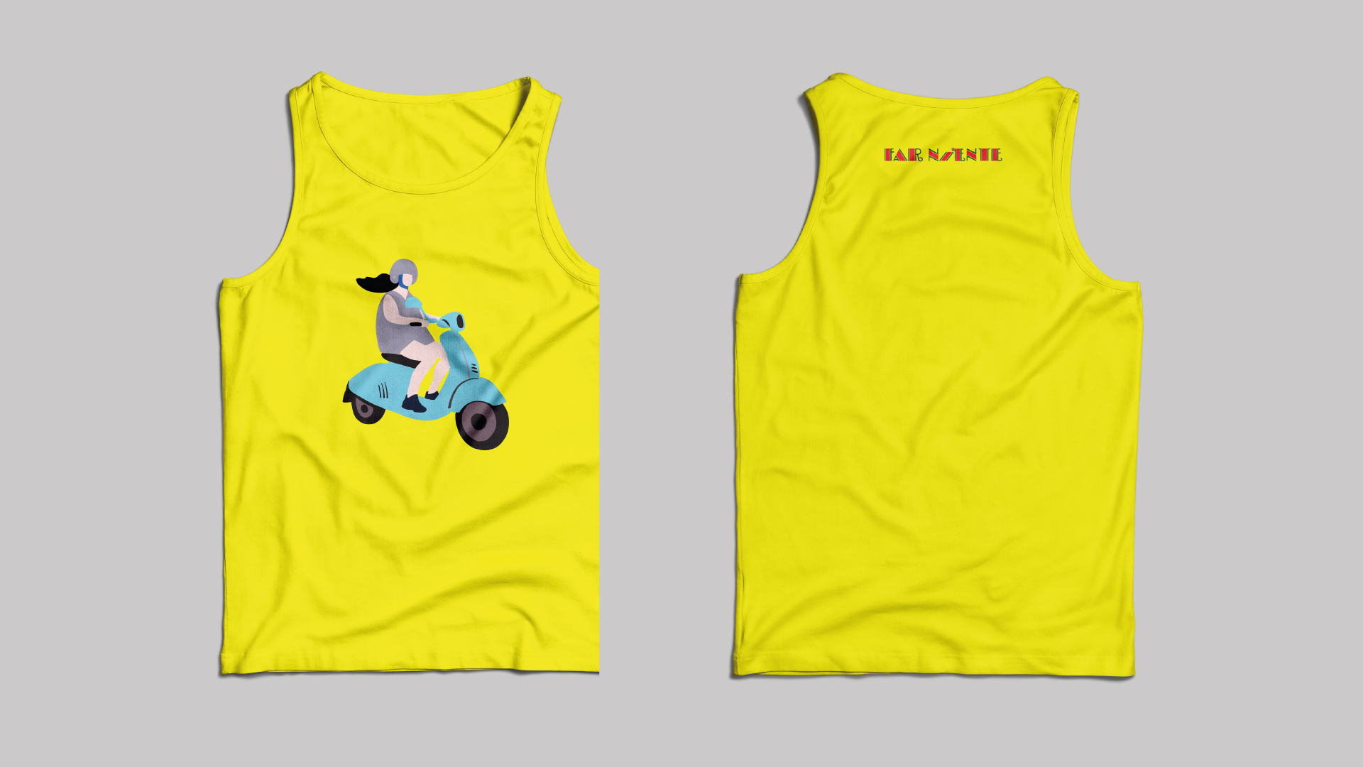
Fun and family friendly. That was the brief that Diana, a young Brazilian entrepreneur give it to me to start the project. This restaurant, located in Coixa, a small city to 20 min from Sao Paulo, wanted to stand out with its identity from the other food spaces of the mall. Diana rapidly noticed that the other places did not put attention to the branding neither to the kids zone. So with this in mind we developed some simple and fun illustrations with an Italy driven style. Did I miss to tell you that this menu is inspired by this amazing culture? Well, it happens that in Brazil, there is a very important Italian community. In fact Diana´s father is from Italy and FAR NIENTE is an Italian expression (off course) that means to be relaxed, to enjoy life, to do nothing. We choose a vintage Italian letter forms for the logo and we put the “I” to rest. This letters also have in its forms a continuous curved line that looks like pasta which is used in the visual system. The colors are vibrant and popular in order to connect with the Brazilian culture that loves color. The solution for the packaging were the stickers that can be mixed in order to brand the bags and boxes. This solution besides to be economically viable communicates the hand made production process of the ingredients of the restaurant.
Related Projects