FIAN visual system
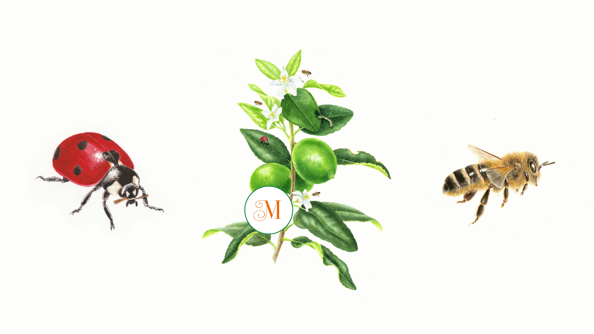
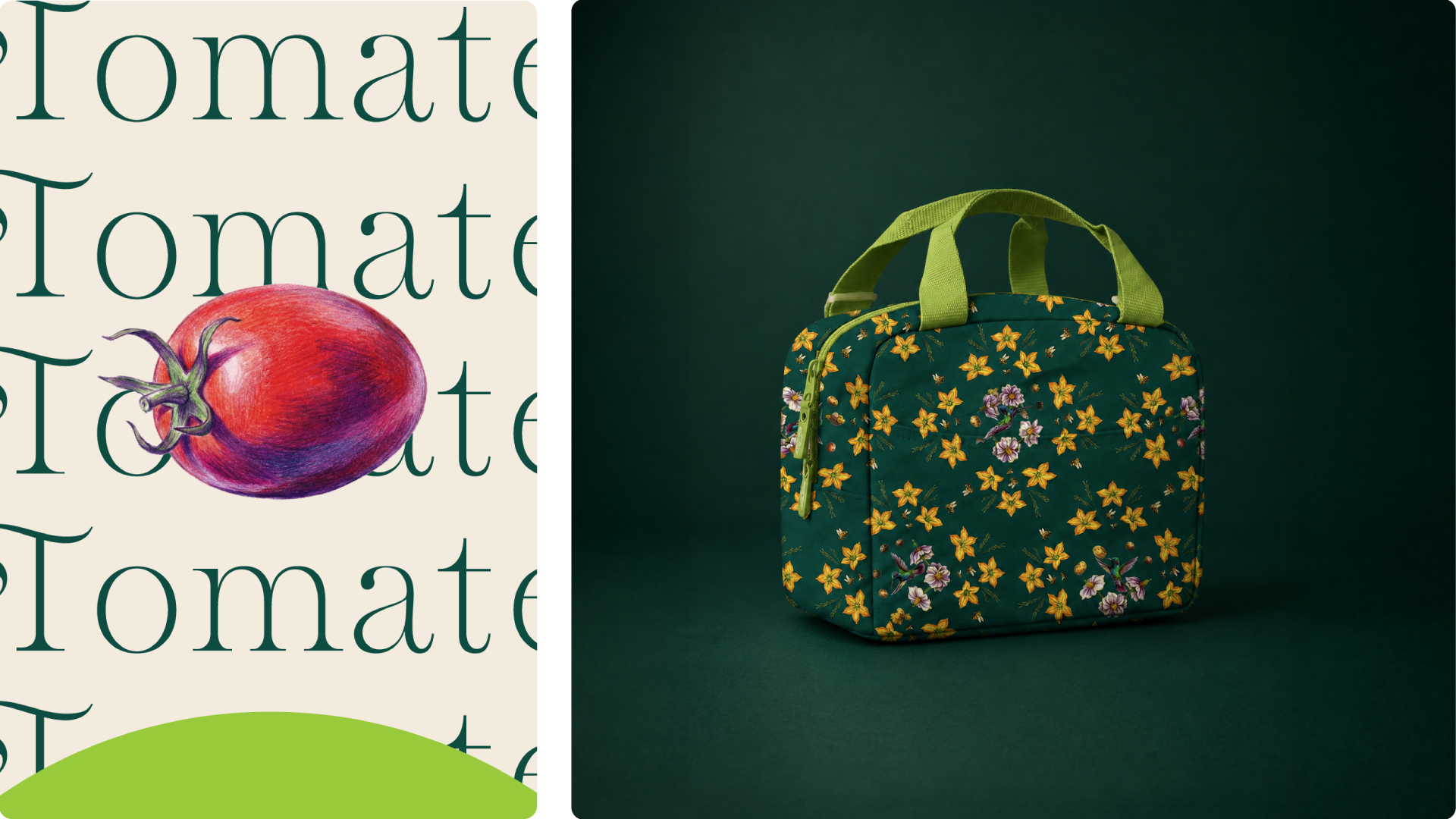
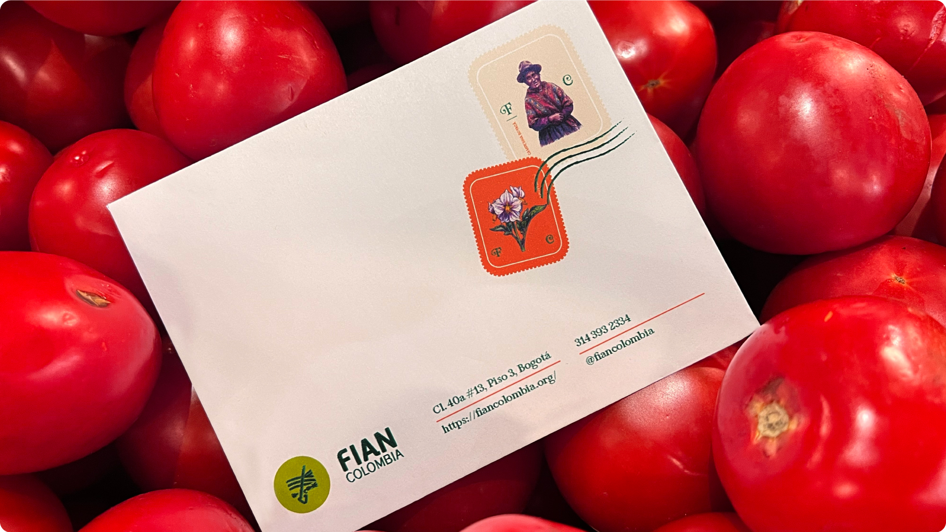
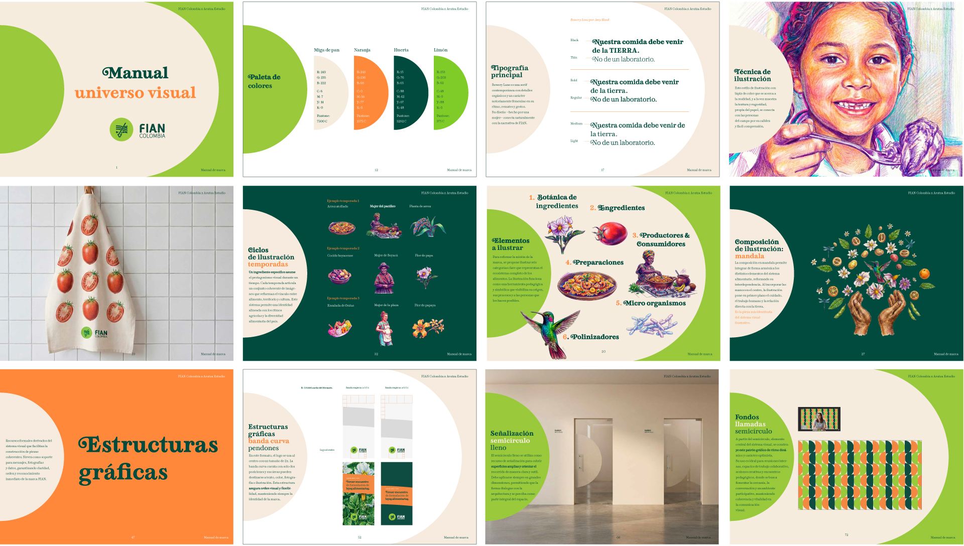
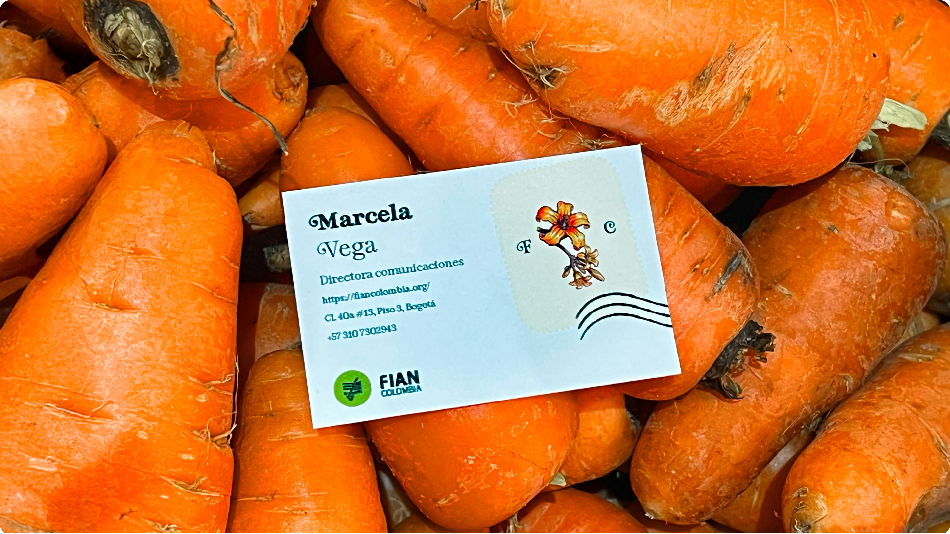
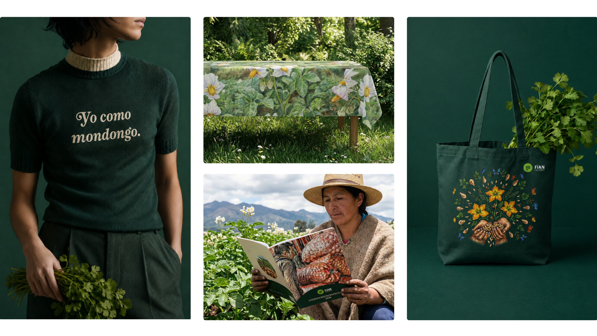
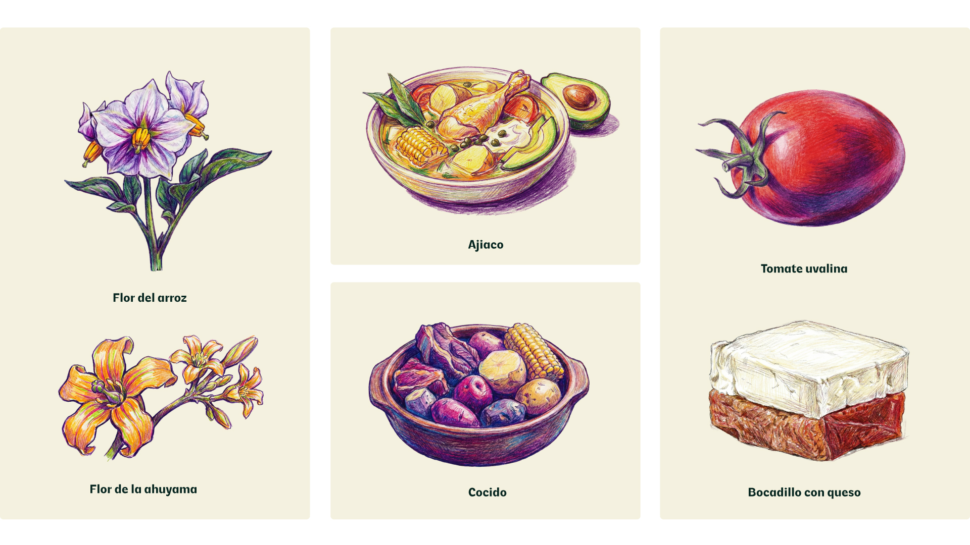
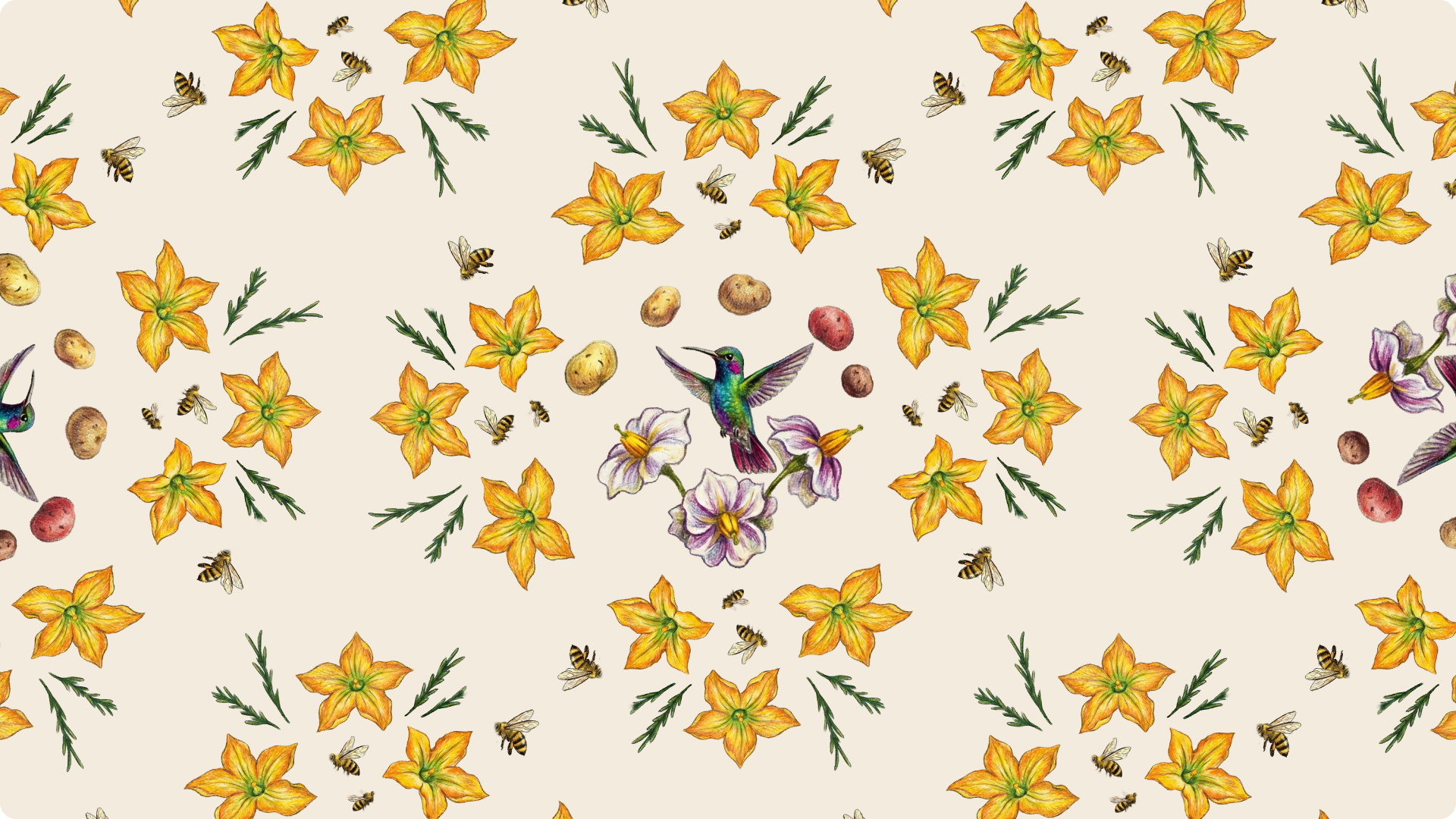
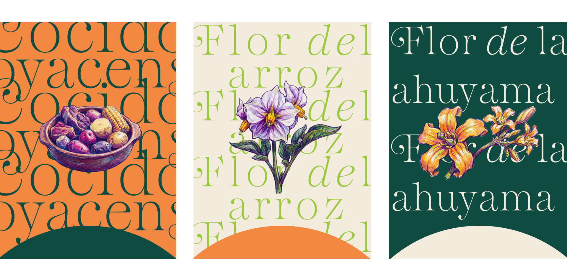
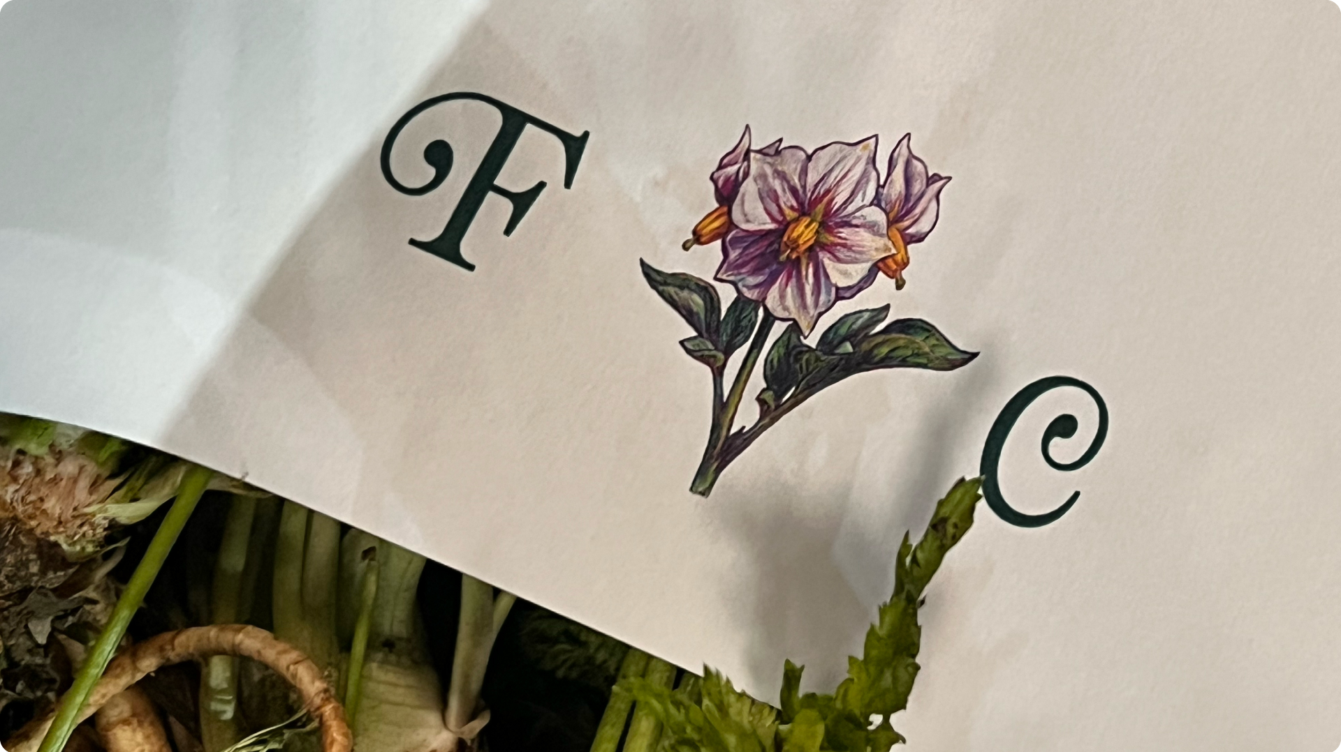
It all started with a simple question: how can an organization talk about the right to food without showing food? Through an open call, our studio was selected to develop the visual identity system for FIAN, an organization dedicated to defending the human right to adequate food. From the very beginning, the goal was clear: create an identity that reflected the organization’s professionalism while designing pieces people would actually want to keep. The kind of pieces that make someone ask, “Where did you get that?” As we reviewed FIAN’s communication, one thing immediately stood out. It was as if Audi never showed a car. If FIAN exists to defend the right to food, why were food and ingredients almost absent from its visual identity? The answer wasn’t simply to use more photography. FIAN communicates with institutions, farmers, producers, and consumers alike, while receiving images from remote regions with very different levels of quality. We needed a visual language that felt approachable, recognizable, and consistent. Our solution was to create a system of hyper-realistic colored-pencil illustrations of food, along with an AI prompt that allows the team to generate new illustrations while maintaining a cohesive visual style. The strategy extended to the promotional items as well. Instead of the usual branded merchandise, we proposed objects directly connected to food—aprons, lunch bags, kitchen towels, and reusable tote bags. If food is at the heart of the organization, its branded objects should reflect that too. The result is a warm, scalable visual identity system that helps communicate FIAN’s mission across every touchpoint.

Related Projects