Rosina Polo Branding
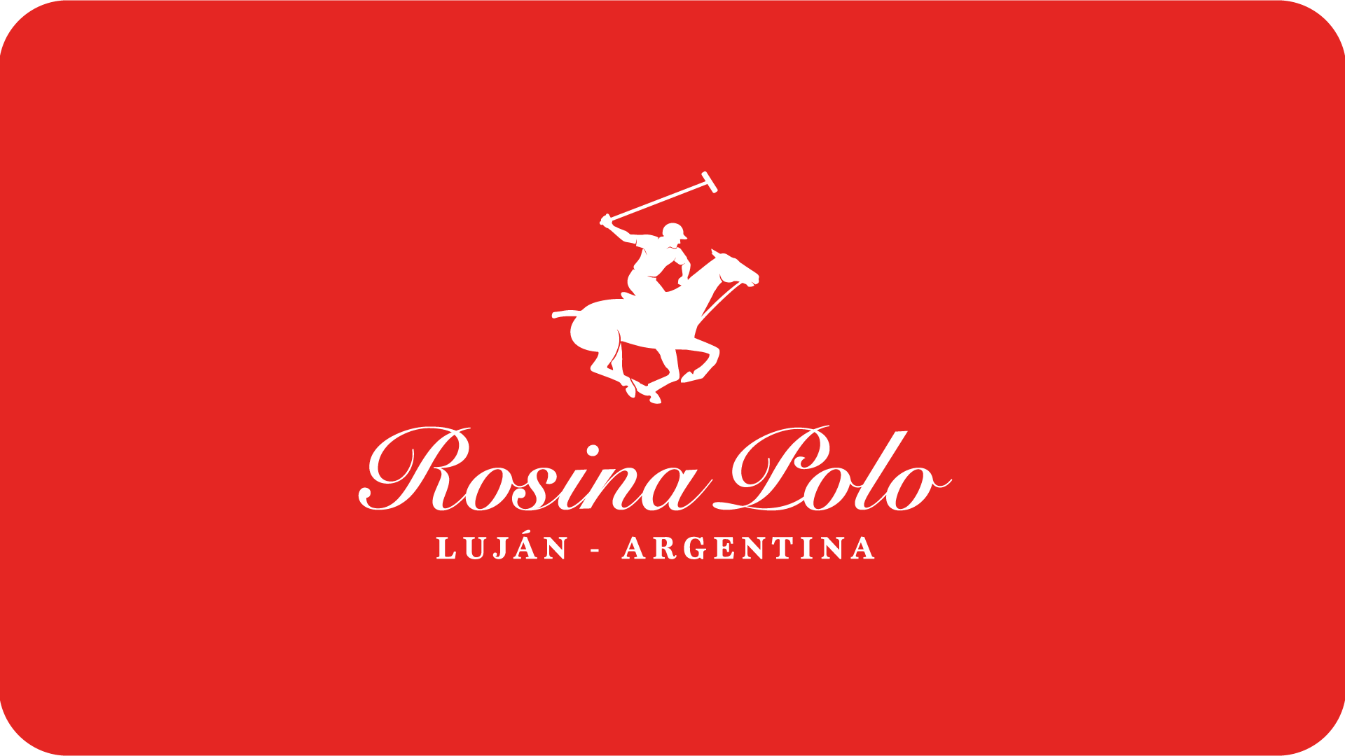
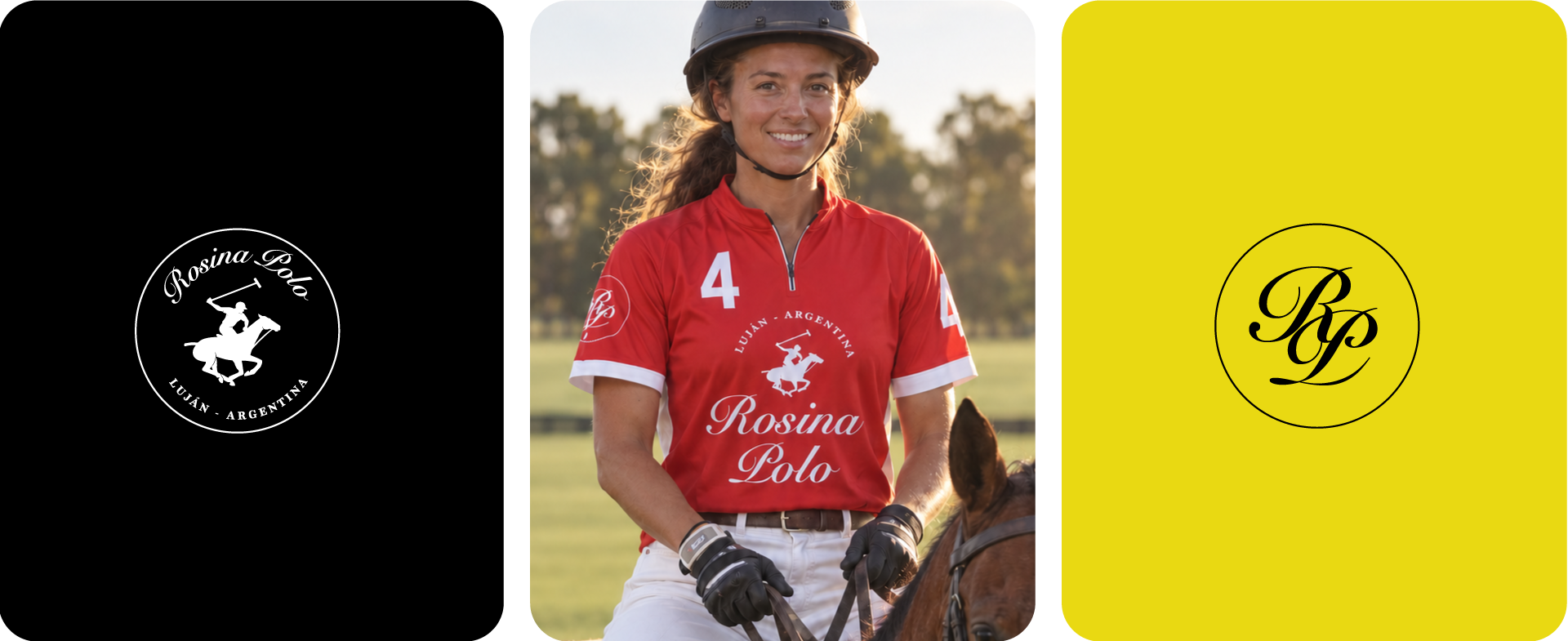
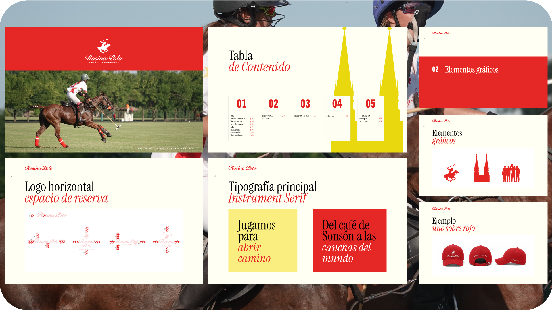
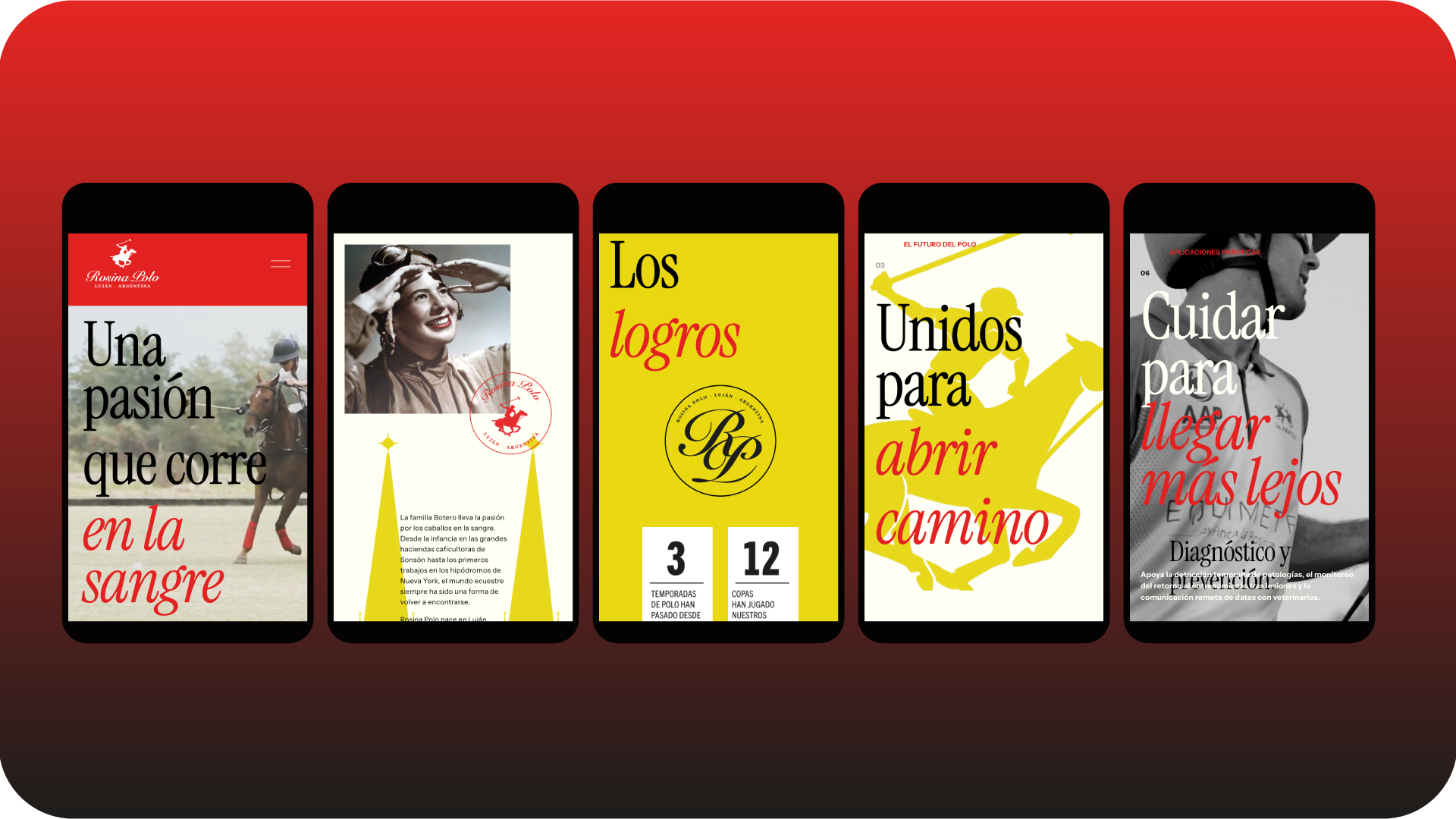
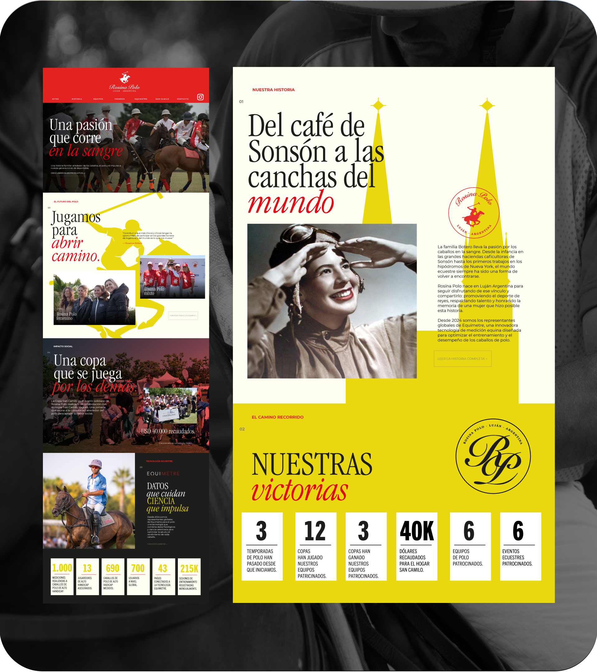
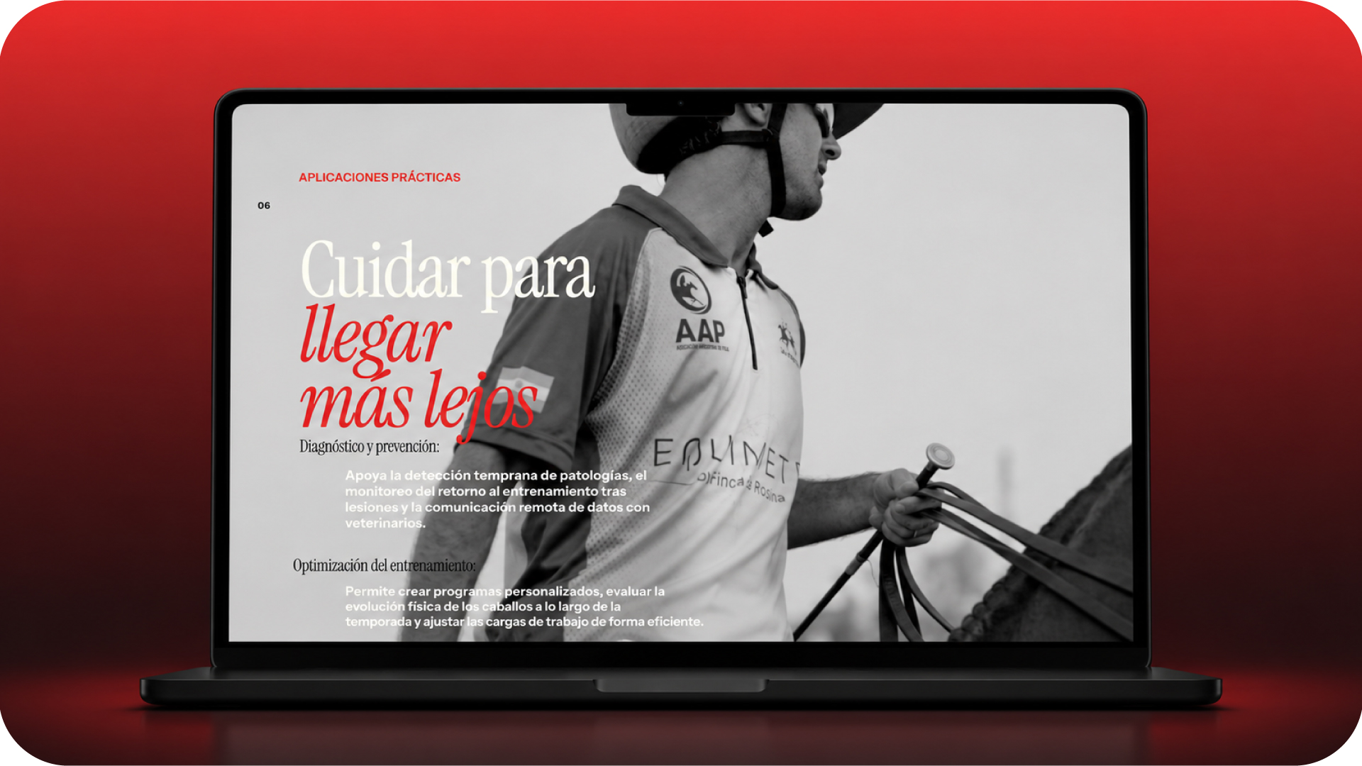
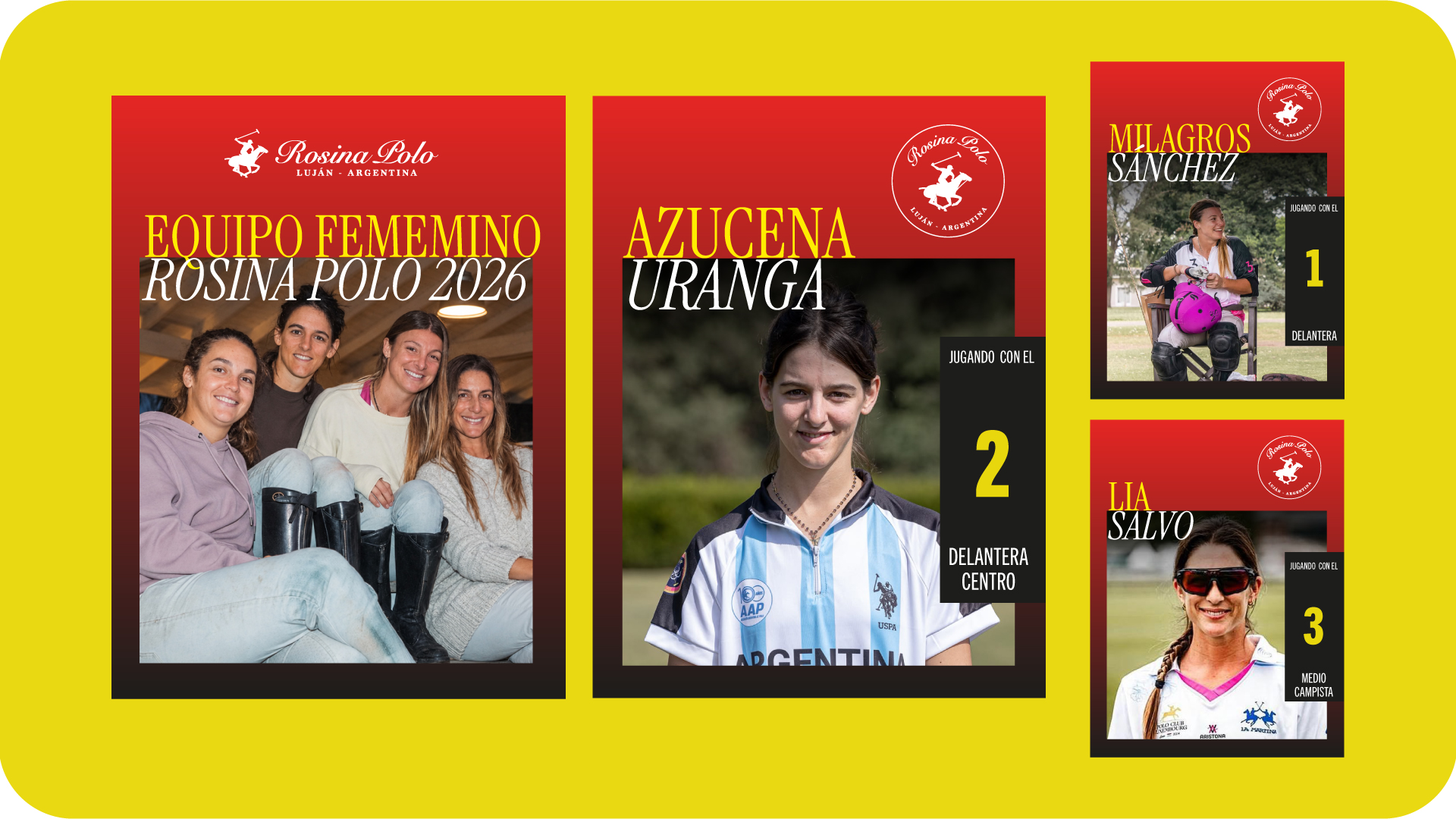
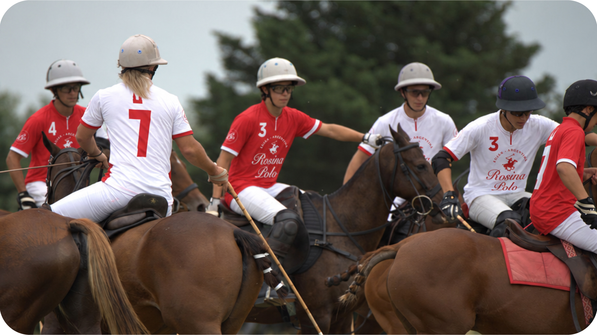
Michelle, a talented woman who has worked in communications for decades, mostly in the food world, wrote to ask me for help with a new project. To my surprise, this time we would swap spoons for horses and ingredients for polo. This is one of those rare branding cases: it is not an identity for a foundation, a polo team, or an individual. It is for a family (Botero family) that uses polo to help others: they sponsor polo teams and donate to Fundación San Camilo. What began as a website quickly became a complete brand identity: a logo redesign, brand guidelines, textures, illustrations, web design, and social media content. The clients had a crush on the first sketches and wanted their entire universe to carry the charm that made them fall in love. And who does not fall for good editorial design? How could anyone not be captivated by photographs of players atop those beautiful animals that are horses? And, to top it off, an enormous condensed serif typeface that speaks of power and elegance; of tradition and aesthetics. The final touch of this identity comes through modern line and contour illustrations that accompany the pieces. They give the brand dynamism and a youthful attitude. They are that strange combination of something very classic and something modern. Like eating pasta with meatballs: it is not the original Italian recipe, but it is delicious.
Visit the website: https://www.rosinapolo.com/
Related Projects