PRACTICAL DOESN´T HAVE TO MEAN BORING.
TATEN is Andrea’s brand. She loves cooking and she loves design almost as much. From the start, one thing was clear: she didn’t want her brand to look like every other artisanal food brand. No kraft paper, handwritten type, or “made with love.”
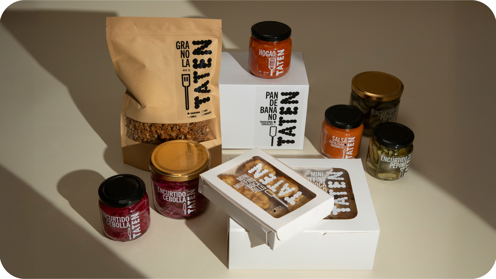
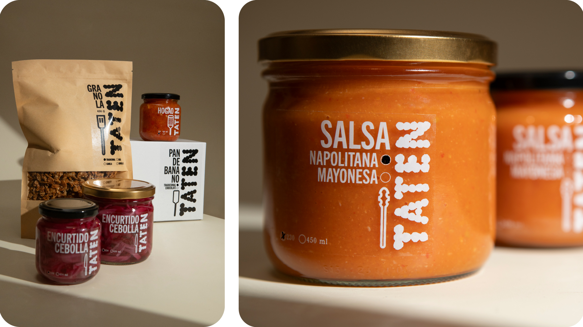
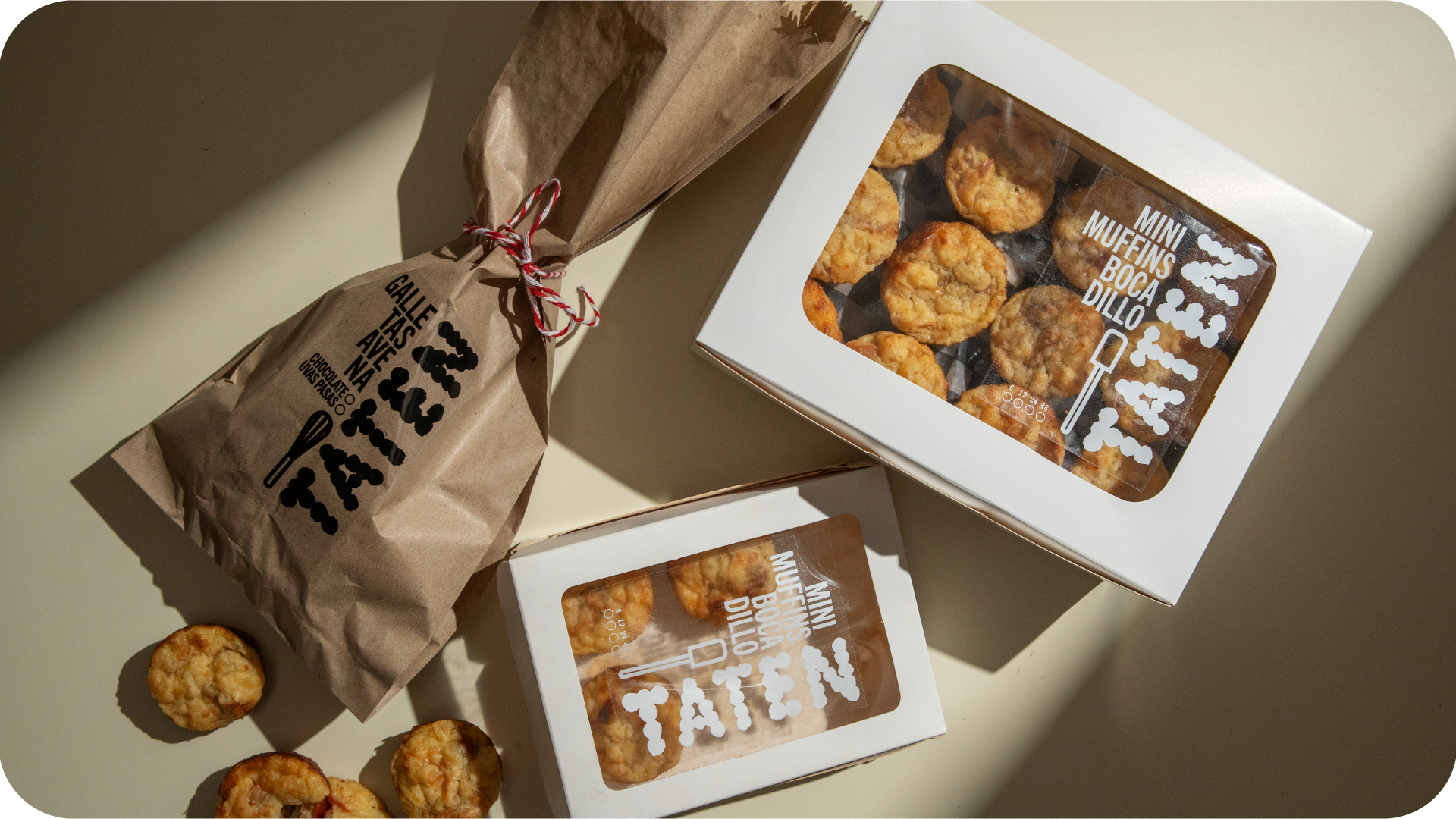
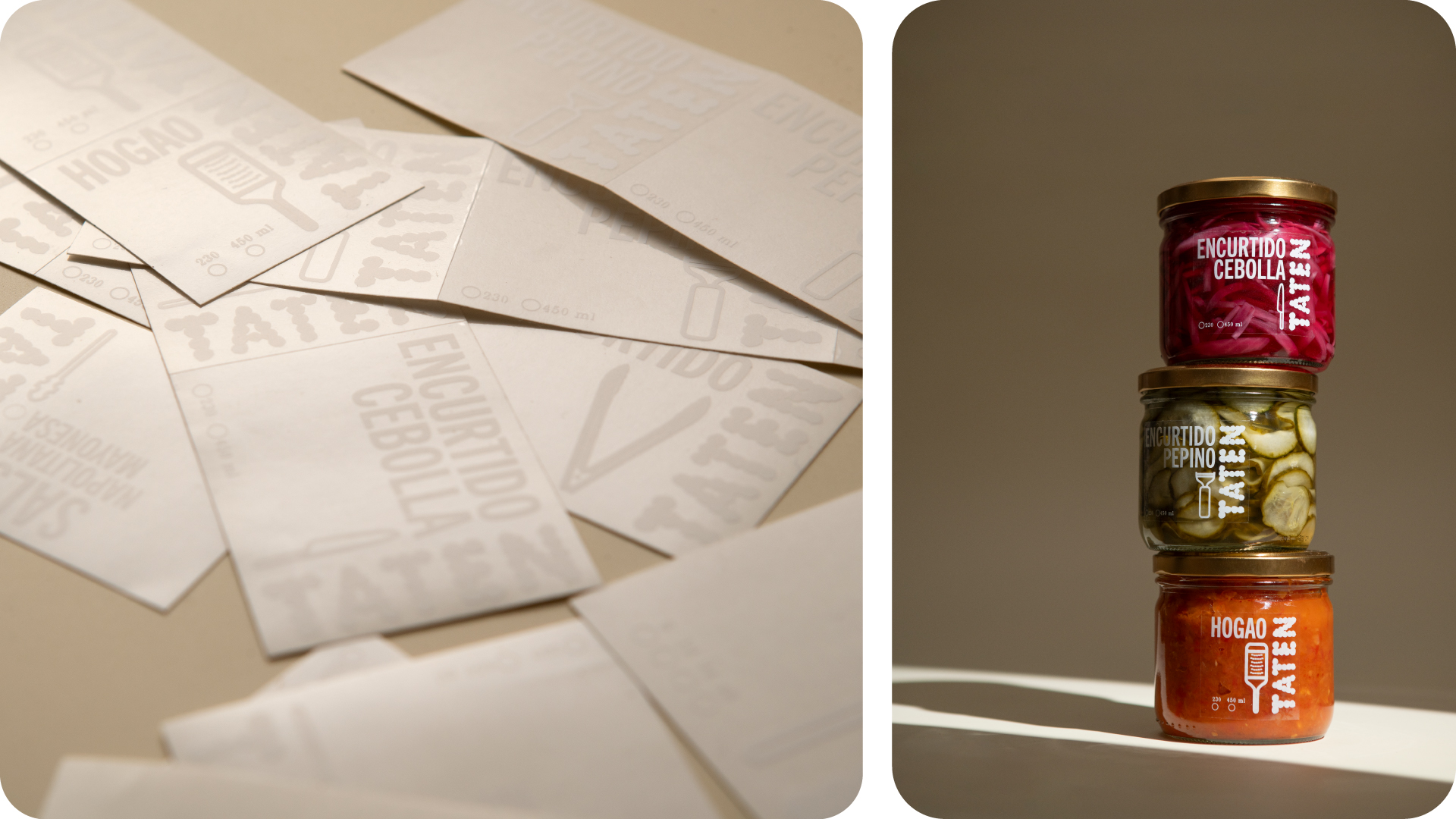
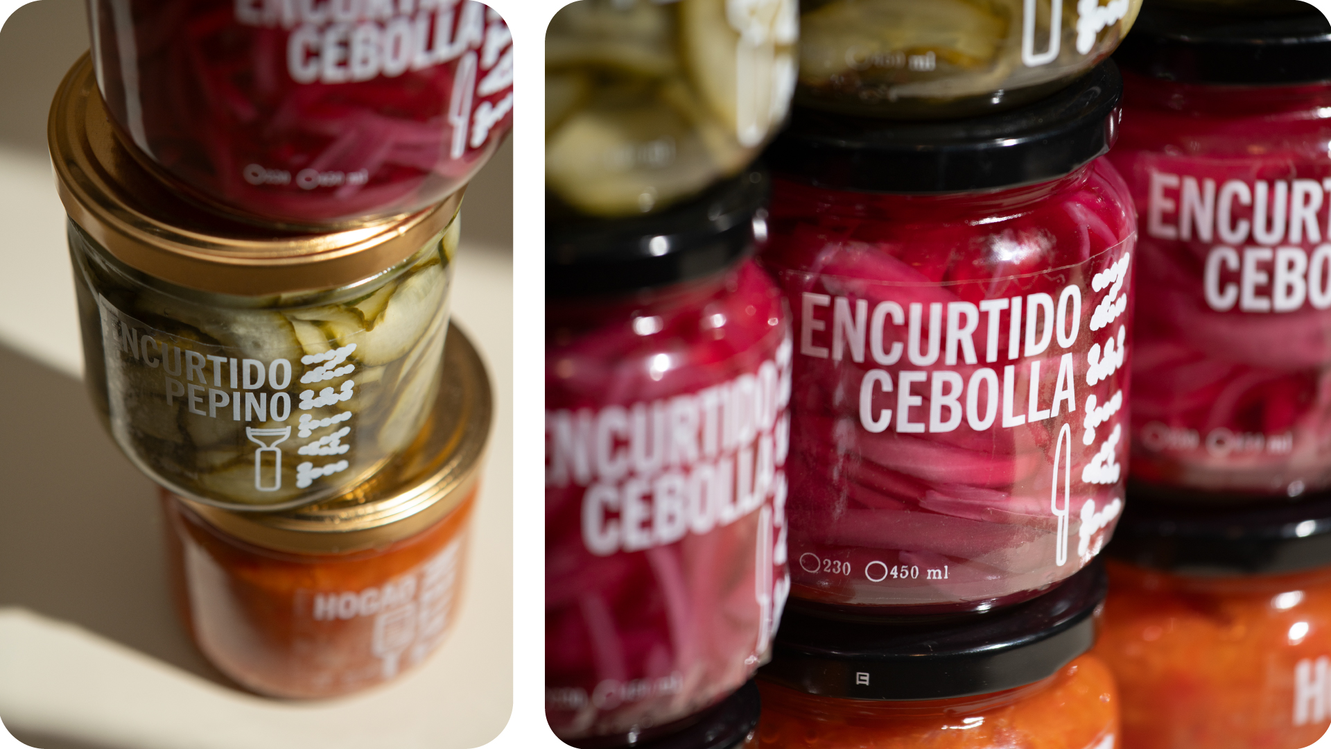
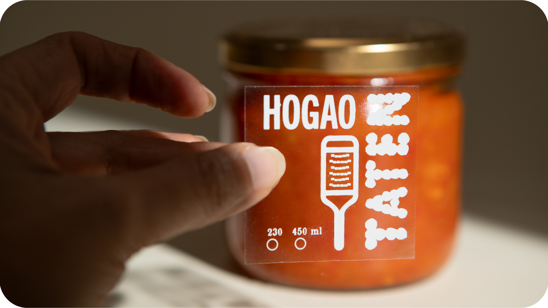
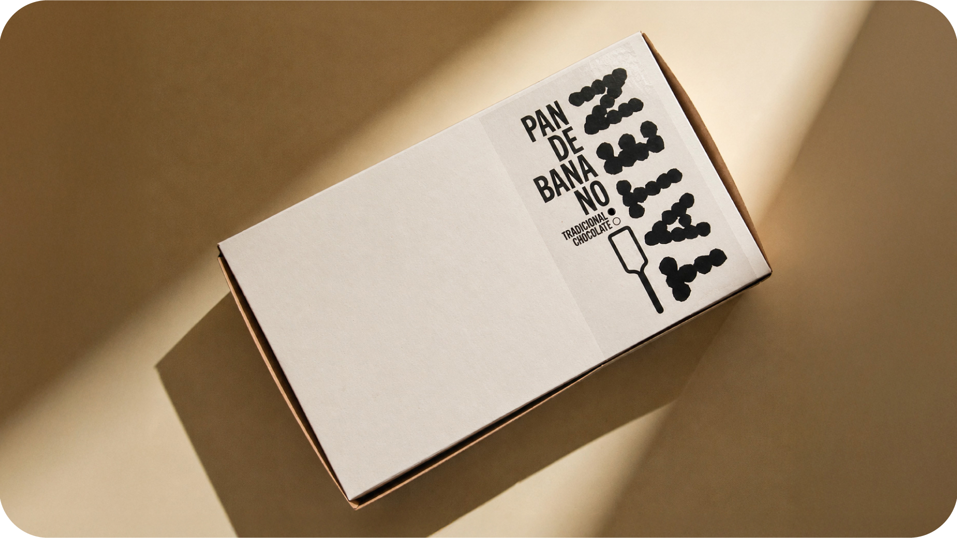
We wanted something more graphic, more contemporary, and with a lot more character. That’s how TATEN came to life: bold, irregular, playful custom lettering inspired by the rounded shapes of muffins and cookies. We paired it with condensed type to organize the information and Super Chef, an illustrated typeface I designed a few years ago based on kitchen utensils. That led to another decision: we didn’t want to tell the usual story —ingredients, farms, provenance. We wanted to show the kitchen.
Mixing. Whisking. Chopping. Baking. Packing. Starting all over again. Super Chef allowed us to bring that little world of spoons, graters, whisks, and other tools directly onto the packaging, making the act of cooking part of the identity itself.
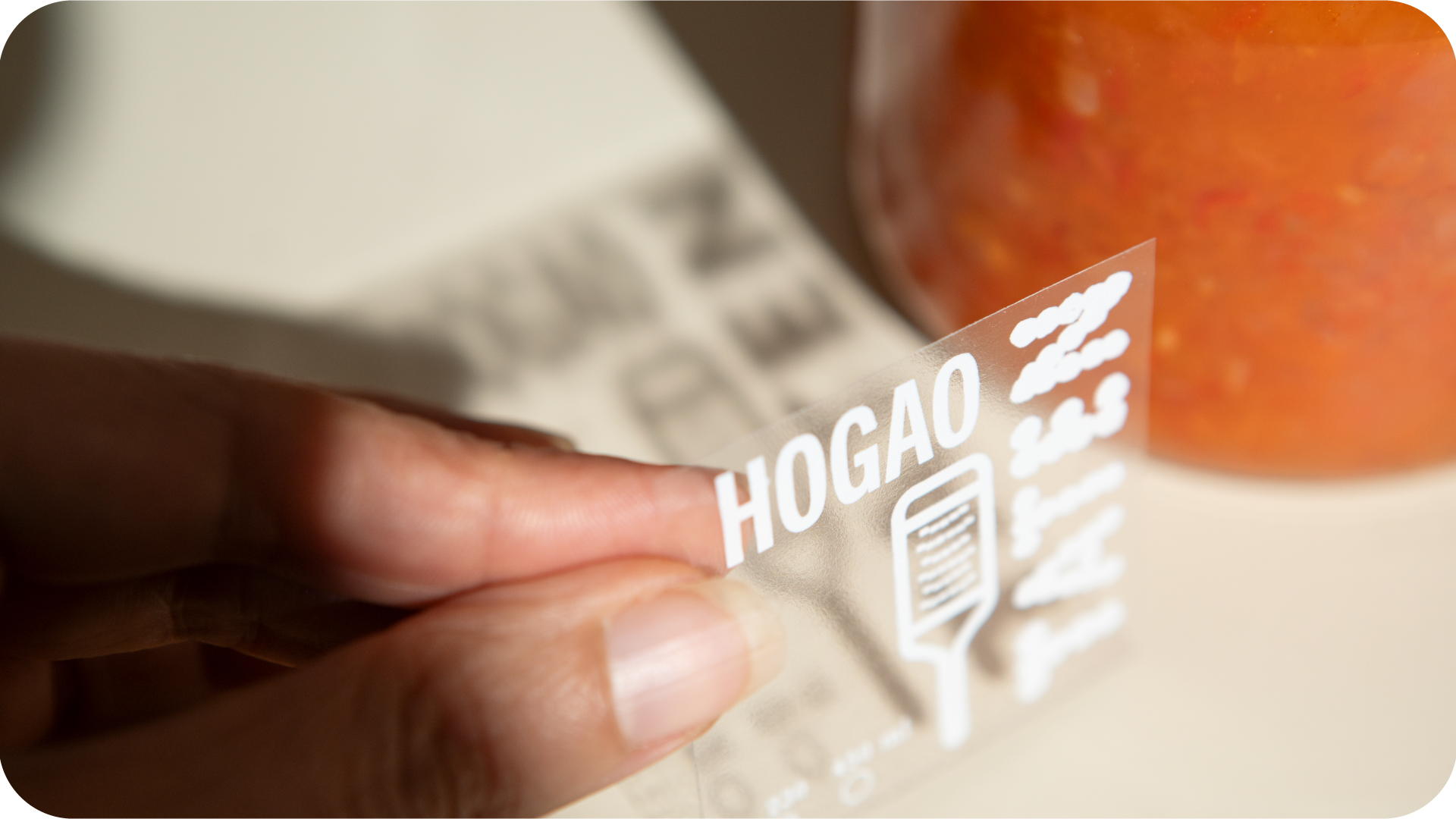
The result is a system that’s simple to produce, easy to recognize, and flexible enough for whatever Andrea decides to cook next.
Photography: Lucho Mariño
Taten IG: go!
Related Projects